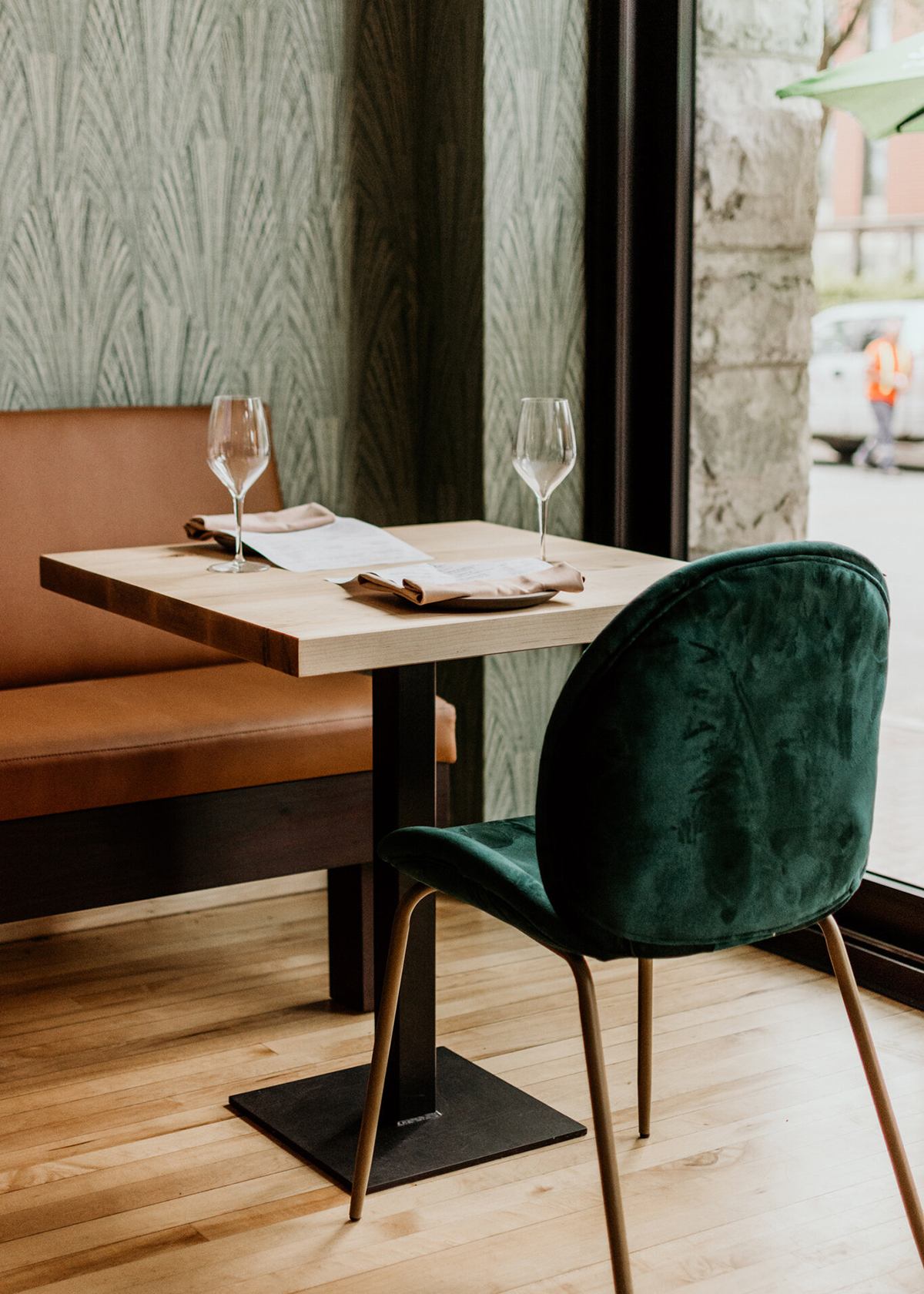
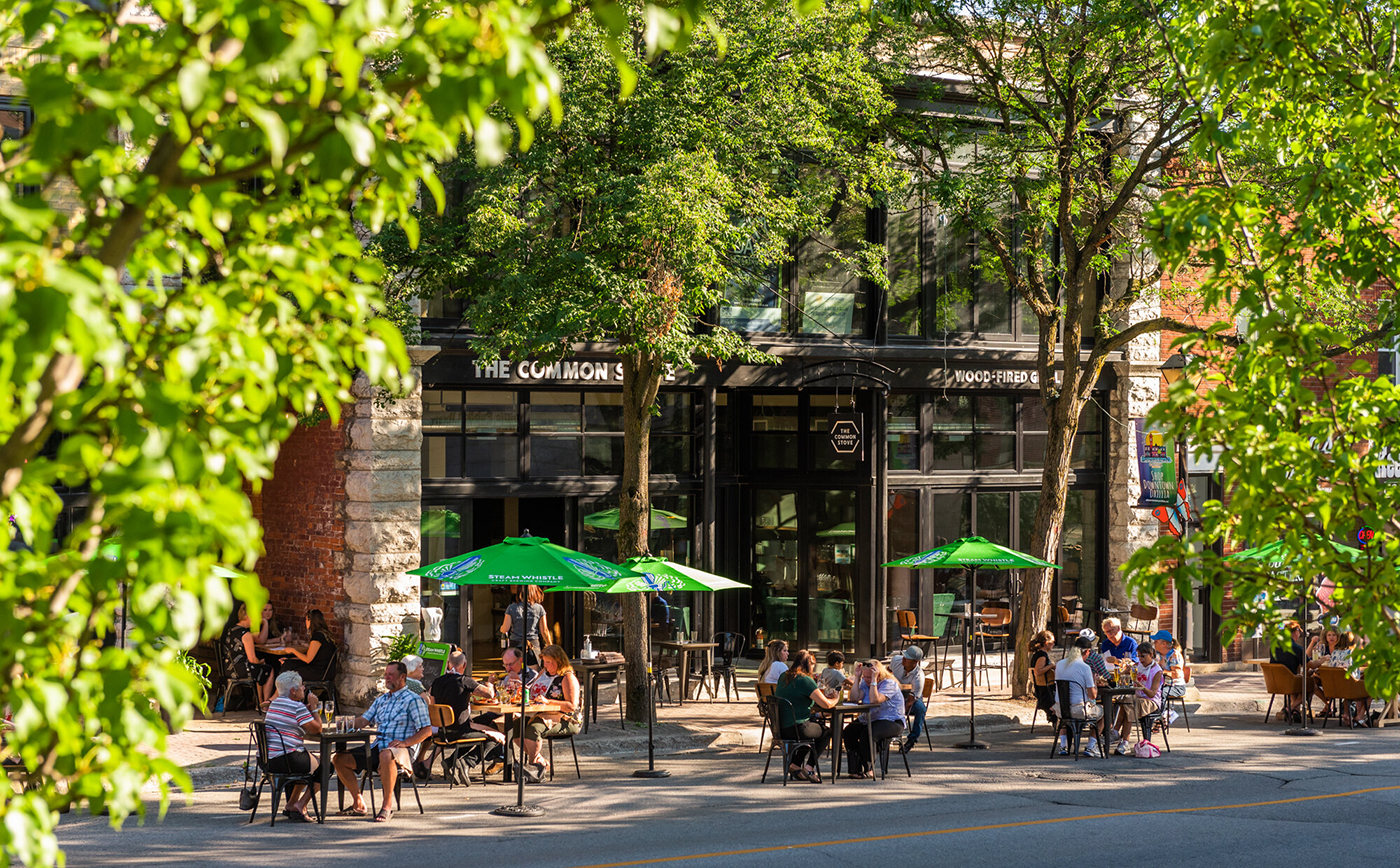
Restauranteurs Simon and Darcy wanted to launch a high-end neighbourhood restaurant, with a difference. One based on community and togetherness, that unites people through food, and where everything possible is made in-house with gentle treatment of simple ingredients. They needed a compelling identity to help tell their story and define their brand character. By using intelligent, warm and engaging messaging we helped The Common Stove stand out and firmly secure their place as a leading restaurant.

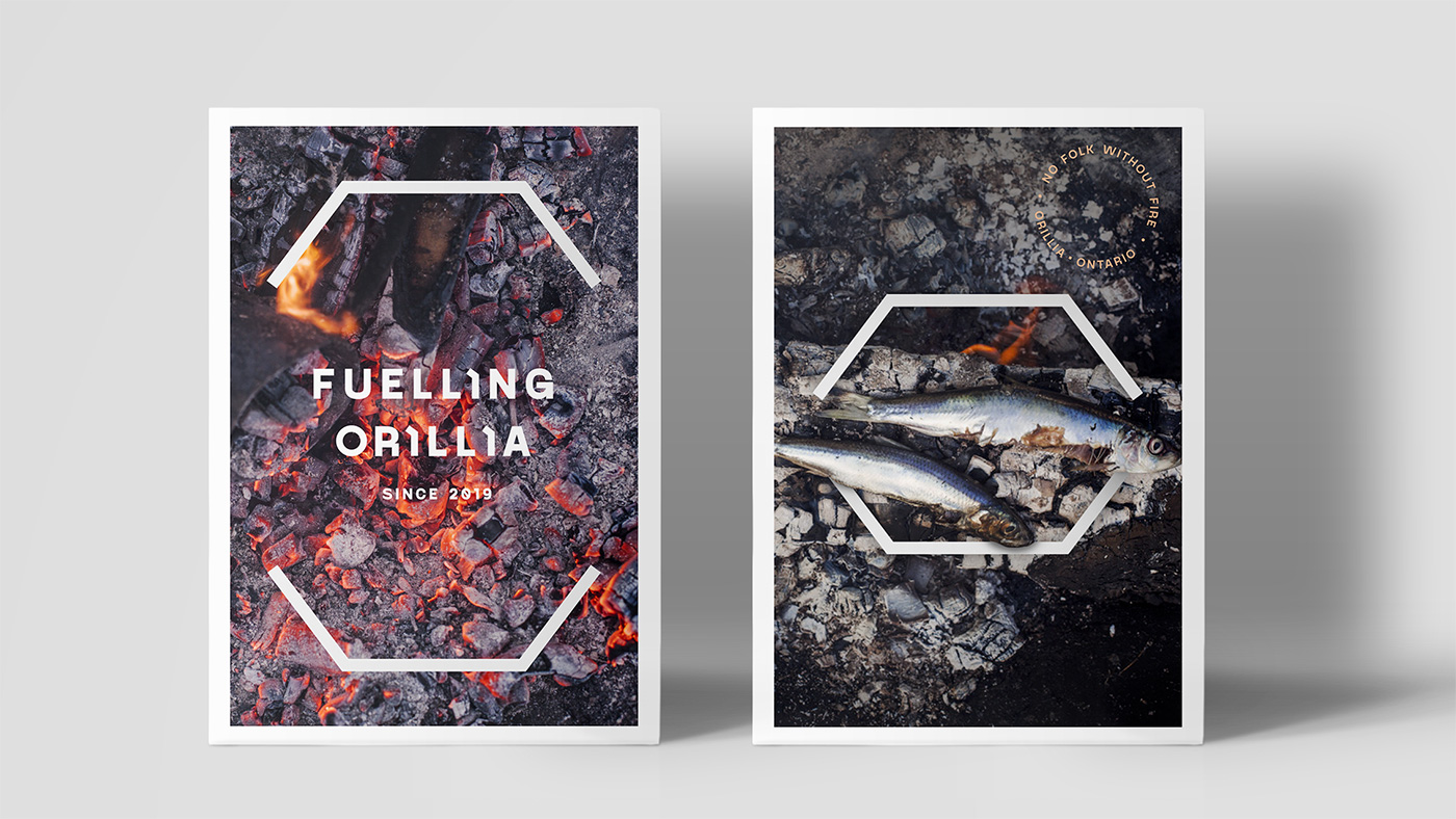
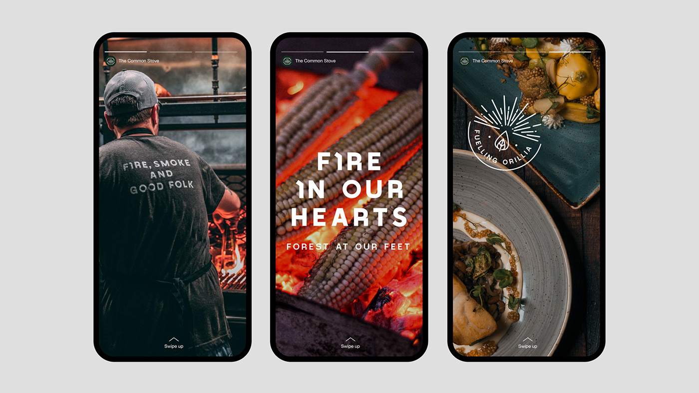
Fuelling Orillia
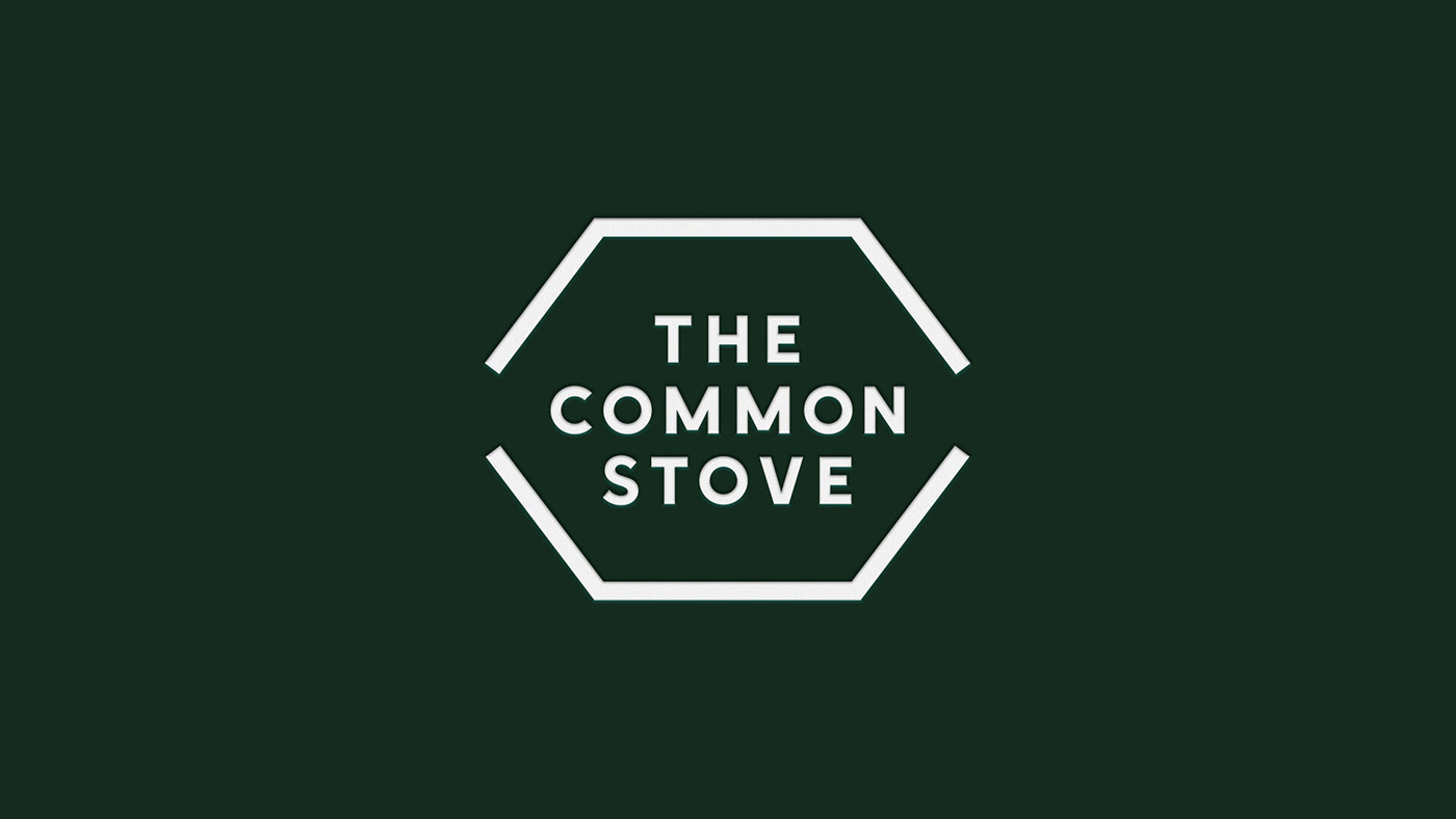
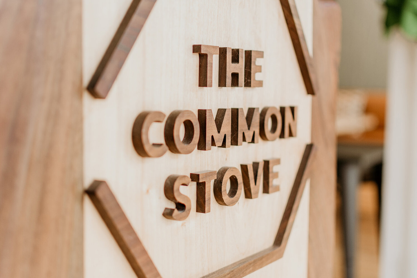
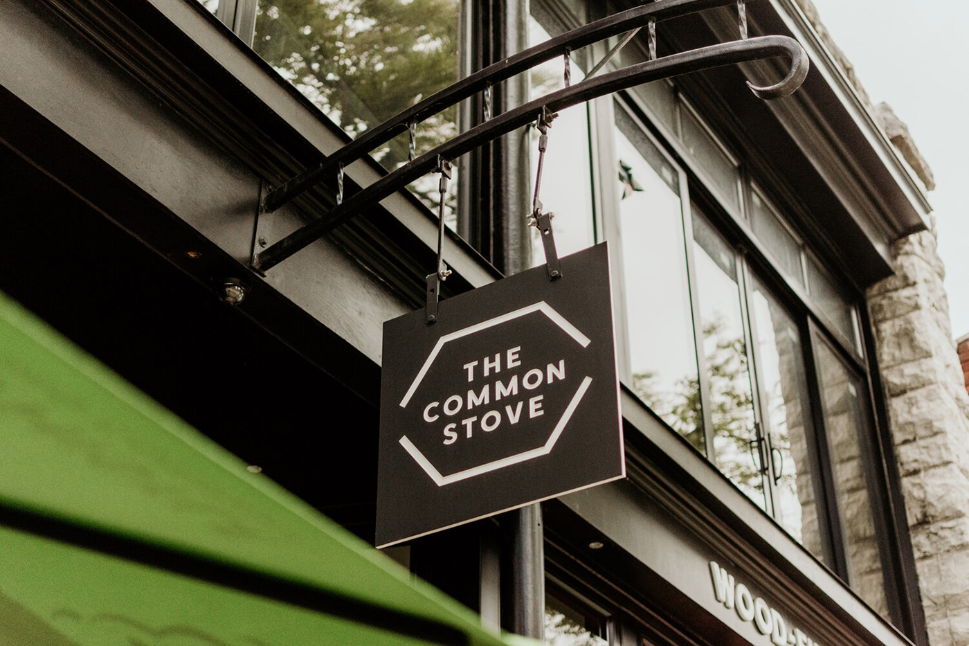
“The Common Stove” comes from the idea of a communal oven and was inspired by a community design project in Slovenia. Here a traditional U-shaped wood-burning stove, known as a kachelofen, was built in a forest clearing and used as a central meeting point to connect three otherwise remote villages. A place to cook, eat, and come together.
This U shape inspired the chef’s counter and booth design in the Orillia restaurant with cooking centred around a wood-fired grill; borrowing not only its fuel and its shape, but also inspiration from how the kachelofen’s warmth and conviviality inspires community.
Every element of the brand identity had to speak of the local natural environment particularly through the use of wood to power the fire. But it also had to fuse the idea of food uniting people and articulate the strong sense of community behind the brand.
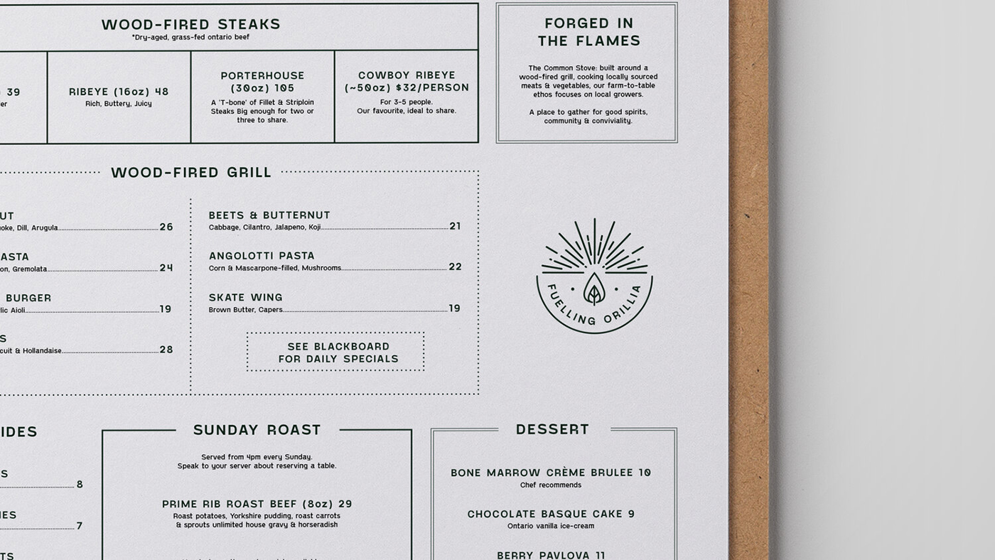
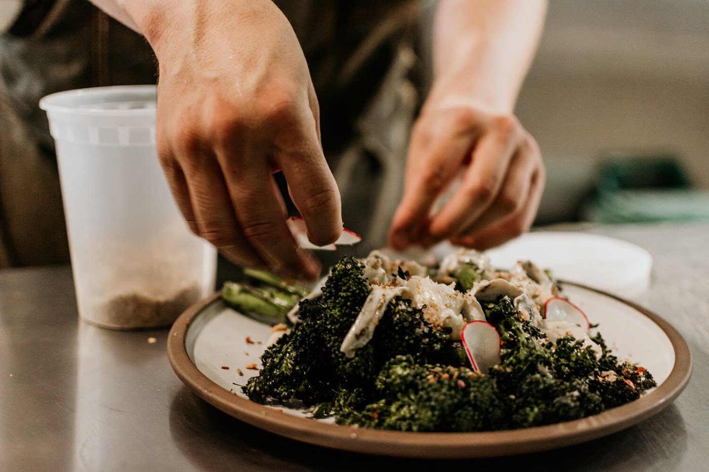
The menu takes its influence from the wood fired grill and elemental cooking with an emphasis on quality and simplicity using natural ingredients locally sourced from the vast forests and lakes.
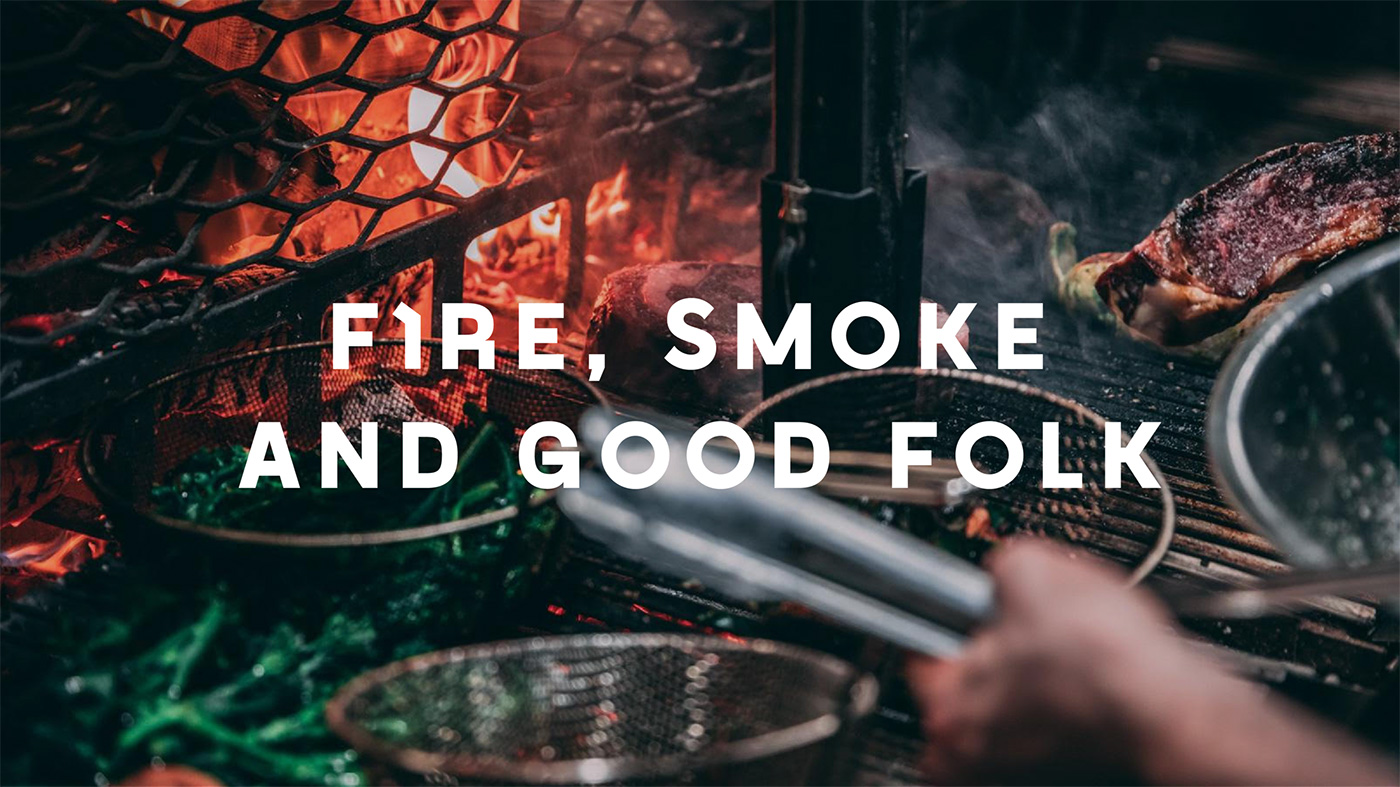
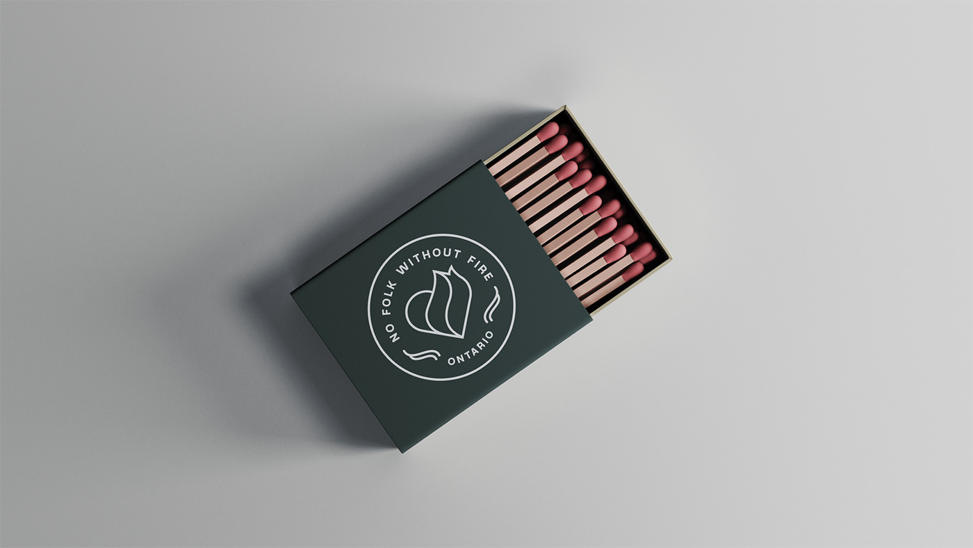
Forged in flames
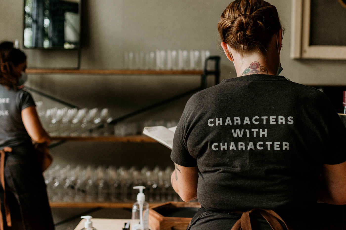
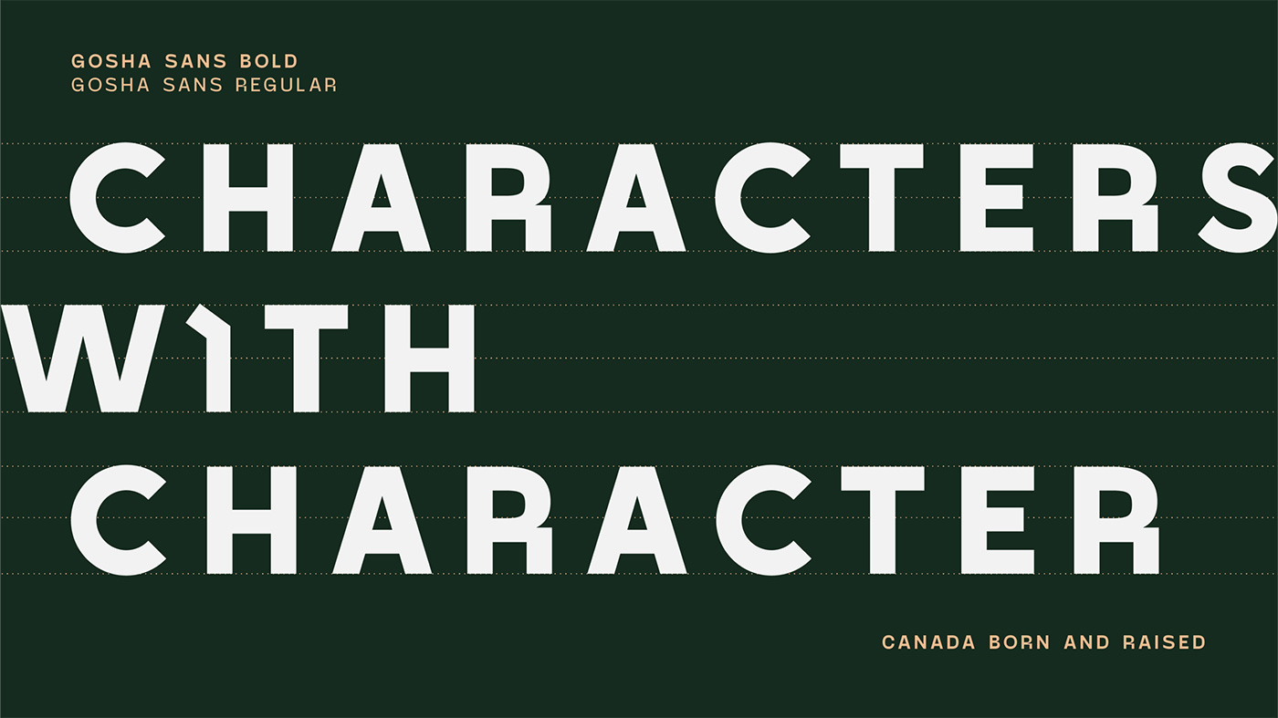
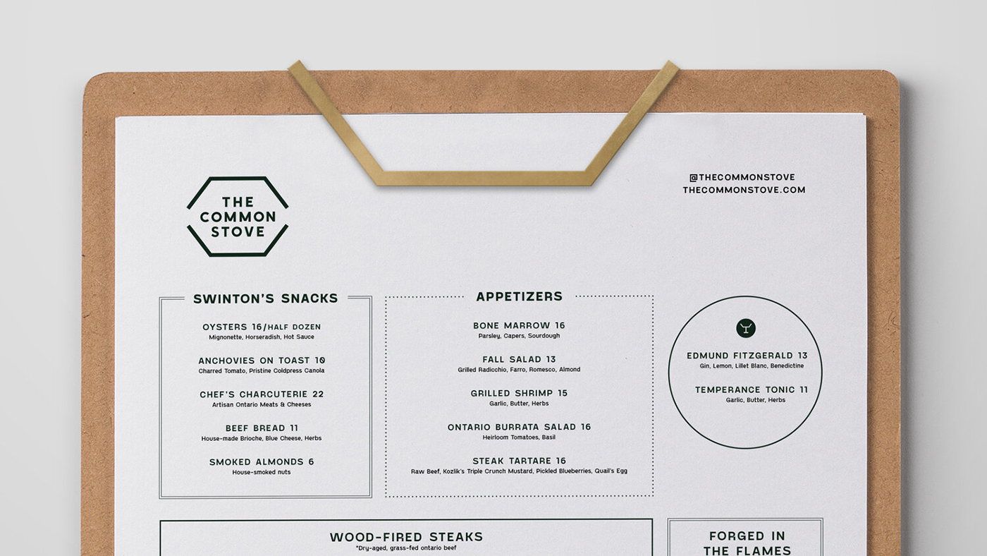
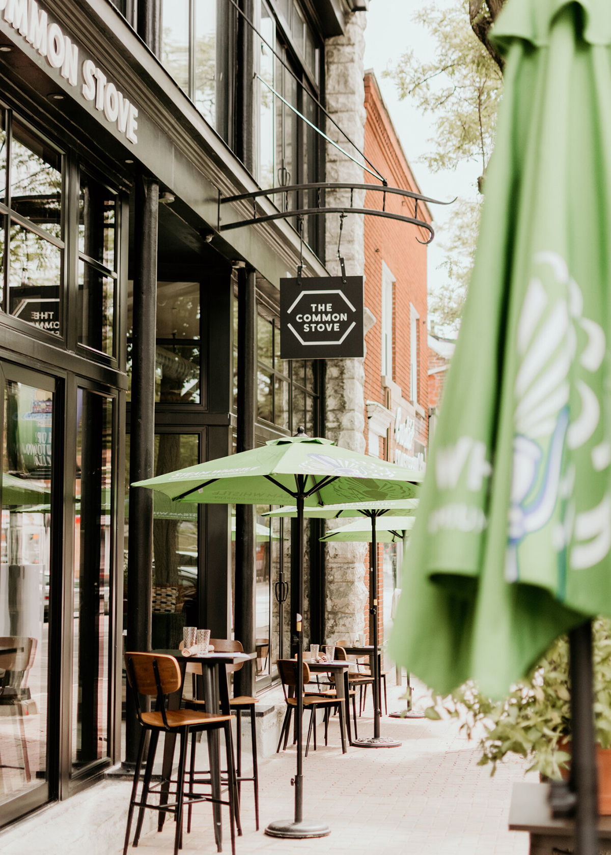
Our research into local competitors identified an opportunity to stand out from the crowd through intelligent, warm, and engaging messaging. We worked with the U shape used for the booths and kitchen counter to create a flexible holding shape reflecting the traditional concept of the kachelofen stove. It inspired the typographic detail, as well as physical elements such as door handles and menu holders.
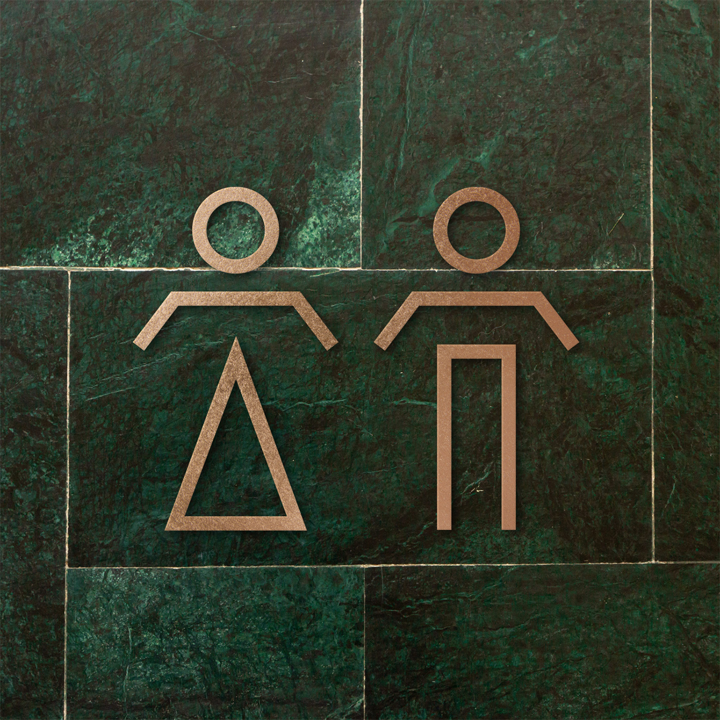
We also created symbols to capture the wilderness feel of the area, food gathering and local charm. The colour palette was influenced by the local environment emulating the natural tones of the forests, crystal clear lakes and simple high-quality ingredients.
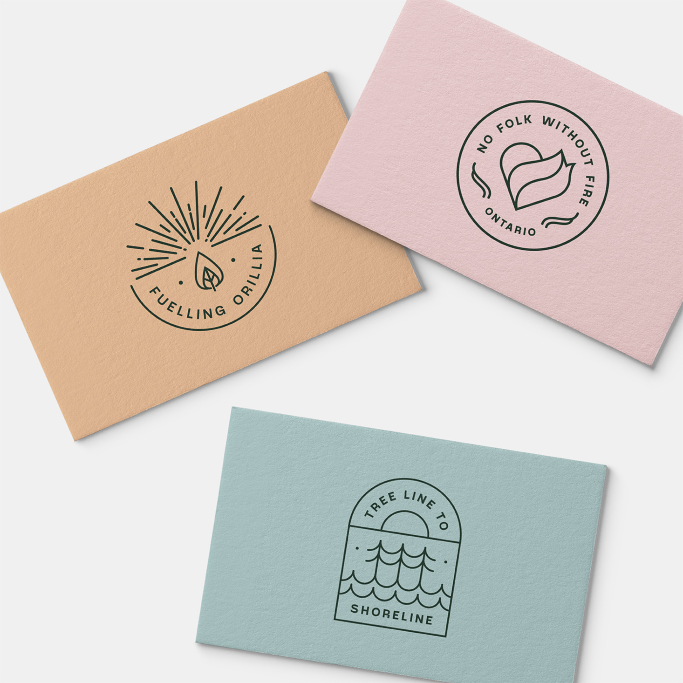
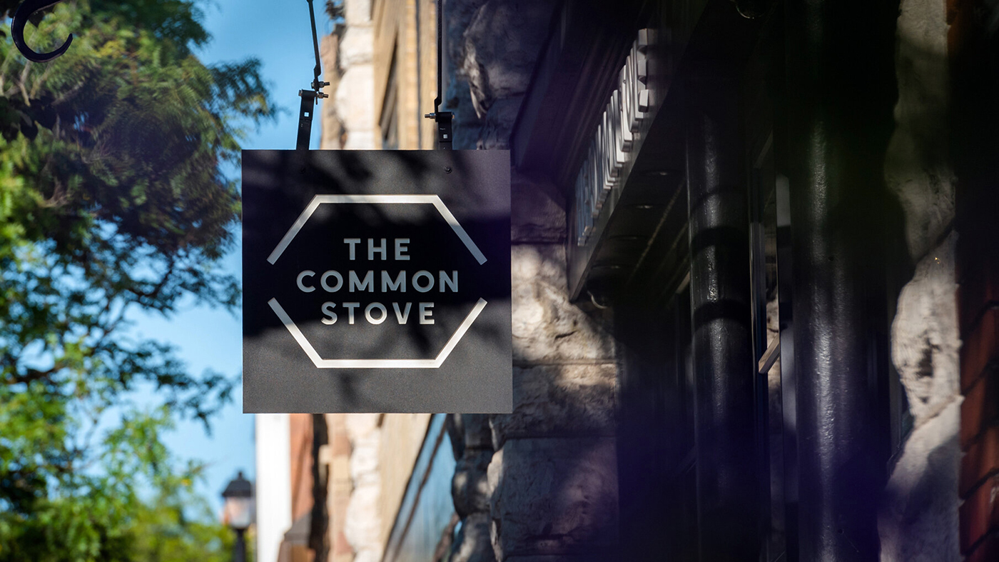
The typography used was inspired by eastern Europe and Russia — subtly referencing the roots of The Common Stove. Headlines were customised to reflect the geometric sans-serif details of the Toronto subway. The use of geometric shapes was further developed in the menu design, reminiscent of subway tiles.
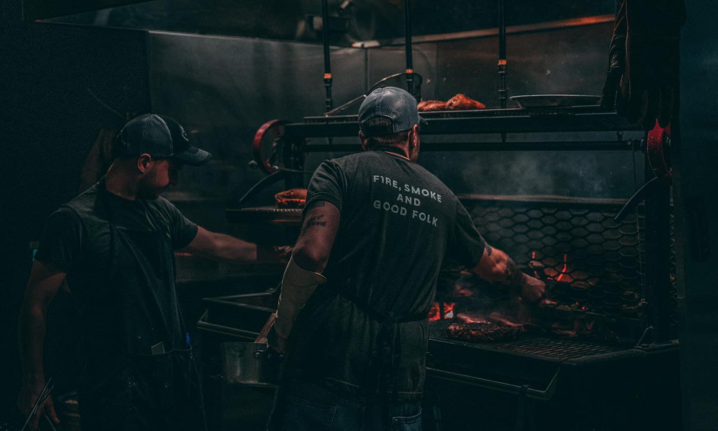
Photography by Rene Dawn.
Lantern elsewhere on Identity Designed: National Children’s Bureau.