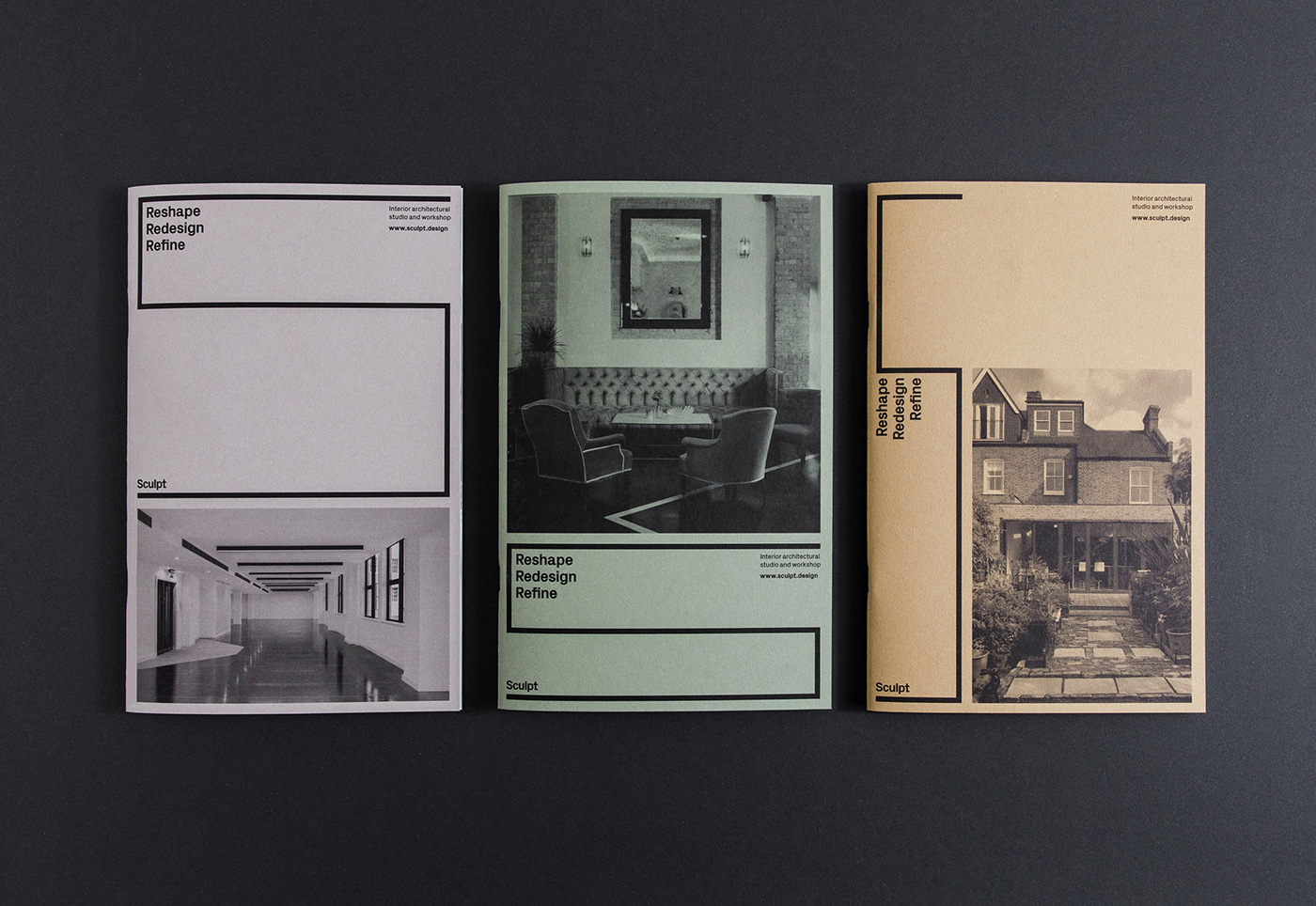
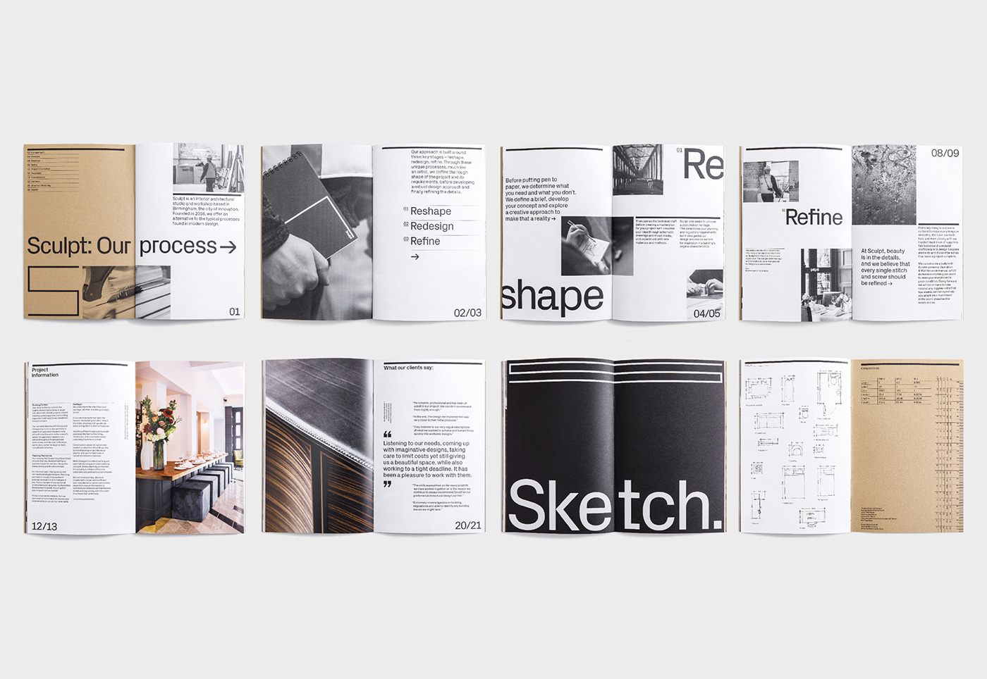
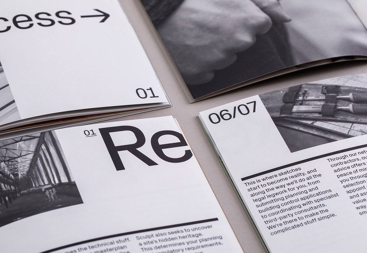
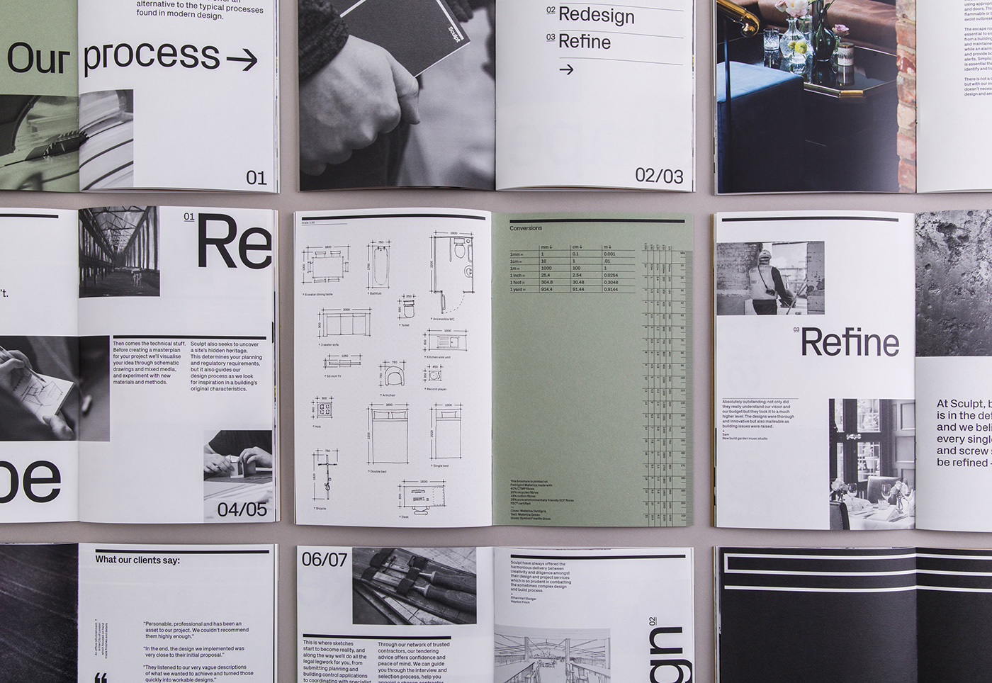
Sculpt is an interior architectural studio and workshop based in Birmingham. They needed a comprehensive rebrand to give them a stronger presence across all touchpoints, echoing Sculpt’s fundamental principles – reshape, redesign, refine.
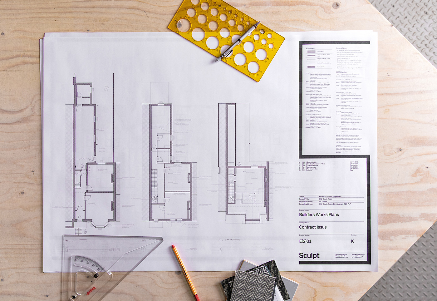
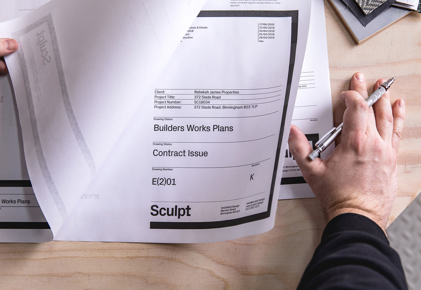
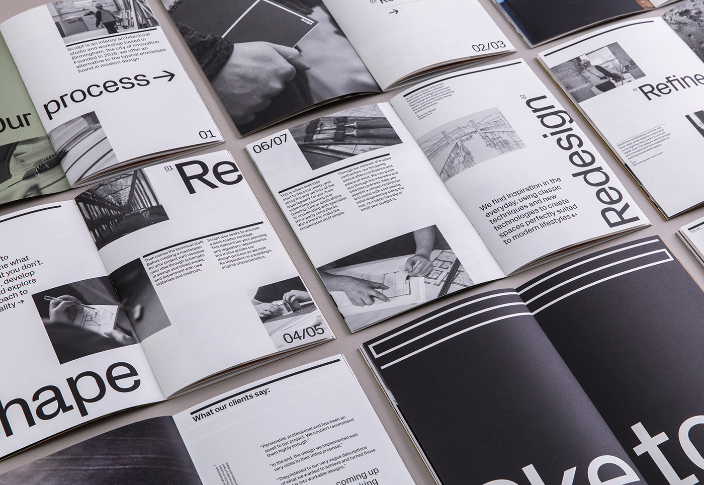
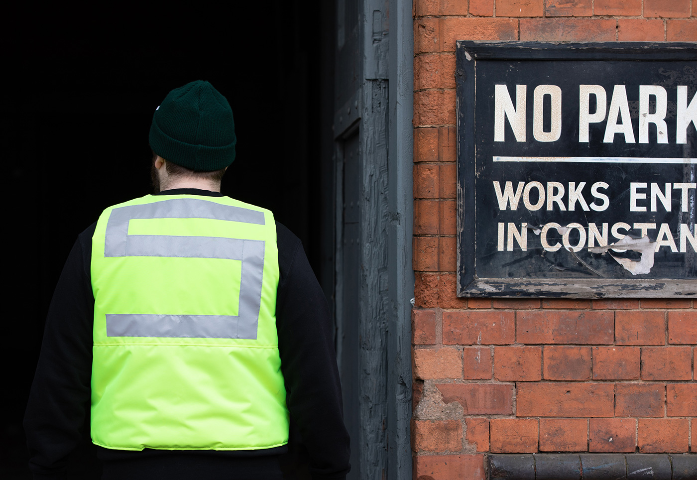
The rebrand needed to better communicate their offer and distinct approach, whilst giving greater visibility across the full client journey, from promotional materials, proposals and plans, to on-site visibility and custom material samples.
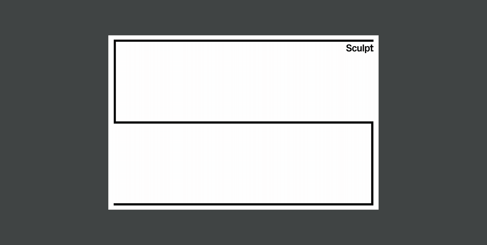
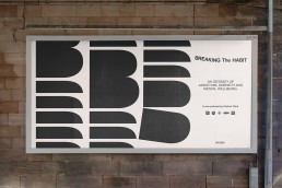
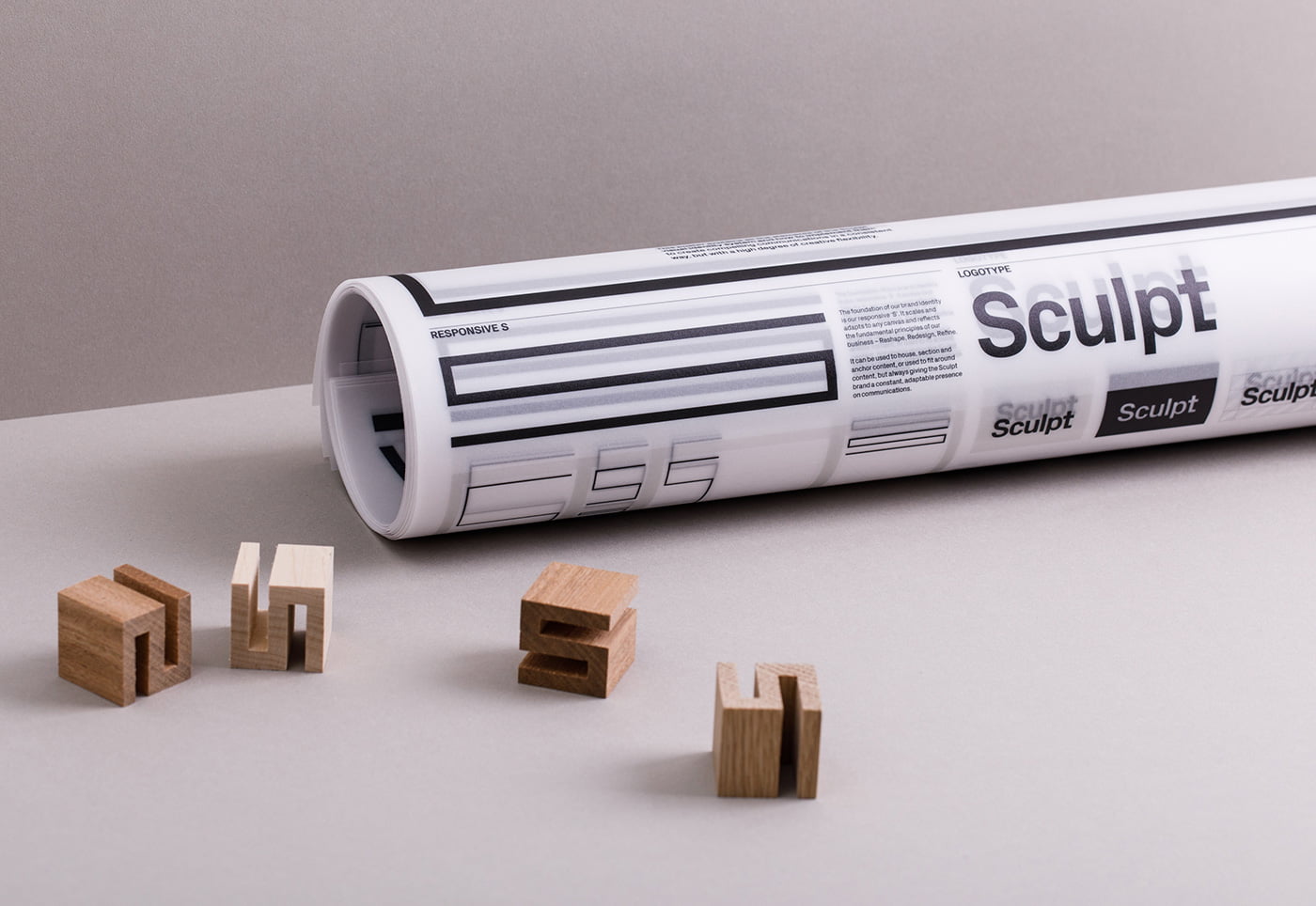
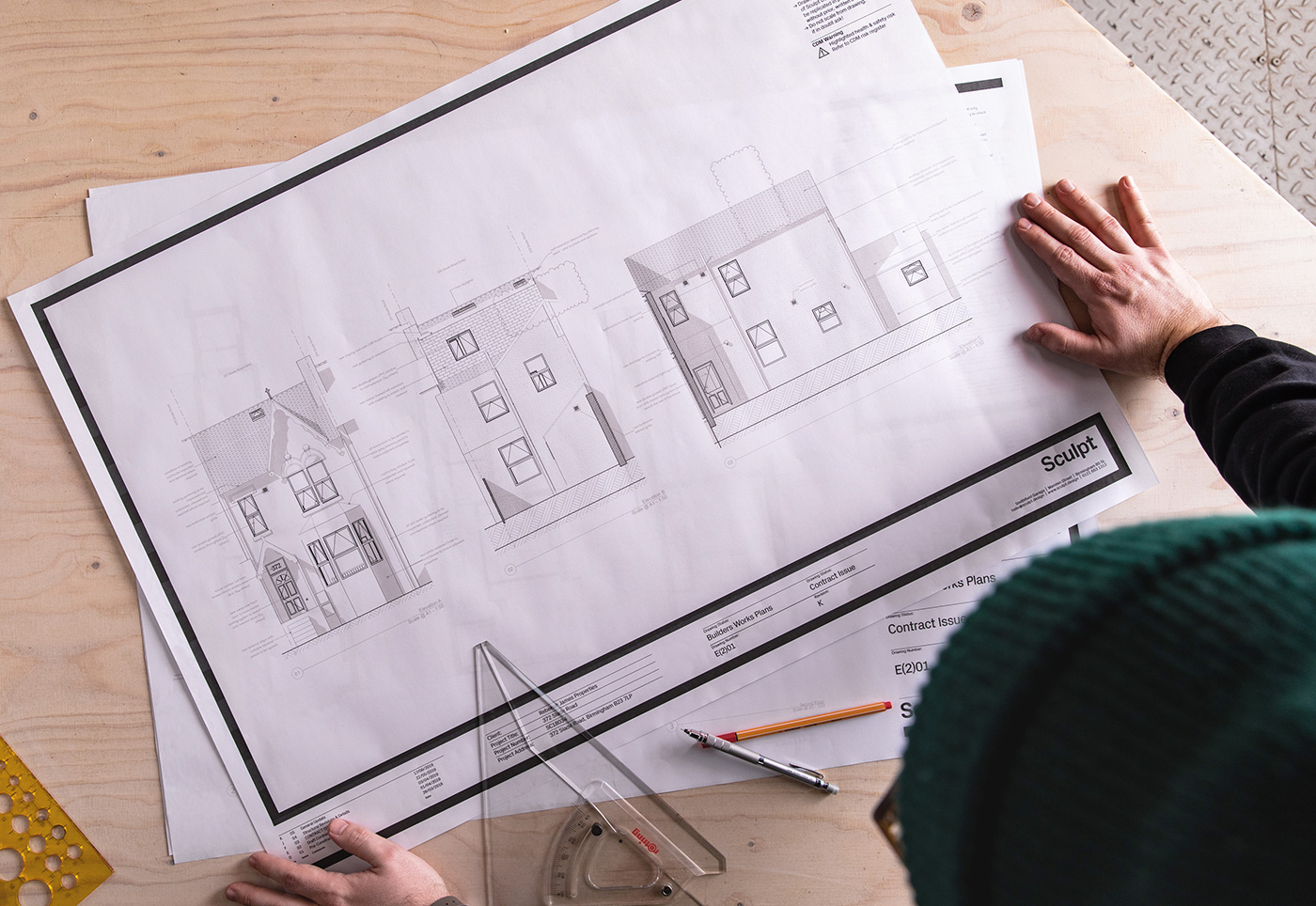
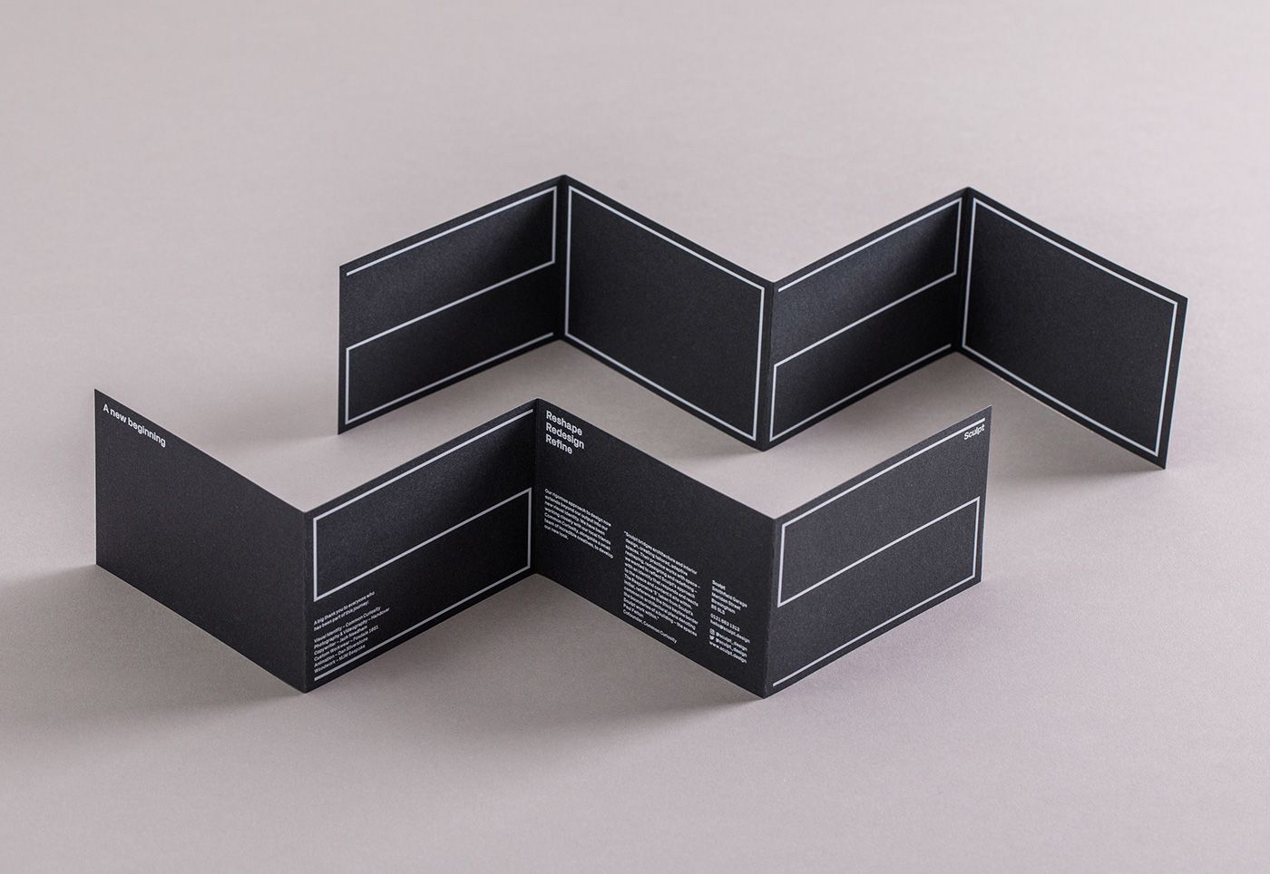
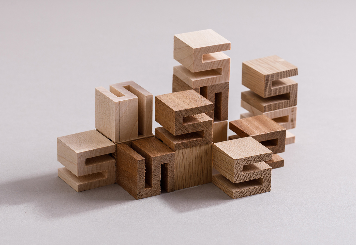
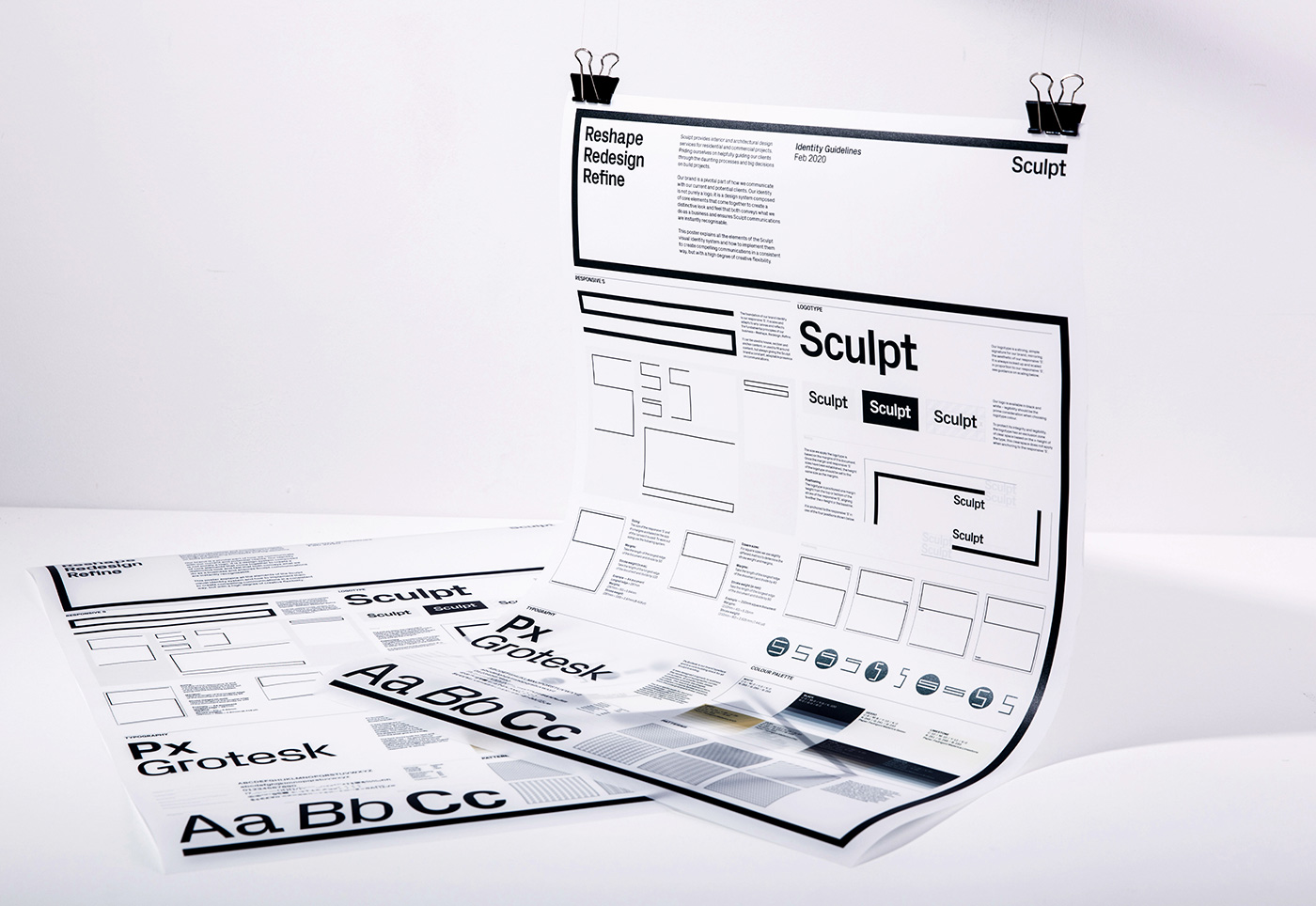
Born from architectural plans, the foundation of the brand identity is the responsive ‘S’ framework that scales and adapts to any canvas, reflecting the fundamental principles of Sculpt – reshape, redesign, refine. It can be used to house, section and anchor content, or used to fit around content, but always giving the Sculpt brand a strong, constant, adaptable presence.
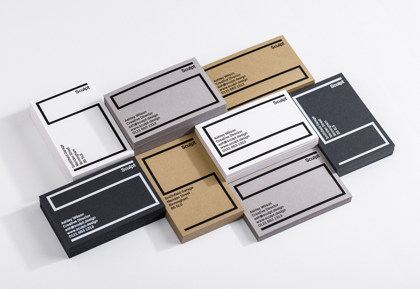
The Sculpt colour palette is inspired by the natural materials and finishes that Sculpt work with on a daily basis and aligned with the Fedrigoni paper range Materica.
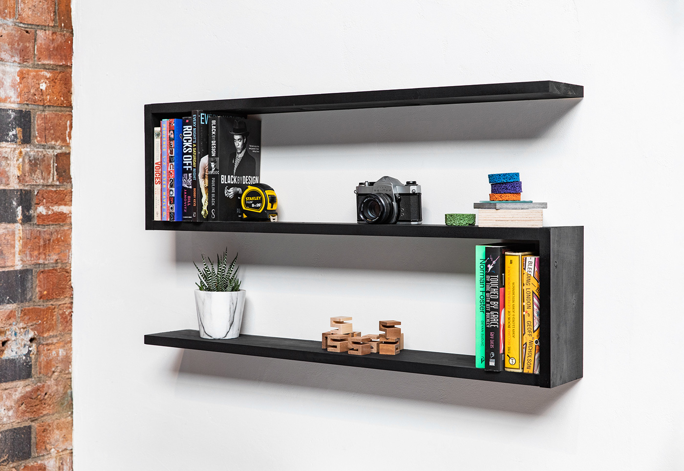
The brand has been adapted into physical manifestations such as bespoke high vis jackets, three dimensional material samples, and even studio shelving.
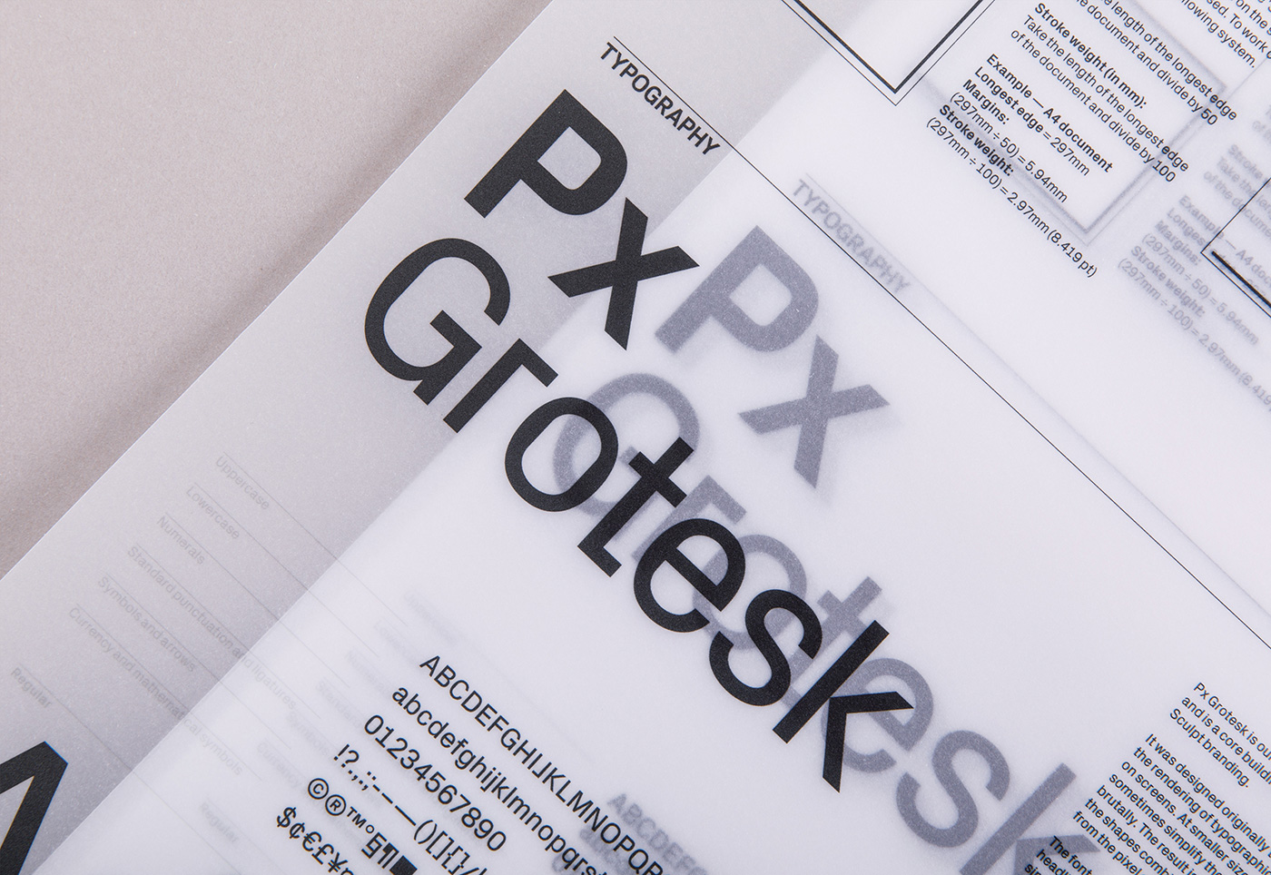
Typeface:
PX Grotesk, by Optimo
Brochure, business cards paper stocks:
Fedrigoni Materica Clay, Kraft, Ardesia, Verdigris, Freelife Gloss.
Guidelines poster paper stock:
GF Smith Transclear
Print photography: Jack Spicer Adams
Brand photography and videography: Handover
Copywriting: Jack Needham
Animation: Dan Silverstone
Print: WithPrint
Wood Blocks: MJM Bespoke
High Vis Jacket: Foxdale 1651
More from Common Curiosity.