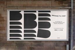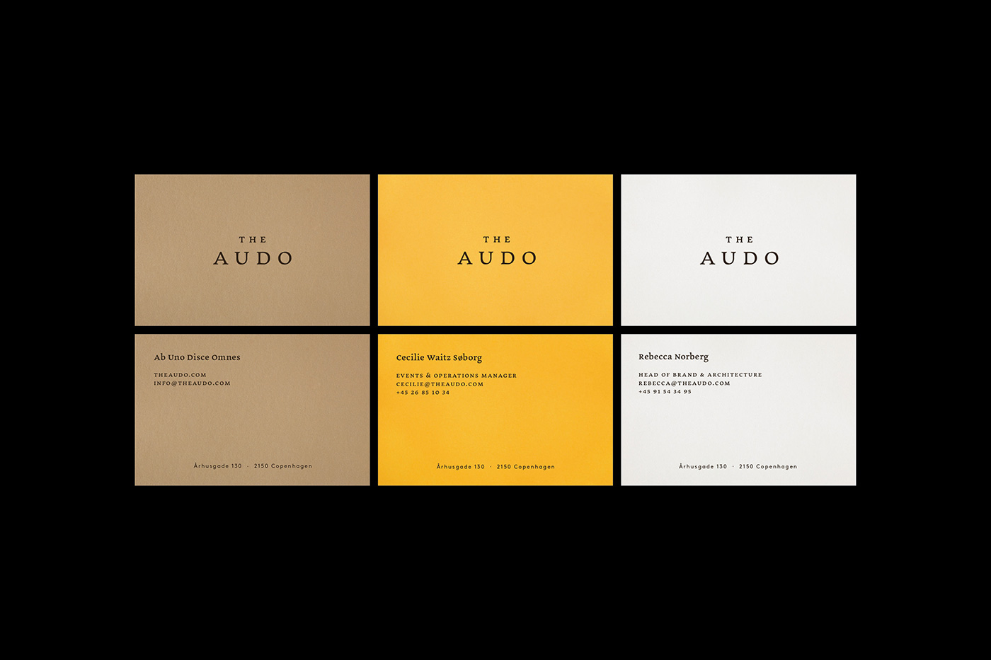
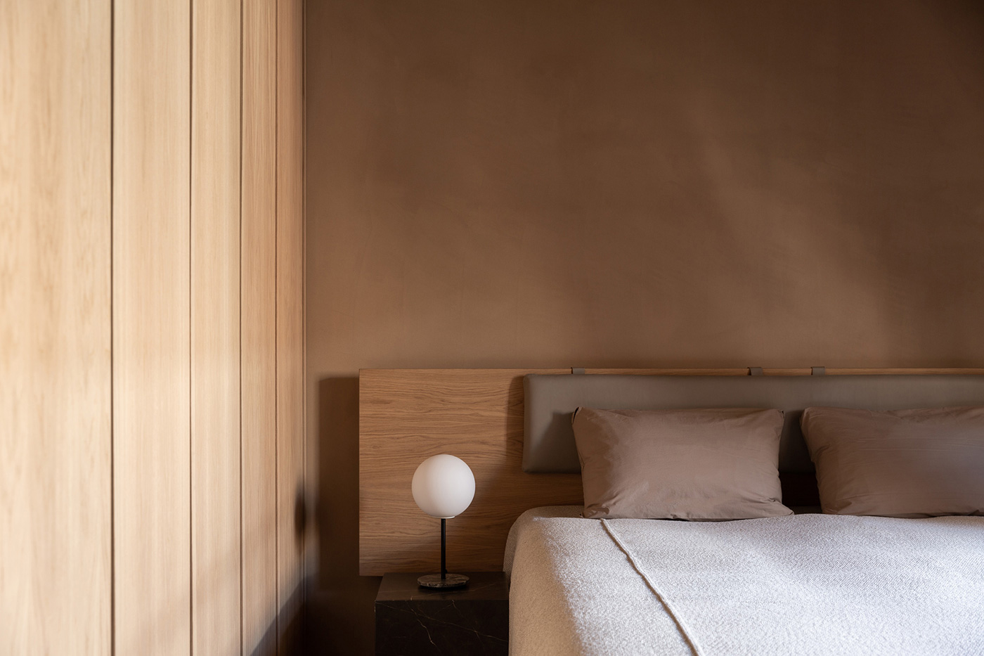
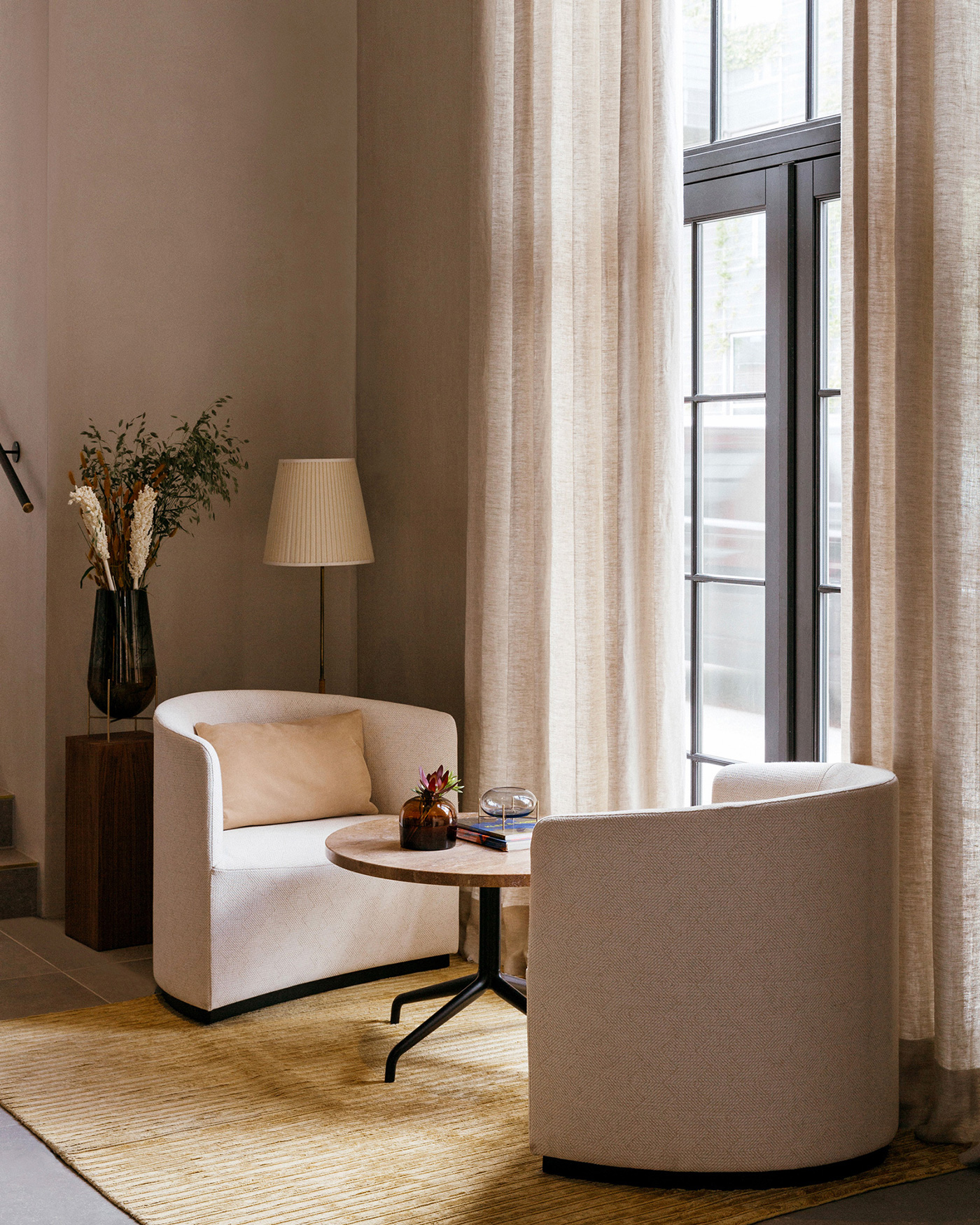
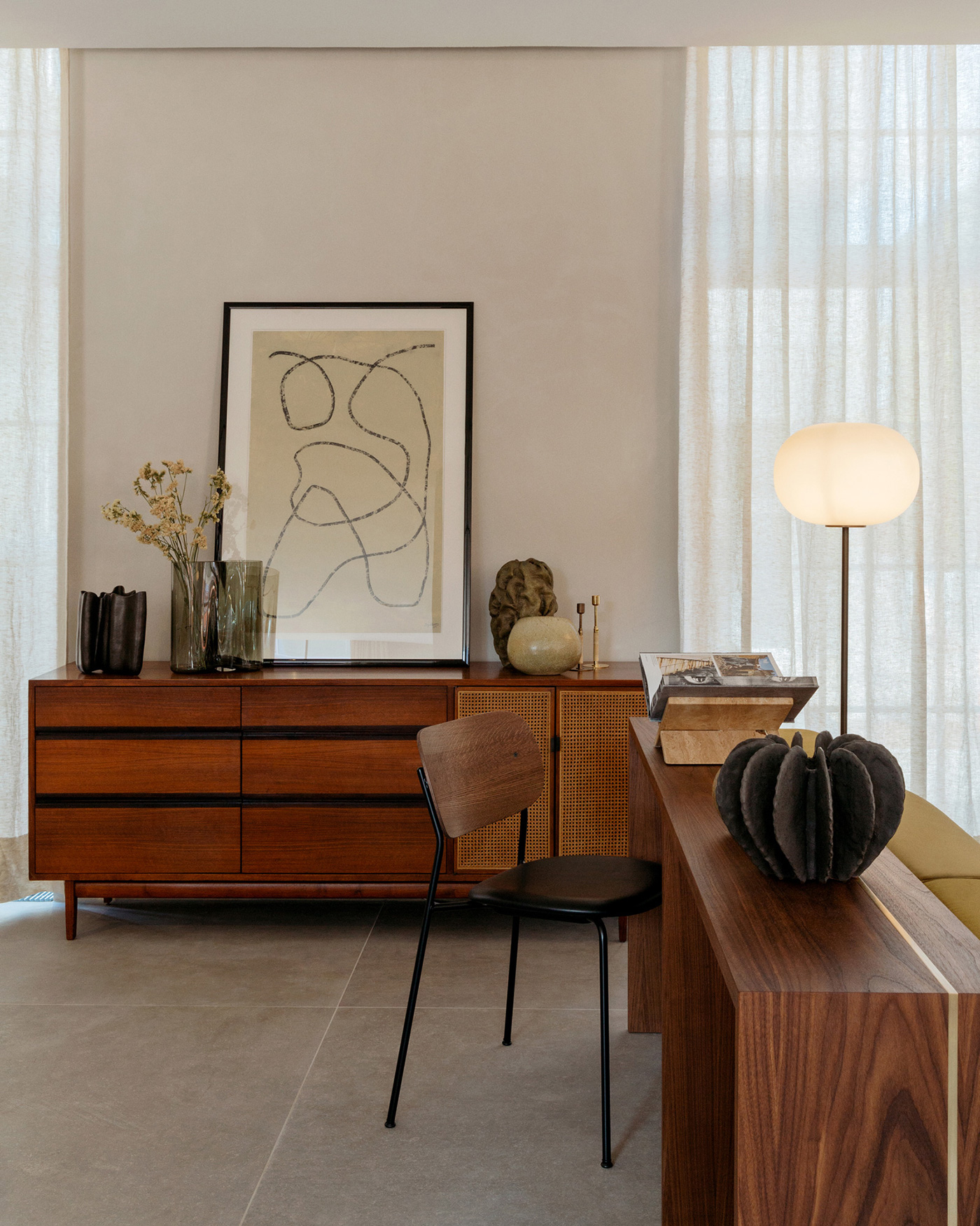
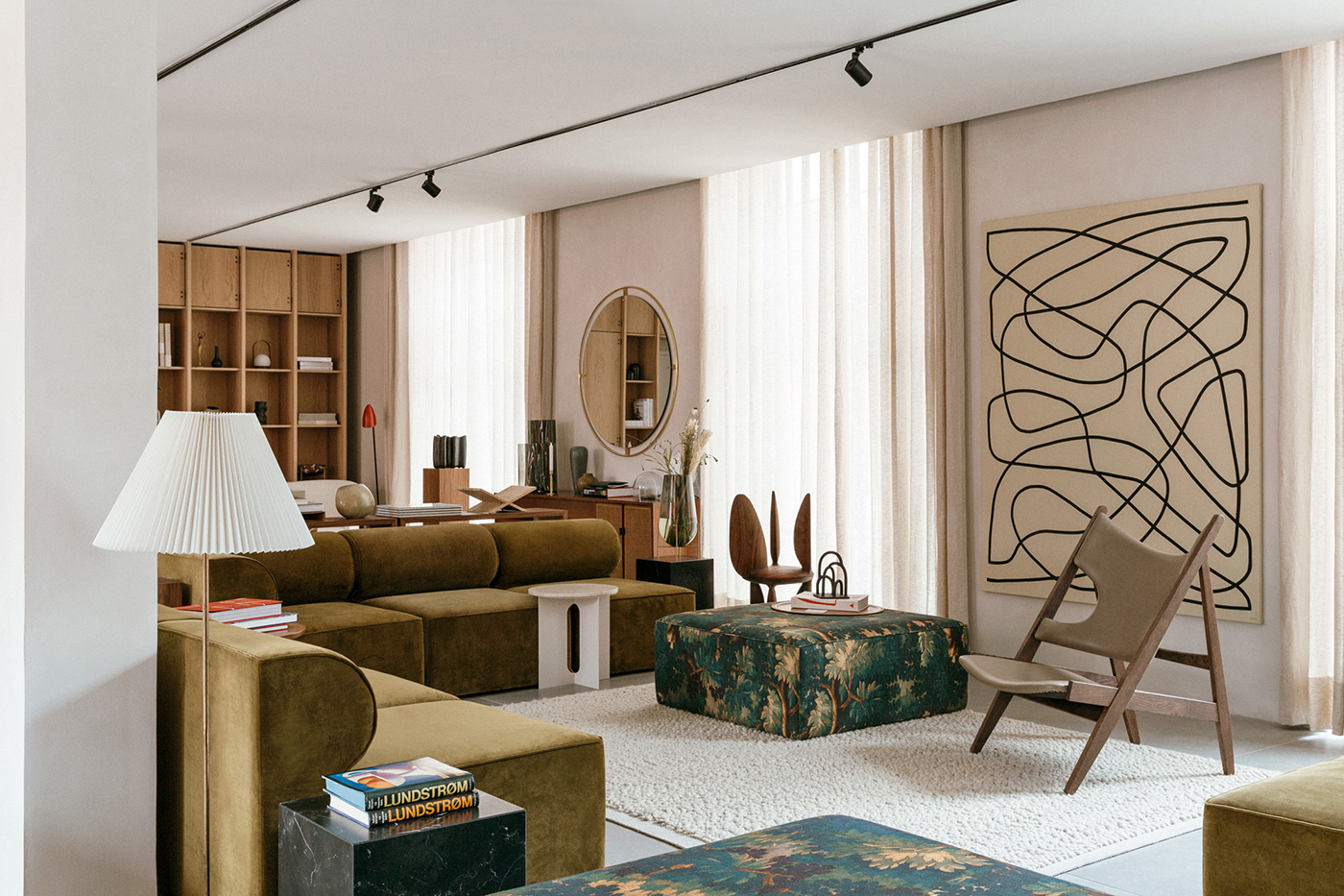
The Audo is a hybrid space in Copenhagen, Denmark, facilitating and celebrating human interaction, connection and artistic expression. As a hotel residence, restaurant, café, concept store, material library, creative work and event space, The Audo beautifully unites design, work, hospitality and community under one roof.
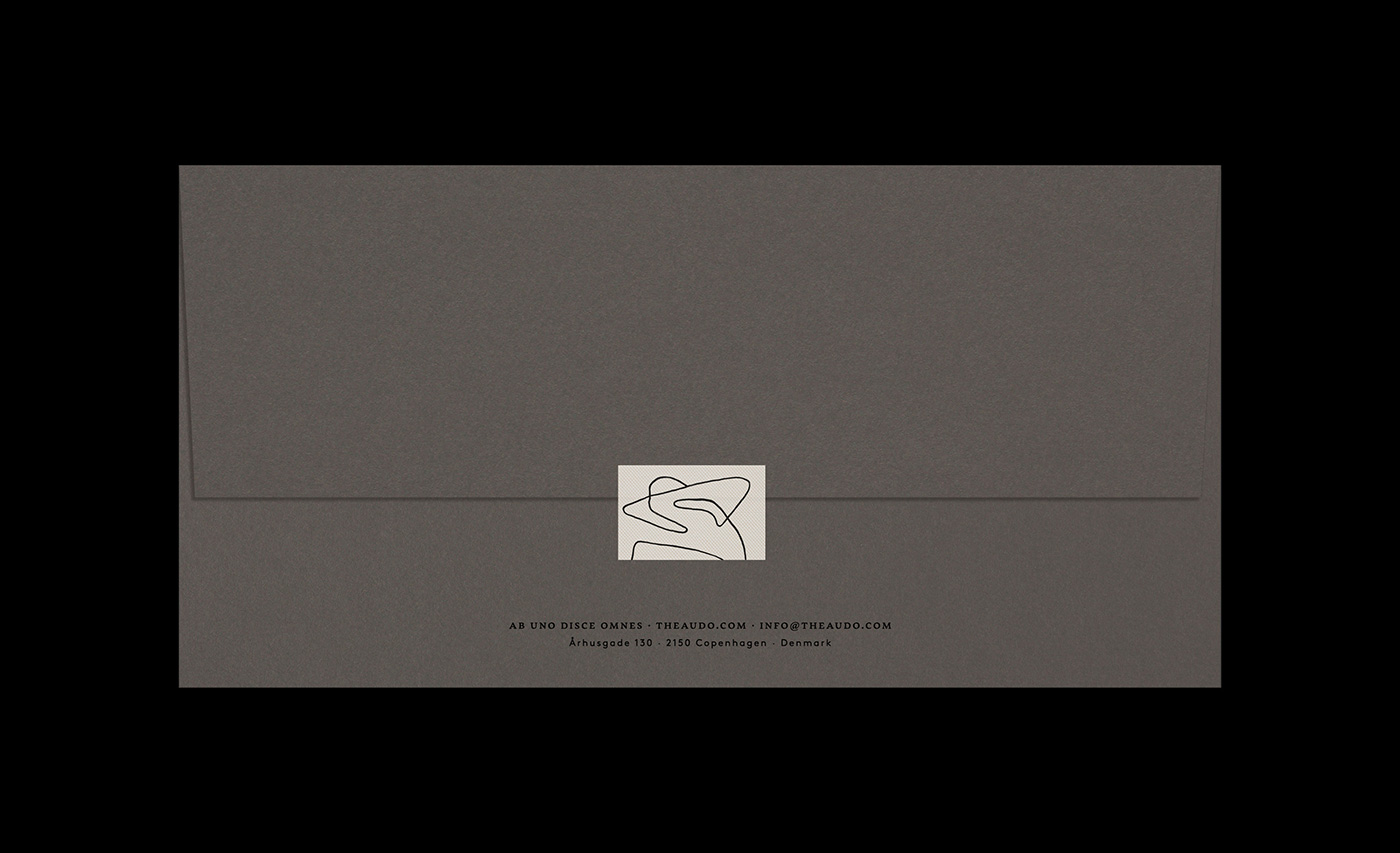
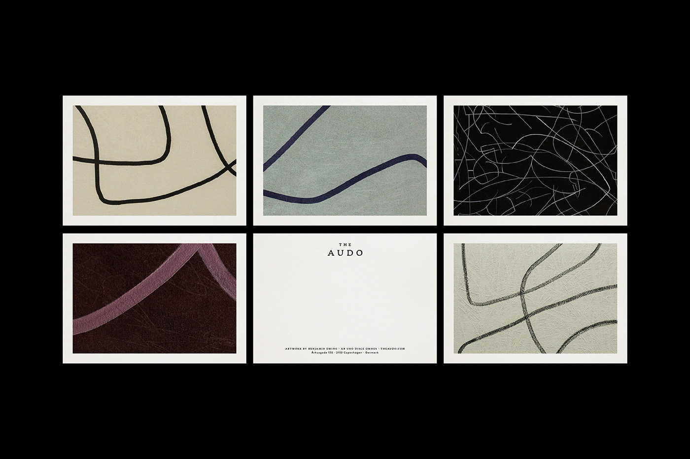
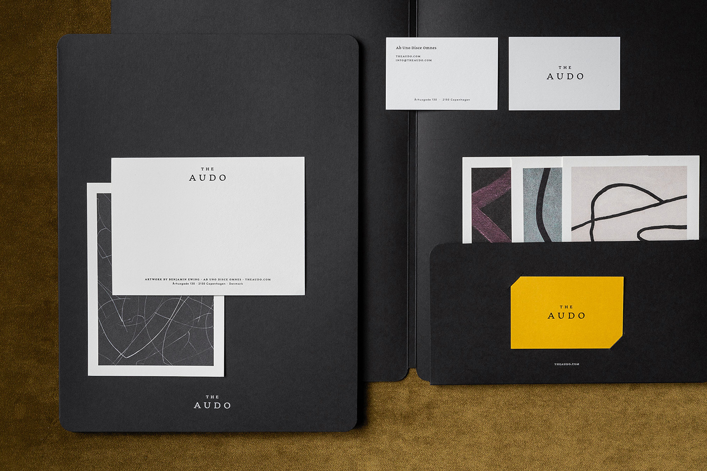
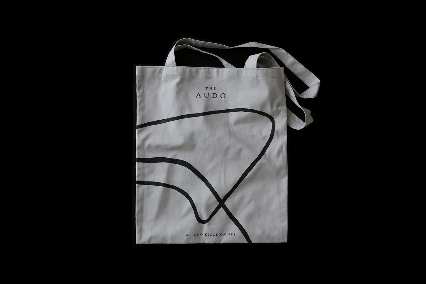
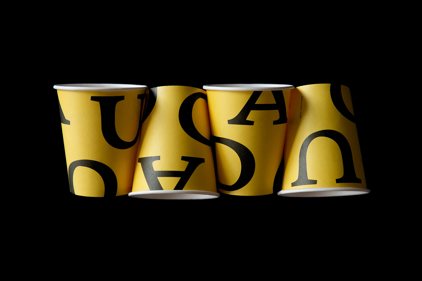
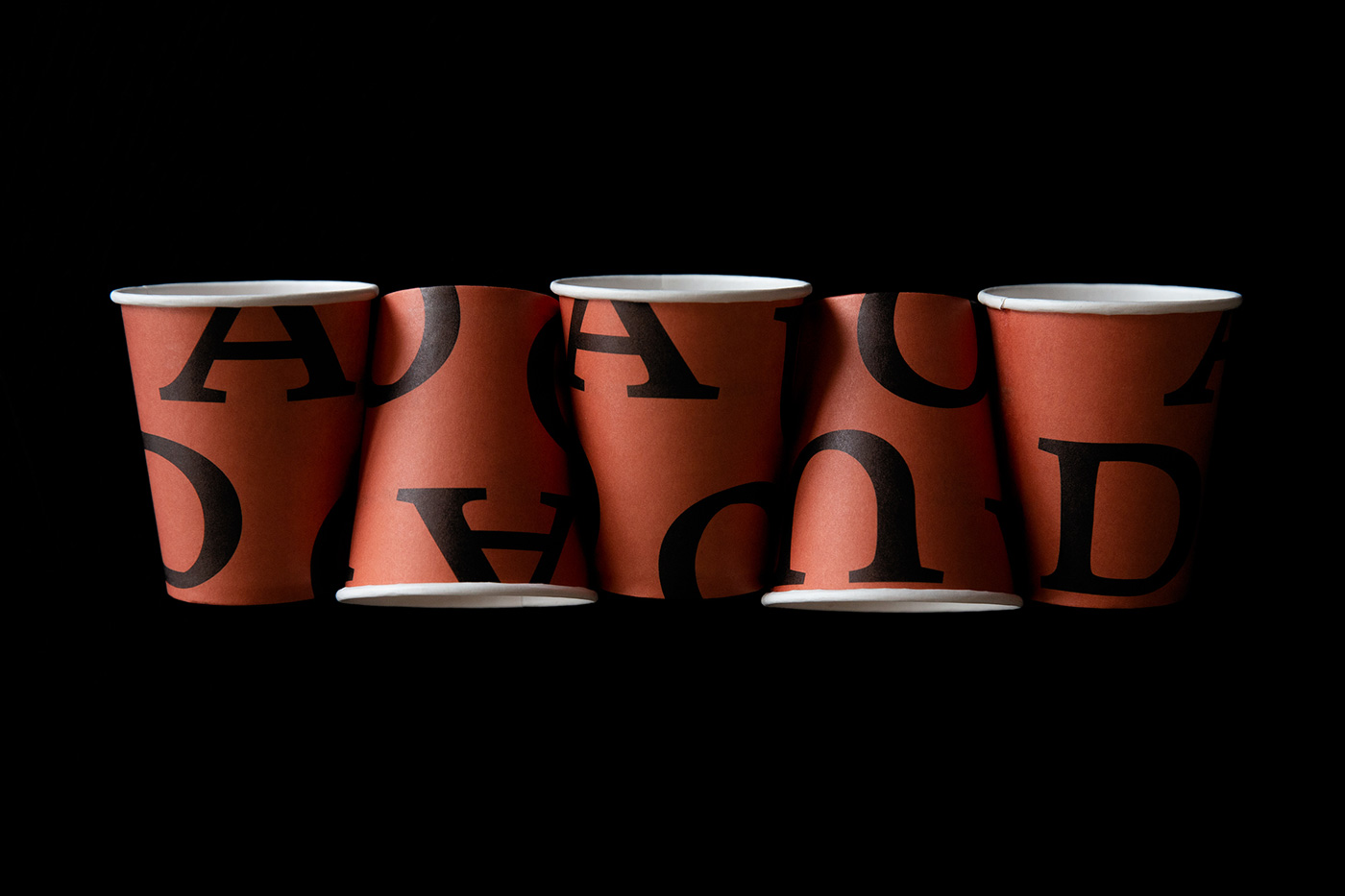
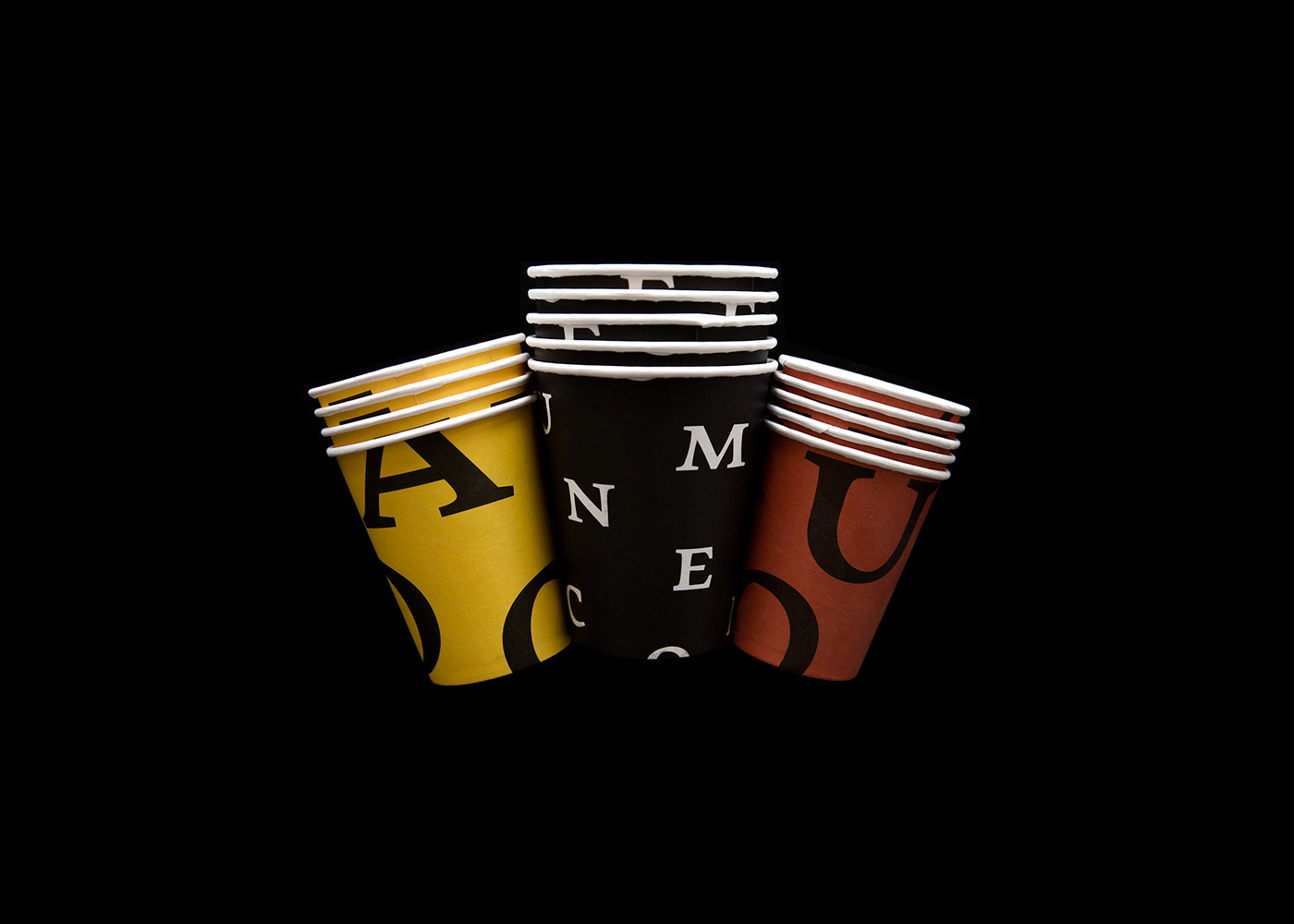
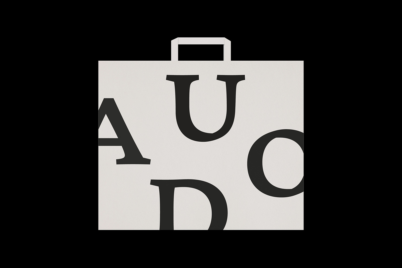
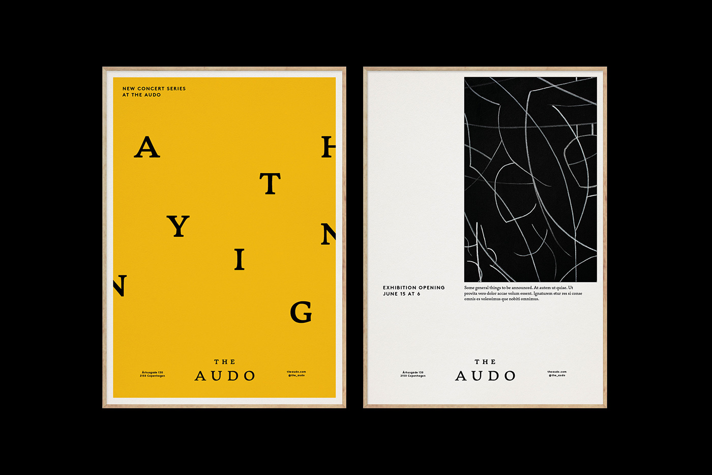
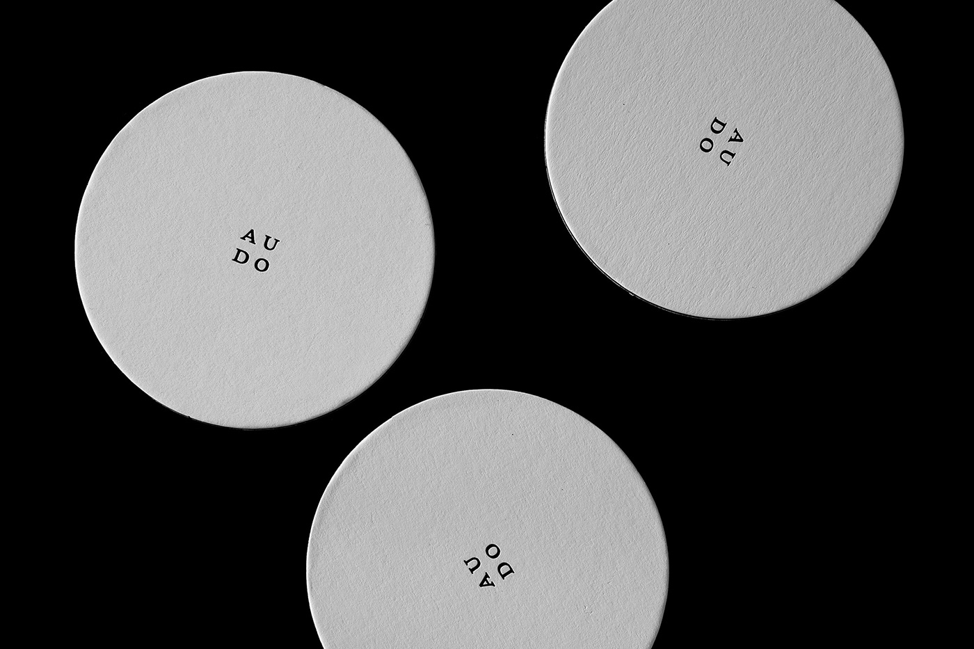
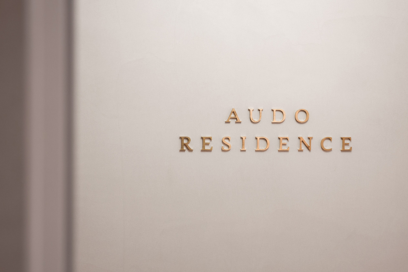
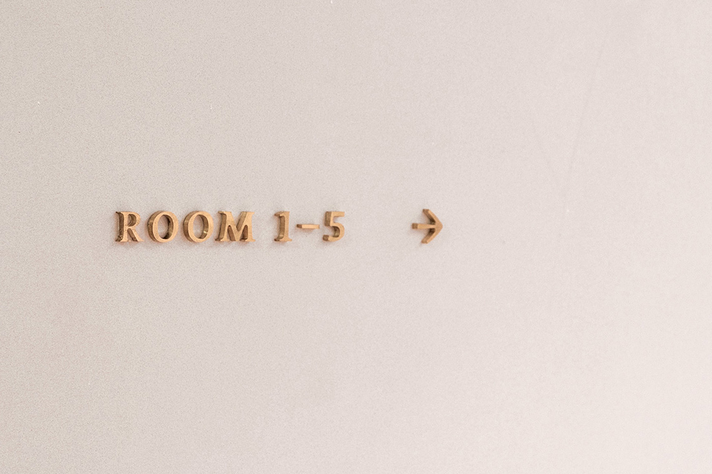
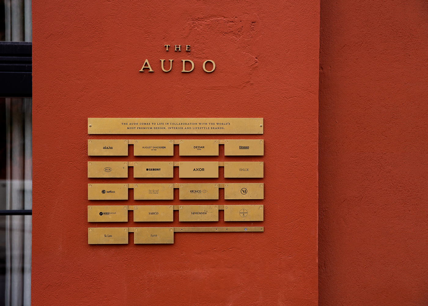
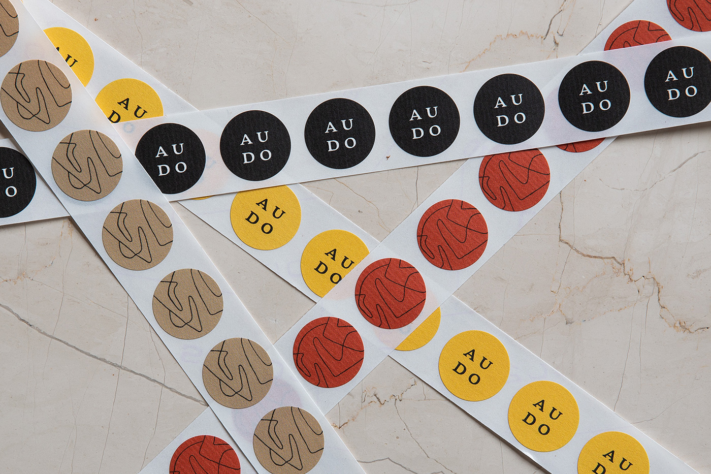
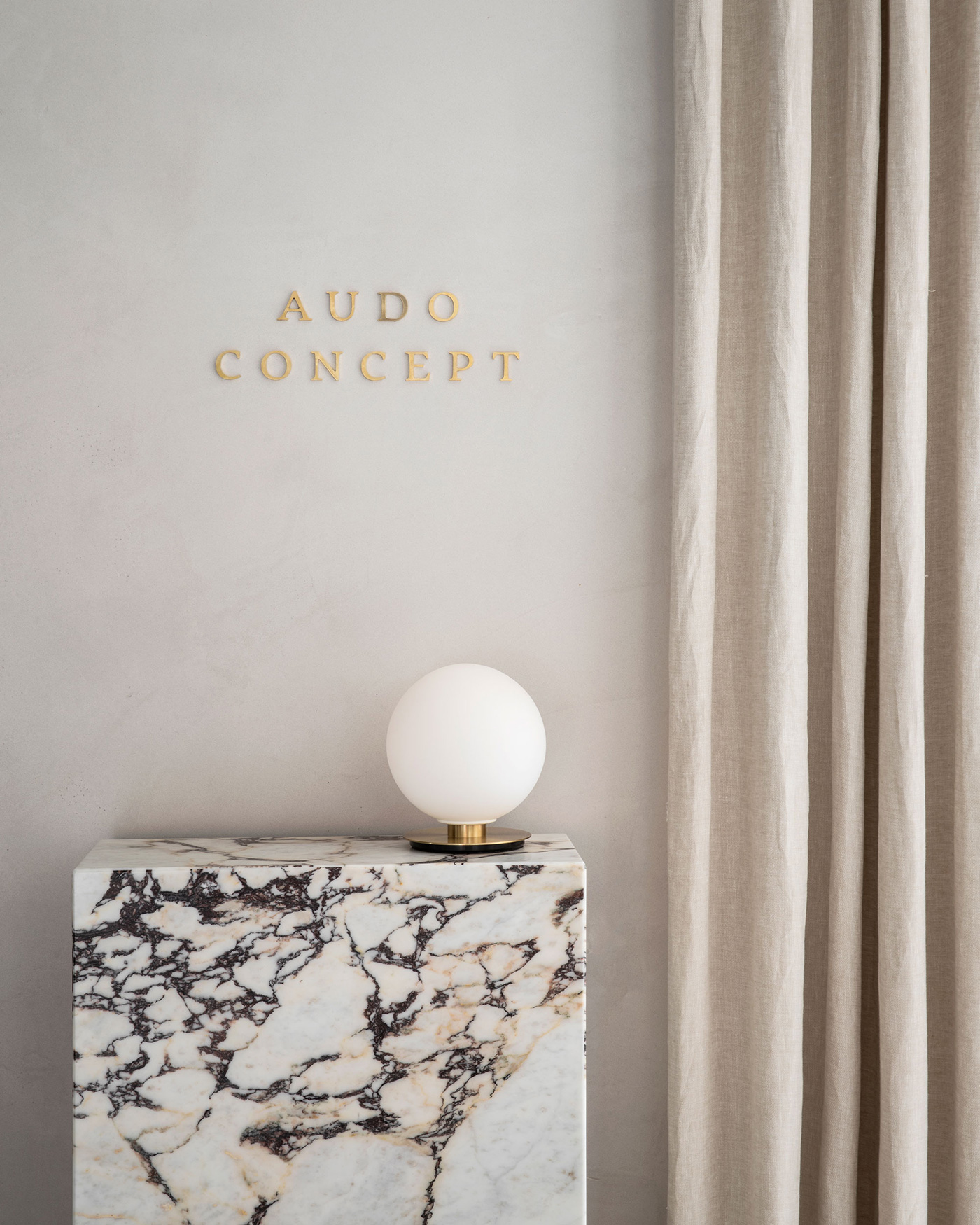
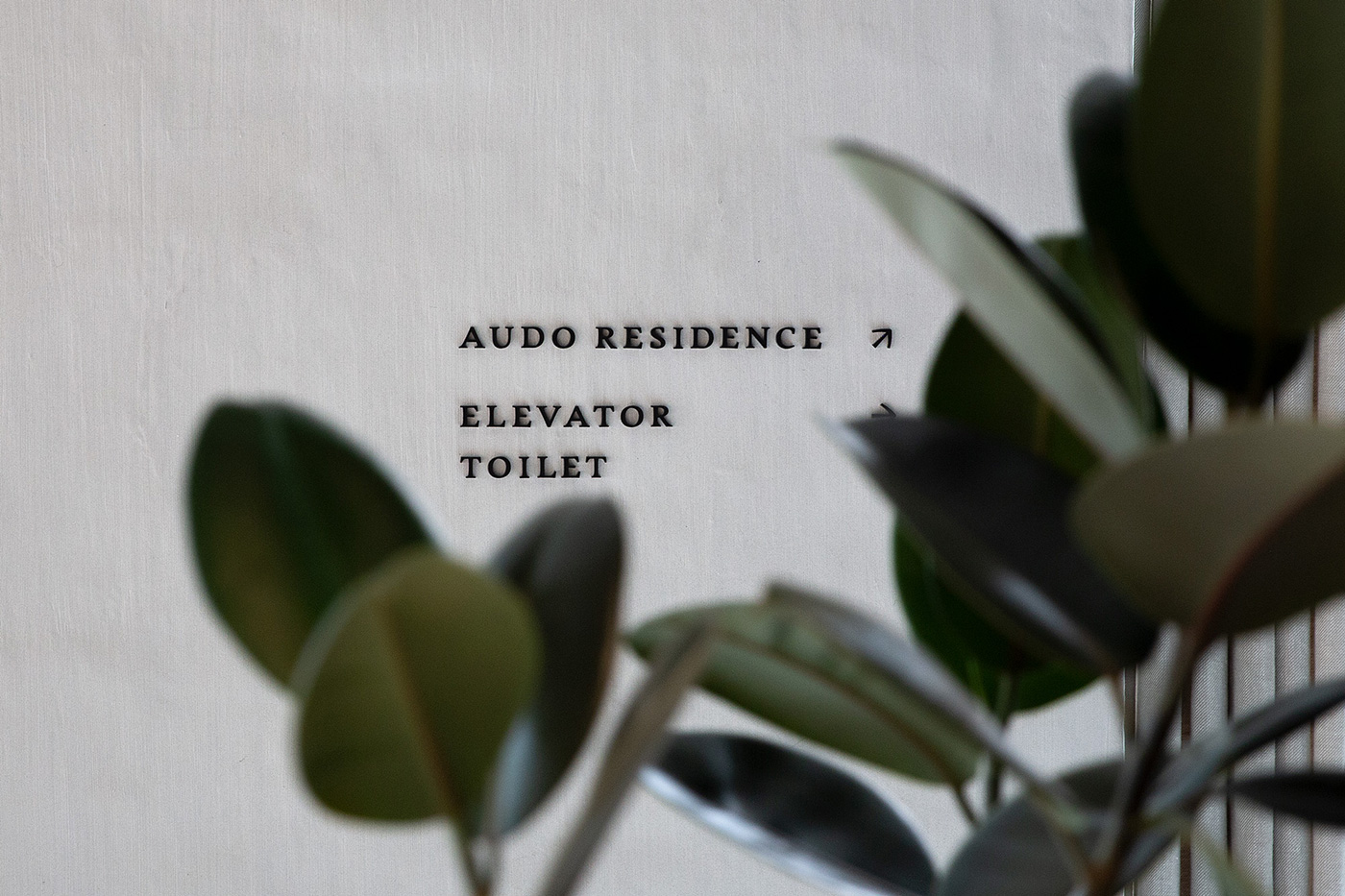
We’ve been delighted to work on the brand identity, bespoke stationery, packaging, wayfinding and signage system, photography, website design, and various other print and digital collateral.
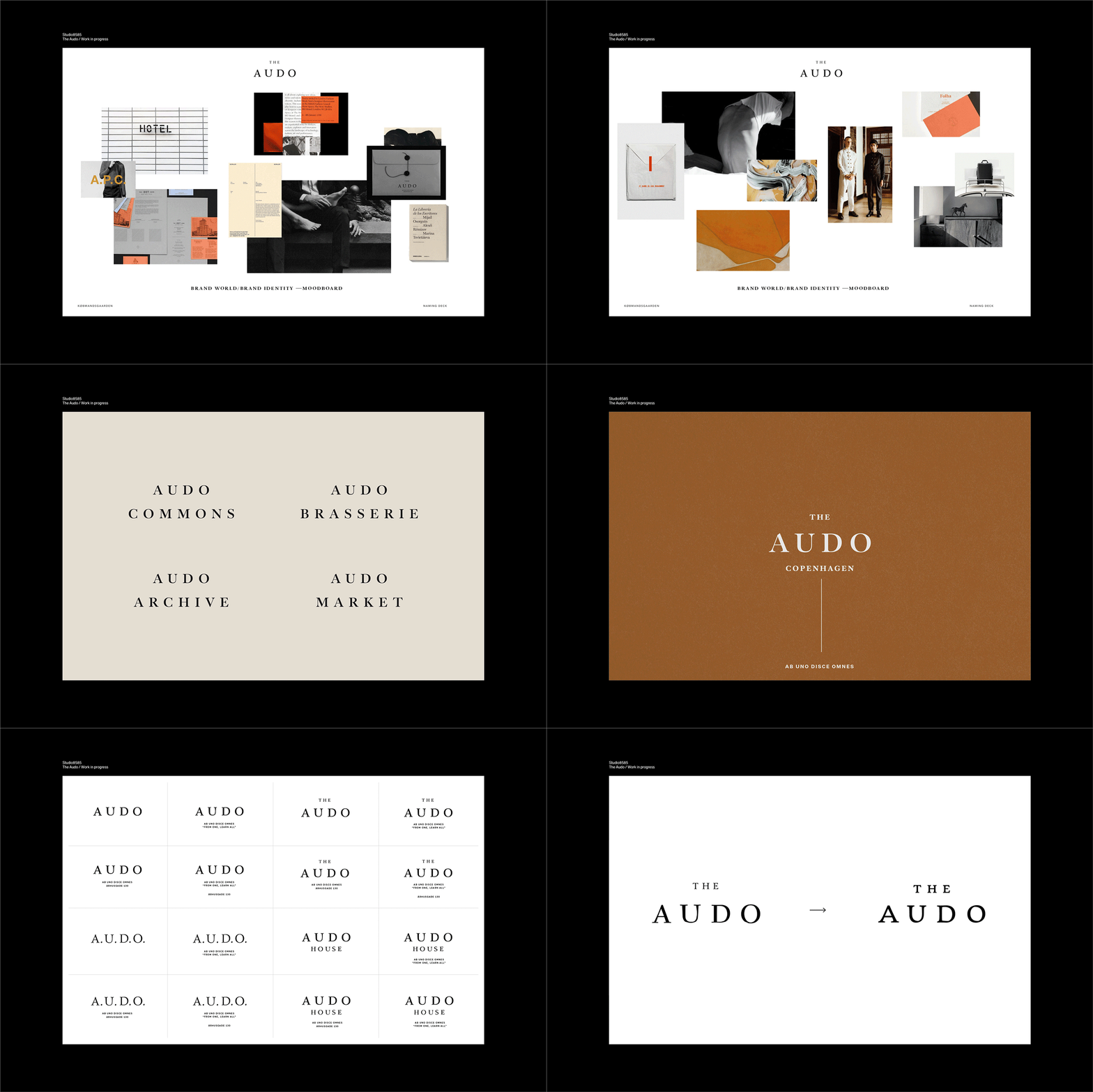
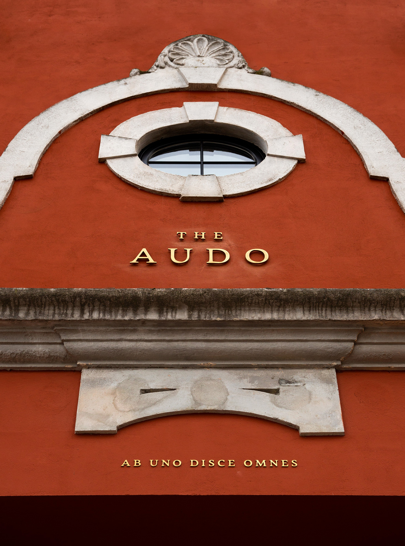
As a multifaceted concept, The Audo’s hybrid presence calls for a consistent and distinguished brand identity architecture. It curates, encourages and celebrates through its visual communication. Abbreviated from the Latin Ab Uno Disce Omnes, meaning from one, learn all, The Audo is inspired by its historical function — originally, it was a trading post for fishing, or simply a market. That collaborative and ever-changing spirit is embodied in its brand identity. Confident, yet correspondingly honest and humble, the visual language provides balance and interest inspired by the curatorial nature and value of openness.
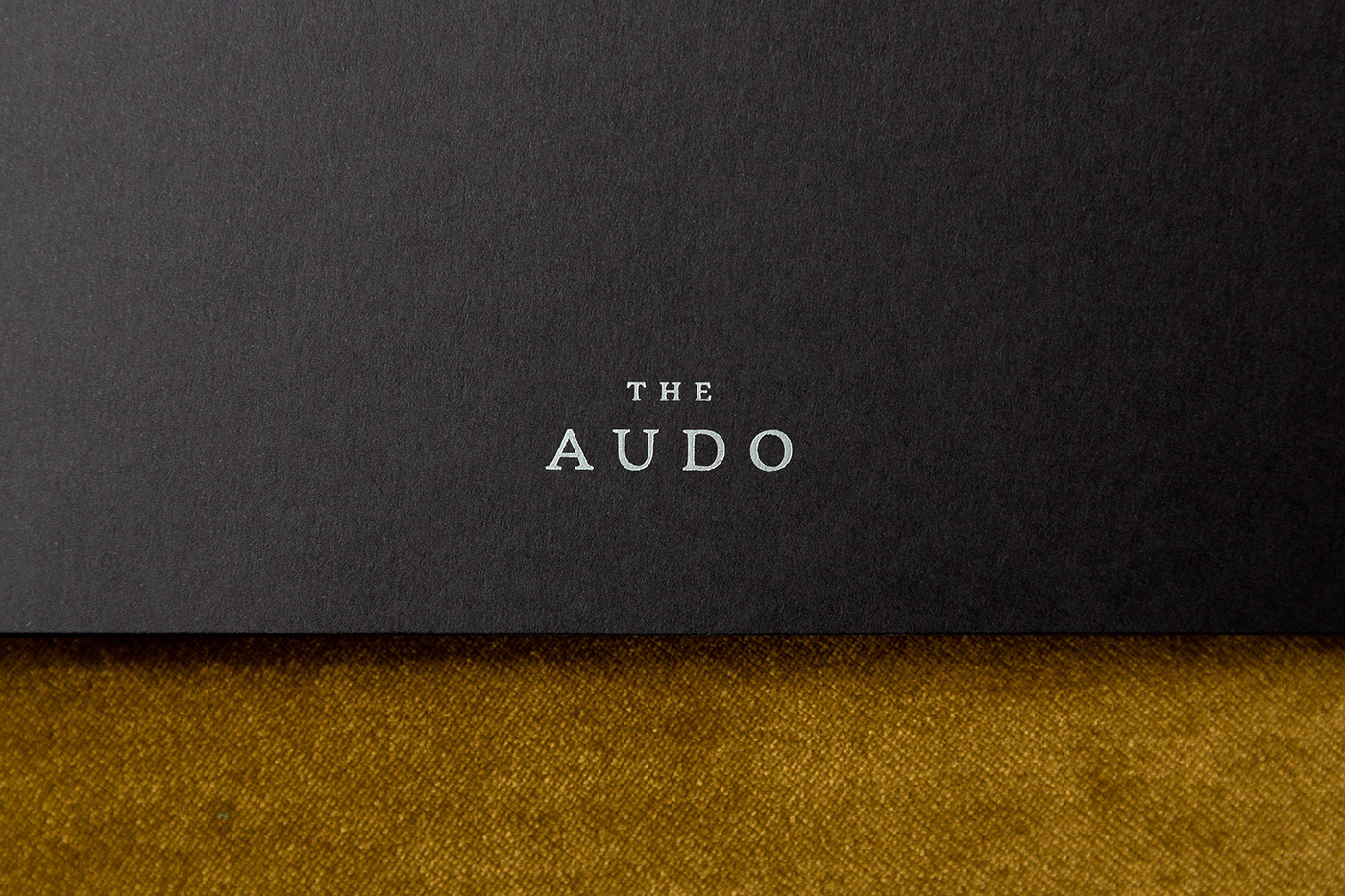
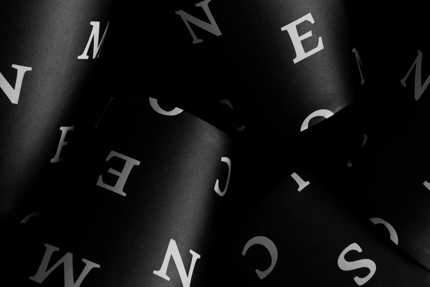
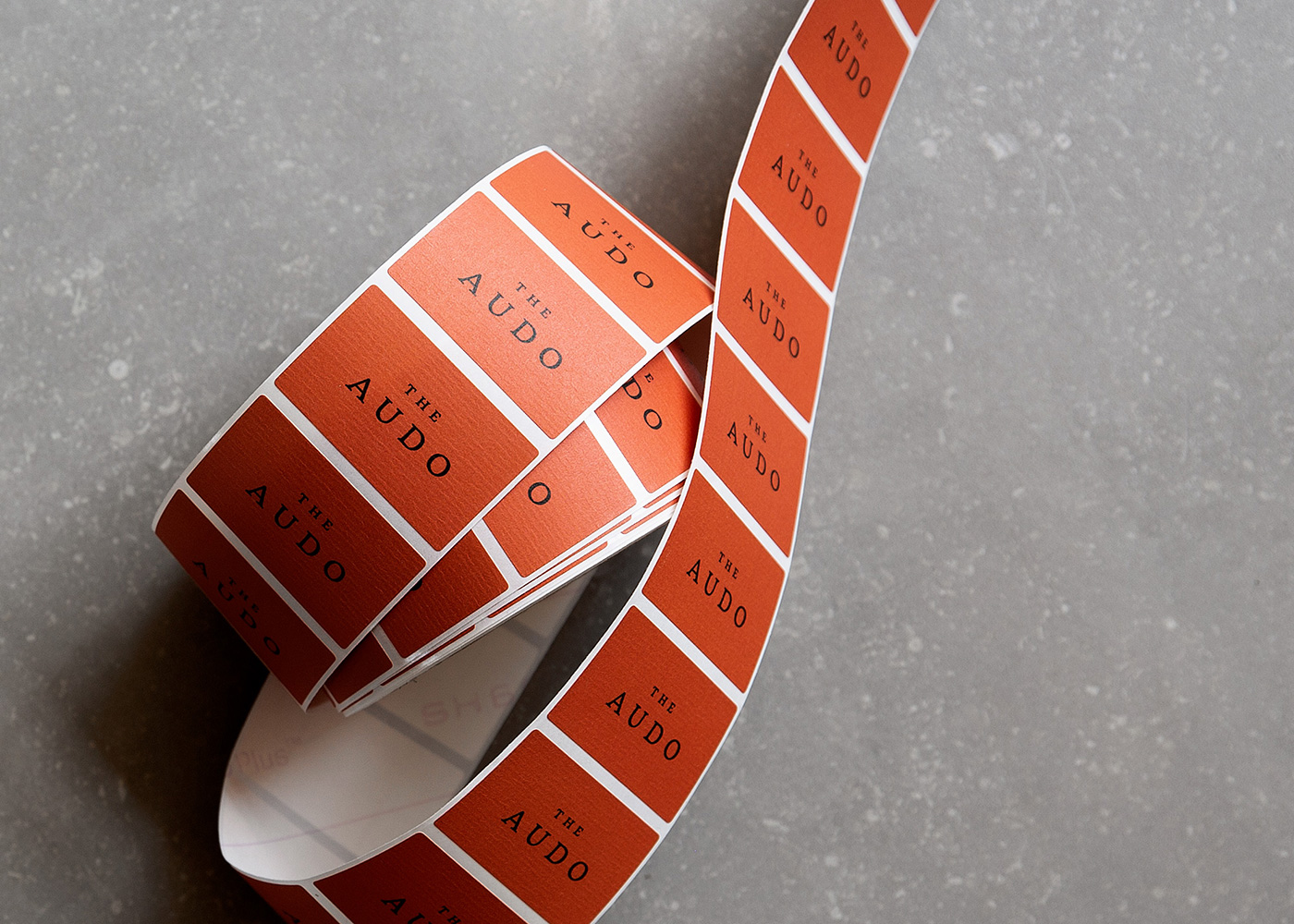
An extensive typographic approach is built upon a contemporary yet organic neo-humanist typeface Garibaldi. It’s used both conservatively, for example, in the wordmark and in many playful iterations. The typographic base is complemented with a bold and modern colour palette and artworks by Benjamin Ewing that were originally exhibited extensively in the Audo’s interior.
Creative director: Nathan Williams
Art director: Mario Depicolzuane
Designer: Benja Pavlin
Illustration: Benjamin Ewing
More from Studio8585.

