
¿Por qué Procreate es el software que todos quieren dominar?
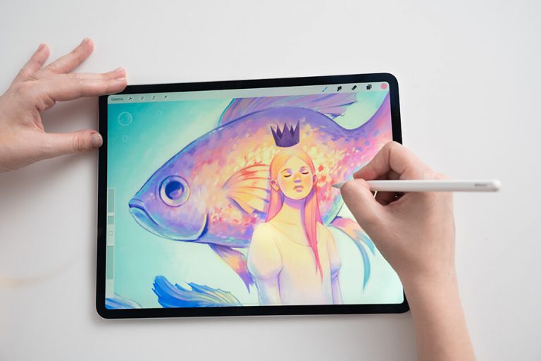 Descubre las razones para usar esta herramienta de ilustración ideal para ilustrar viñetas, diseñar lettering o crear personajes animados. Si hay una app que destaca entre las cientos que existen para iPad, no es otra que el software profesional de ilustración Procreate. El asistente de animación se lanzó en 2011 y, desde entonces, sus usuarios […]
El gobierno francés renueva su identidad corporativa en una apuesta por la simplicidad
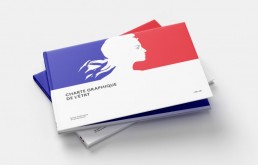
 Con el objetivo de facilitar a los ciudadanos la identificación de la acción del gobierno, la república francesa ha lanzado una nueva identidad corporativa que destaca por un rediseño del logotipo y una nueva tipografía.

La lengua de los Rolling Stones ya es cincuentona
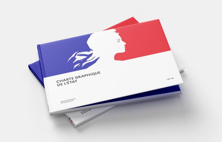
 El logotipo de la lengua de los Rolling Stones ni fue creado por Andy Warhol ni inspirado en la boca de Mick Jagger, sino ideado por el diseñador John Pasche y basado en la lengua de la diosa india Kali.

Cines de Francia usan su cartelera para apoyar a los comercios de su barrio durante la pandemia
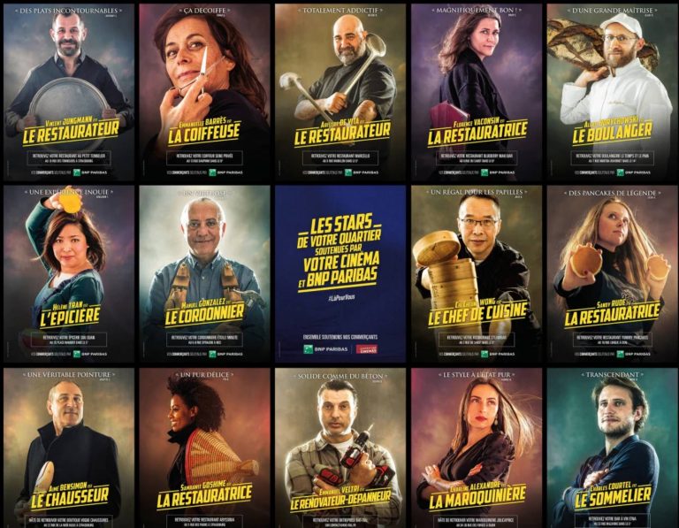 Se trata de una iniciativa del banco BNP Paribas y busca ayudar a los comerciantes locales que están sufriendo las consecuencias económicas de la pandemia.

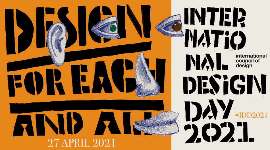
Feliz Día Internacional del Diseño #IDD2021
Hoy 27 de abril es el Día Internacional del Diseño (#IDD2021), también conocido como el Día Mundial del Diseño de la Comunicación. Impulsado por Ico-D —anteriormente Icograda, International Council of Graphic Design Associations—, esta celebración es una oportunidad para reconocer el valor del diseño y su capacidad para efectuar cambios con impacto positivo en la sociedad.
En Brandemia nos unimos a la celebración y al análisis. Para ello hemos invitado a 4 reconocidos profesionales a participar con su punto de vista. Así, hoy contamos con las voces de Verónica Fuerte, fundadora y directora creativa de Hey Studio, Pablo Rubio, CEO y fundador de Erretres, Luciana Pigati, manager director en Brandlab, y Josep Maria Mir, senior creative advisor de Summa.
Bajo el lema elegido por Ico-D: Diseño para todos y cada uno, a ellos les trasladamos las siguientes preguntas:
¿Puede influir el diseño en el bienestar y el desarrollo de las personas?
¿Es posible un acceso justo y equitativo al diseño?
¿Cómo construir a través del diseño un mundo mejor, más inclusivo y más justo?
¿Puede influir el diseño en el bienestar y el desarrollo de las personas?
“El diseño está en todos los ámbitos de nuestra vida y en todas las edades”, explica Verónica Fuerte, fundadora y directora creativa de Hey, en Barcelona. “Creo que el diseño es fundamental y decisivo para que nuestras vidas sean mejores. Y depende de qué diseño uses o compres, pueden cambiar las cosas”. Y es más, para Verònica, de lo que no hay duda es que “el mejor diseño es el invisible; el que sin darte cuenta, hace que tu vida sea mejor”, asegura.

Otra perspectiva es la que ofrece Josep Maria Mir, fundador y director creativo en Summa. Para Mir, además del diseñador, para alcanzar ese bienestar y el desarrollo de las personas hay que tener presente otro elemento clave: el cliente que promueve el encargo.
En este sentido, Josep Maria apunta que el diseño “puede contribuir al desarrollo y bienestar de las personas en ámbitos como la usabilidad, la enseñanza, la comunicación, sin duda, e incluso la señalética. Pero siempre, dejando claro, que esto no puede suceder si detrás del diseñador o del diseño gráfico no hay un promotor o un cliente”.

Luciana Pigati, manager director en Brandlab, pone el foco en la capacidad transformadora. “El diseño, más allá de la estética, es un motor con una capacidad tremenda para impulsar transformaciones constantes en la vida de la gente y su realidad”.
Un punto en el que coincide Pablo Rubio, fundador de Erretres: “En los últimos años, el diseño ha pasado de ser tan solo una mera disciplina casi estética o funcional que añadía valor al final de la cadena, a ser considerado como un proceso mucho más complejo donde las capacidades del diseñador se integran desde el principio en el reto. Eso hace que el poder transformador del diseño, a la hora de generar bienestar, se haya multiplicado”.
Todo ello sin perder de vista los elementos culturales y sociales. “La historia y el tiempo nos han mostrado la manera en que artistas, culturas, países desarrollados y marcas líderes, a través del diseño, han entendido cómo influenciar e impactar la realidad en la que vivimos”, explica Luciana Pigati. “Y de esta manera, impulsar ese desarrollo constante en mejores entornos, mejores condiciones de vida, mejores herramientas y mejores posibilidades para el futuro”.
¿Es posible un acceso justo y equitativo al diseño?
Para Verònica Fuerte, “el diseño es un ingrediente más para construir este mundo mejor, de los muchos ingredientes que hay en el mundo. Por otro lado, también depende de quién use y cómo use el diseño, porque hay diseños buenos y malos”, dice. “Y además está quién lo diseña. Porque quién está detrás, qué empresa hay detrás, también te está dando un mensaje, y te indica qué autenticidad tiene”.
Pablo Rubio ve que en cierto modo, “la tecnología es un elemento bastante democrático”. Ahora bien, el caso es distinto “para el acceso a servicios o productos bien diseñados”, dice. “Y esto no es un asunto de dinero, sino de cultura: cultura de encargo en el cliente, cultura de proyecto en el diseñador y cultura de exigencia en el usuario”.
Por su parte, Josep Maria Mir incide en un tema de objetivos. “Si hablamos de diseño gráfico, se trata de una modalidad pública y abierta y, por tanto, el acceso es justo y equitativo. Dependerá, en todo caso, de los objetivos de cada proyecto”.
Mientras que Luciana Pigati considera que lo justo y lo equitativo tiene mucho que ver con “entender el modelo”. “Yo cambiaría las palabras para romper algunos paradigmas y dejar de ver el diseño como algo lejano o inaccesible. Para empezar, hablaría de un ‘diseño para todo y para todos’. Creo que eso inspiraría todas las formas posibles para hacerlo parte de nuestras vidas y de nuestra realidad”.

¿Cómo construir a través del diseño un mundo mejor, más inclusivo y más justo?
“Para un mundo más inclusivo creo que debe empezar por la diversidad en el diseño”, afirma Verònica Fuerte. “Cuanta más diversidad de género y más diseñadores y diseñadoras haya, el mundo será mucho más equitativo y los mensajes que queremos comunicar también lo serán. Para mí la meta es que sea fifty-fifty para que sea más equitativo, que espero que sea pronto”.
Un “cambio de perspectiva” es otra de las claves que aporta Pablo Rubio. “Considero que debe haber una suma de sensibilidades y cambio cultural que nos haga rechazar las cosas que no cumplen unos parámetros mínimos: sostenibilidad, diversidad, inclusión, veracidad, etc.”. Y recalca: “Como diseñadores tenemos un gran poder de transformar las cosas, pero ese poder otorga una responsabilidad. La clave está en la formación y en la cultura”.

A modo de conclusión, un manifiesto sencillo es el que aporta Luciana Pigati a través de la comprensión. “Entendiendo la realidad; entendiendo a la gente” es la base para construir un mundo mejor a través del diseño explica Pigati. Y como broche, Josep Maria Mir nos sitúa los pies en la tierra para indicarnos: “Seamos modestos, hacemos lo que podemos”.
Inclusividad y equidad. Impacto positivo e impacto para la comunidad. Desde lo individual a lo global. Sin duda, el diseño gráfico es una herramienta de gran valor. Tan solo hay que cuestionarse las cosas y comprender el contexto social, económico, ambiental, tecnológico y geográfico para desbloquear la mirada y hacer que finalmente todo sume. Porque al fin y al cabo, todas y cada una de las personas merecen vivir en un mundo bien diseñado.
¡Feliz Día Internacional del Diseño!
Los orígenes del Día Internacional del Diseño se sitúan en 1991, si bien no fue hasta 1995 cuando tuvo alcance internacional. Este día conmemorativo surge de un concepto desarrollado por Kim Paulsen, en la vicepresidencia de Icograda entre 1993 y 1995, para conmemorar la fundación del Consejo el 27 de abril de 1963. Hasta 2020, este evento se celebró como Día Mundial del Diseño. Ahora se celebra como Día Mundial del Diseño de la Comunicación.
La entrada Feliz Día Internacional del Diseño #IDD2021 se publicó primero en Brandemia.
Nota original
¿El nuevo logo de Telefónica está bien o mal?
![]() Telefónica acaba de presentar su nuevo branding, después de más de 20 años, un reposicionamiento de su imagen con nuevo color, nueva tipografía y nueva filosofía. Esta pregunta es muy habitual entre los diseñadores. ¿Qué te parece? ¿Está bien o mal? ¡A mí no me gusta! ¡Me gustaba más el del 84! Vamos por partes. […]
Telefónica acaba de presentar su nuevo branding, después de más de 20 años, un reposicionamiento de su imagen con nuevo color, nueva tipografía y nueva filosofía. Esta pregunta es muy habitual entre los diseñadores. ¿Qué te parece? ¿Está bien o mal? ¡A mí no me gusta! ¡Me gustaba más el del 84! Vamos por partes. […]

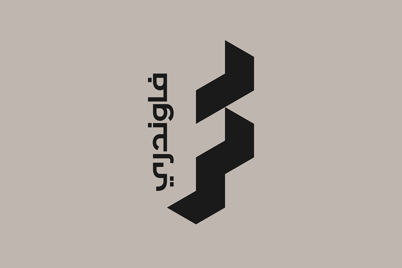
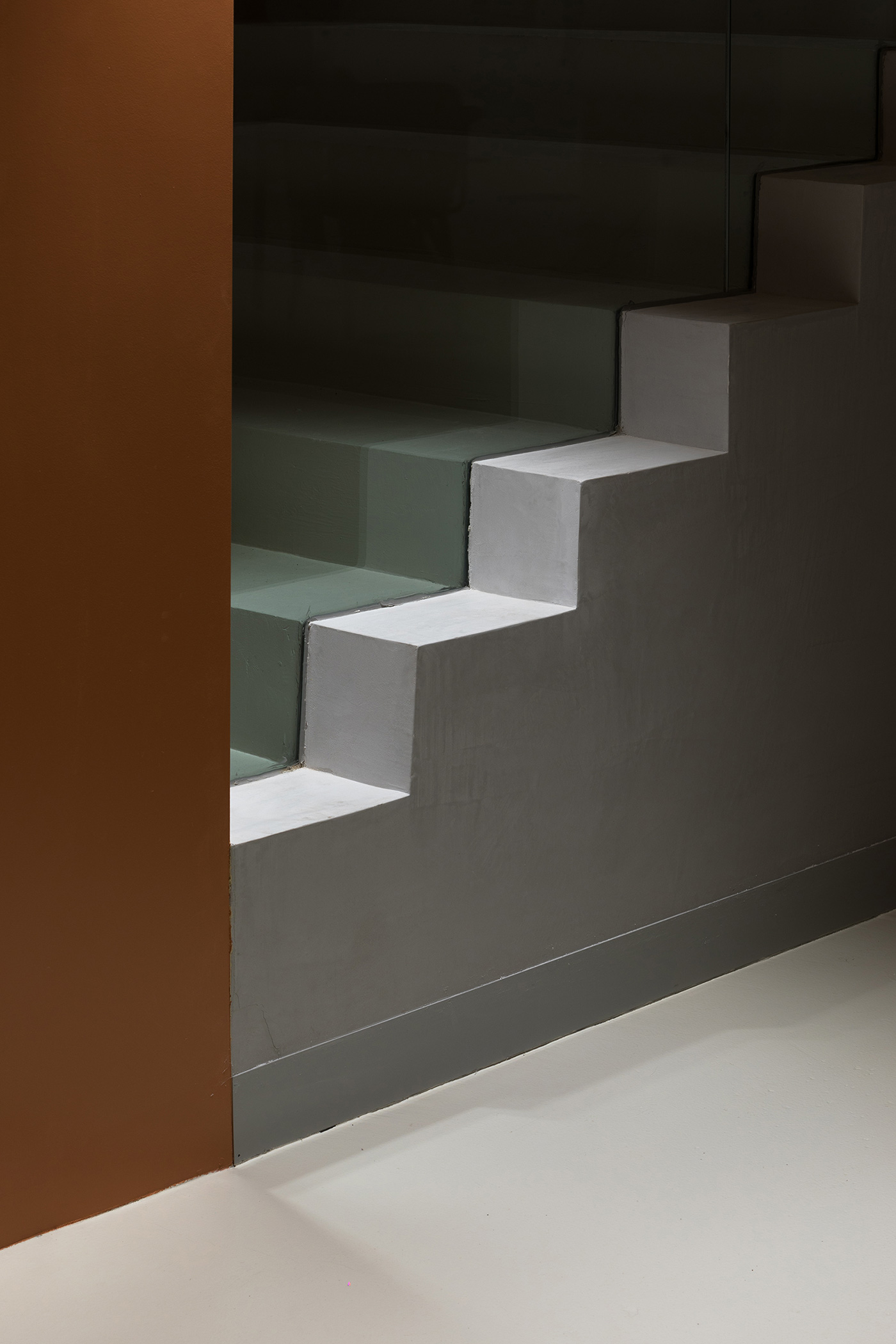
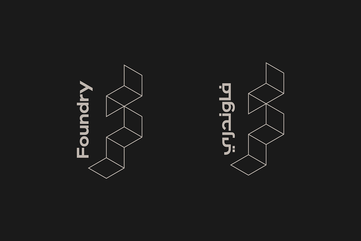
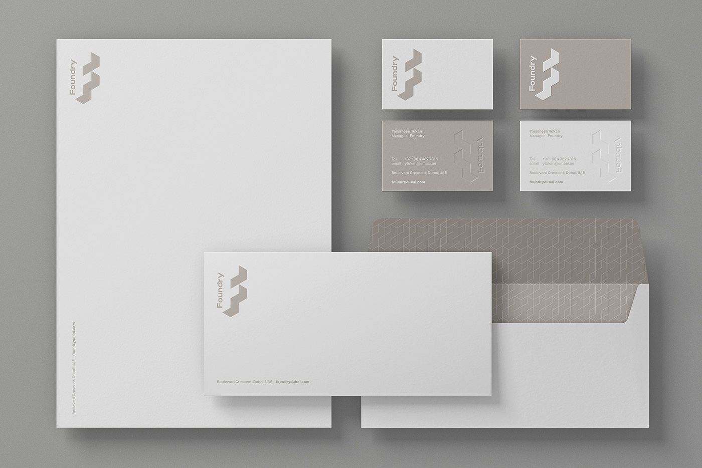
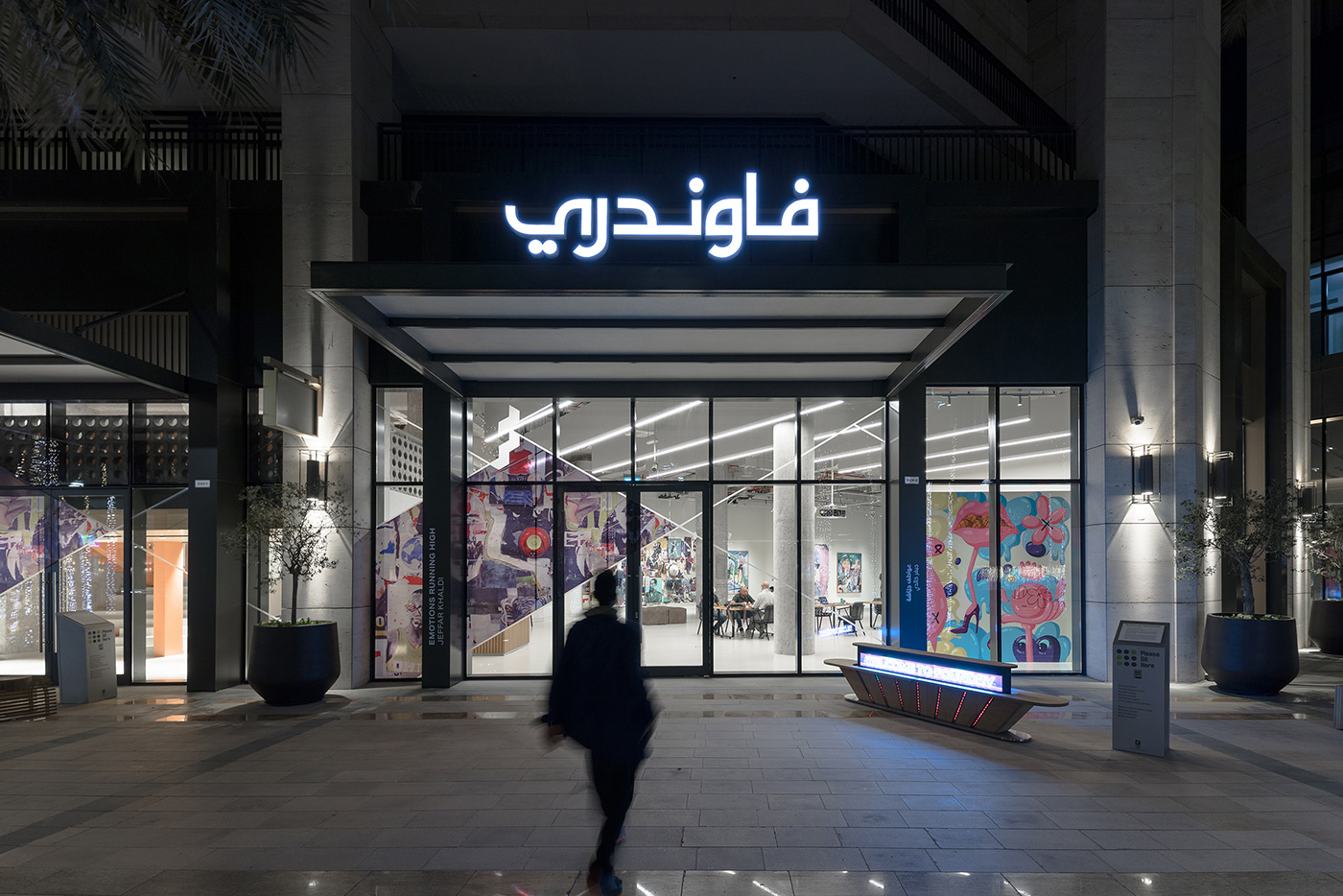
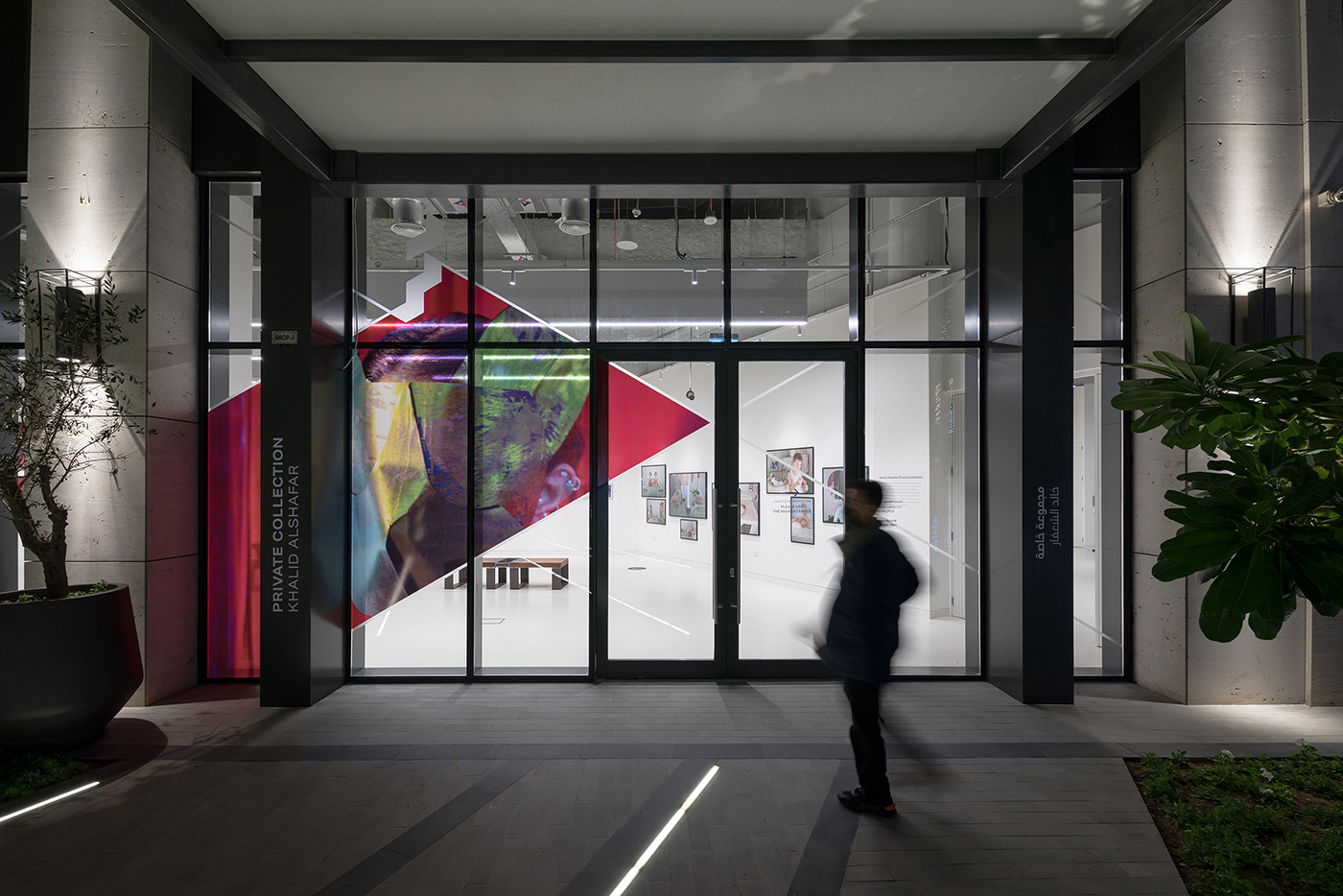
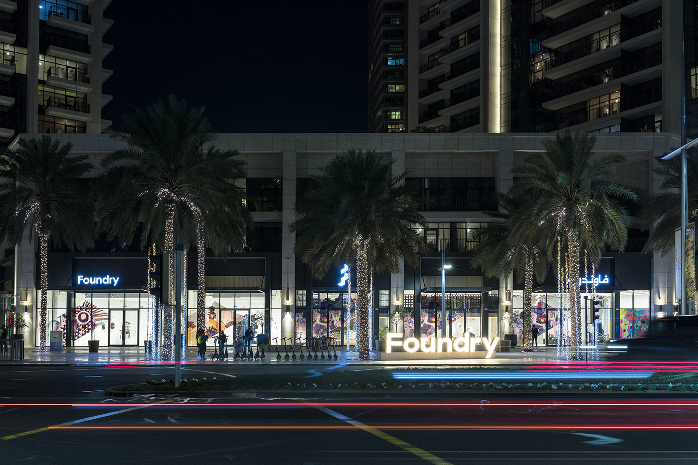
Foundry
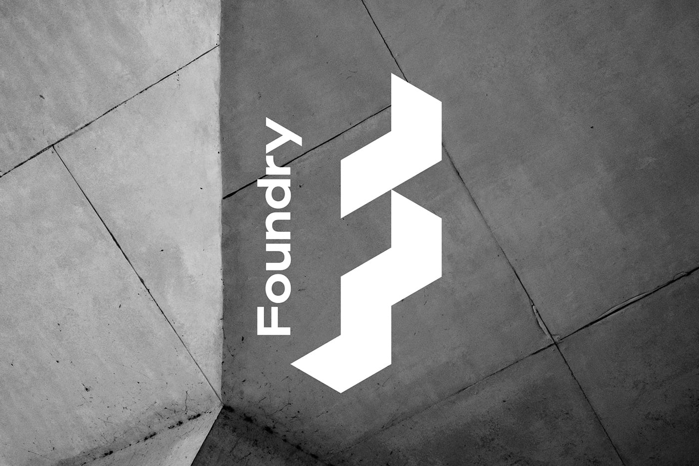
Foundry is a brutalist-inspired progressive art, culture, and co-working space created for Emaar communities.
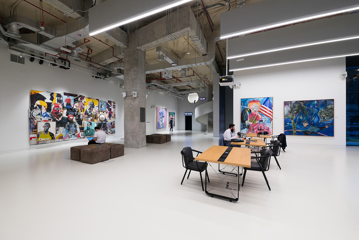
Emaar defined an opportunity to add culture destinations into their mass scale communities spread across the Emirate, starting with Downtown Dubai. Their plan was to develop multifunctional spaces to engage the surrounding community through expression and culture. We were approached to help create and define the brand. Working closely with the project team we built out the envisioned brand strategy into a visual design system.
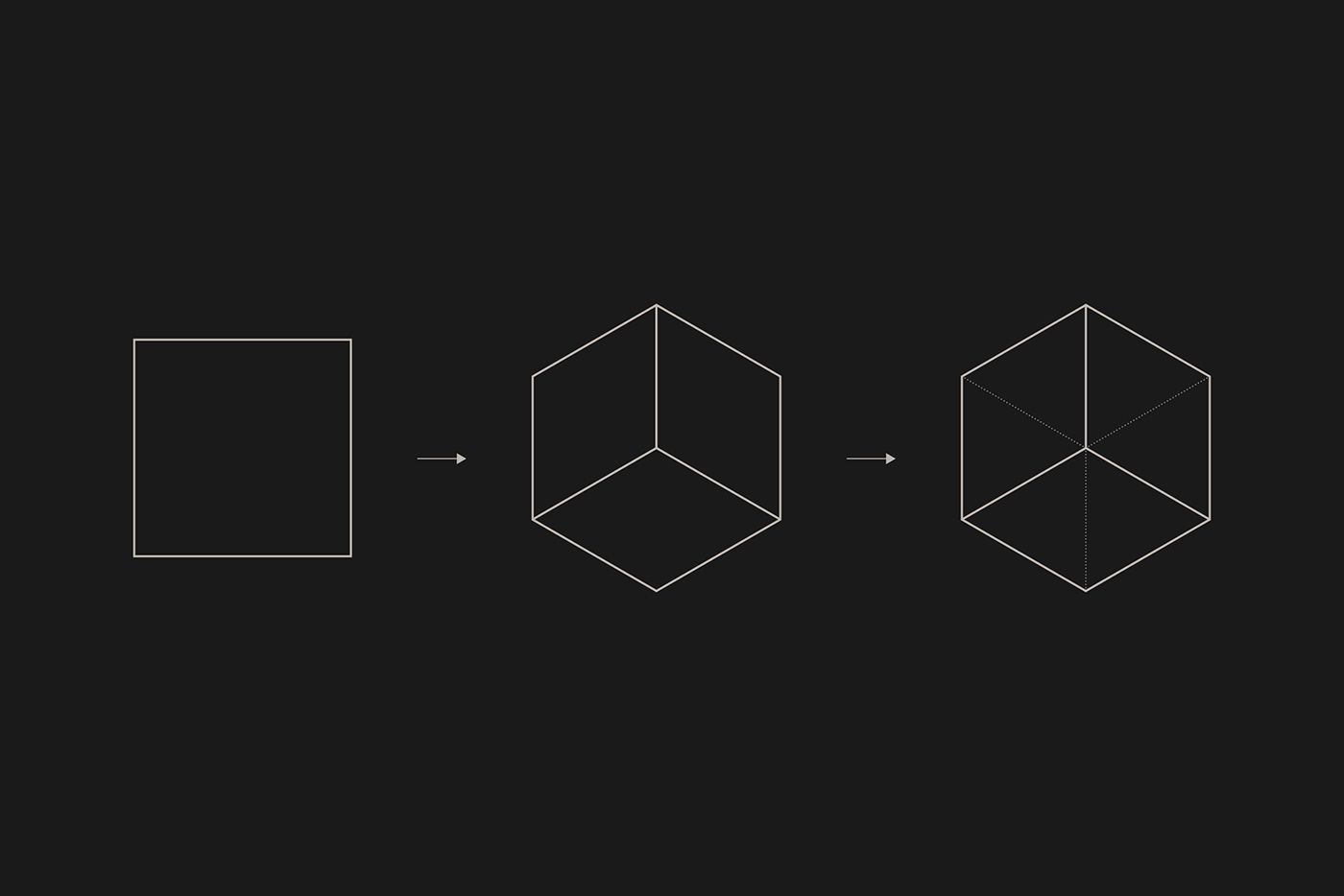
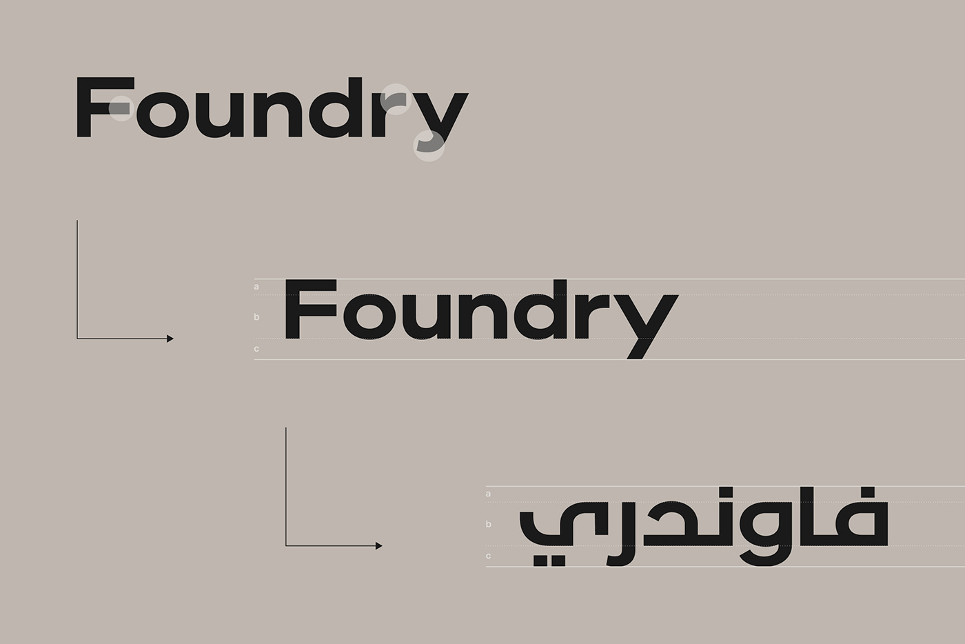
Foundry was born — a place to discover contemporary artworks, innovative pop-up activations, design stores, and co-working spaces. The industrial quality of the brand name and identity is a nod towards the brutalist aesthetic of the interior architecture. Based on the concept of perspective the logo was created to be both 2D and 3D — a reflection of not only the minimalist interior design but also the art forms that would be hosted within Foundry.
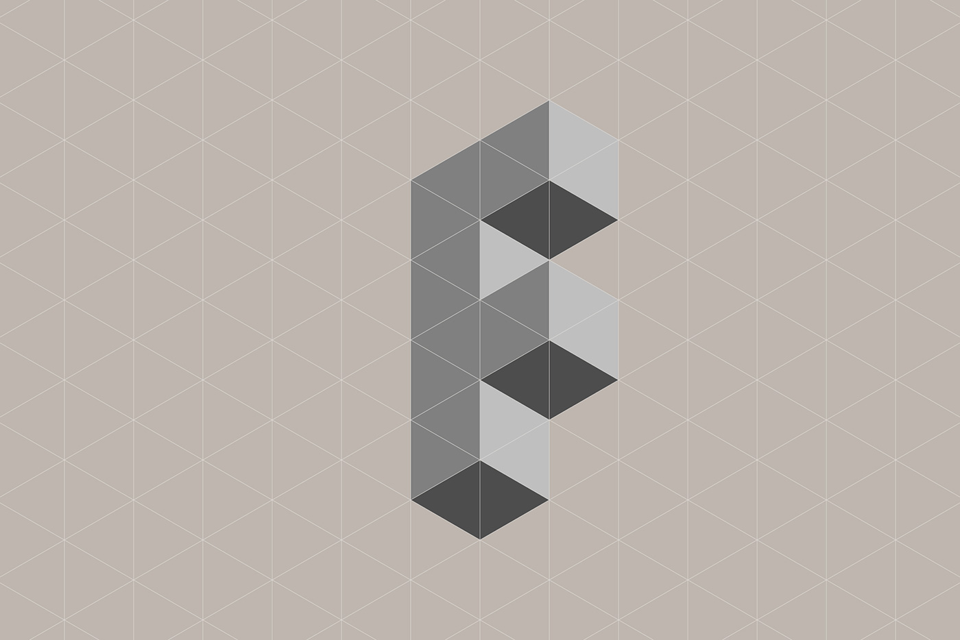
The brand design system revolves around the ‘F’ brandmark. It’s an anchor point for the base design of all communication materials, allowing for maximum impact of the artists work across both print and digital applications.
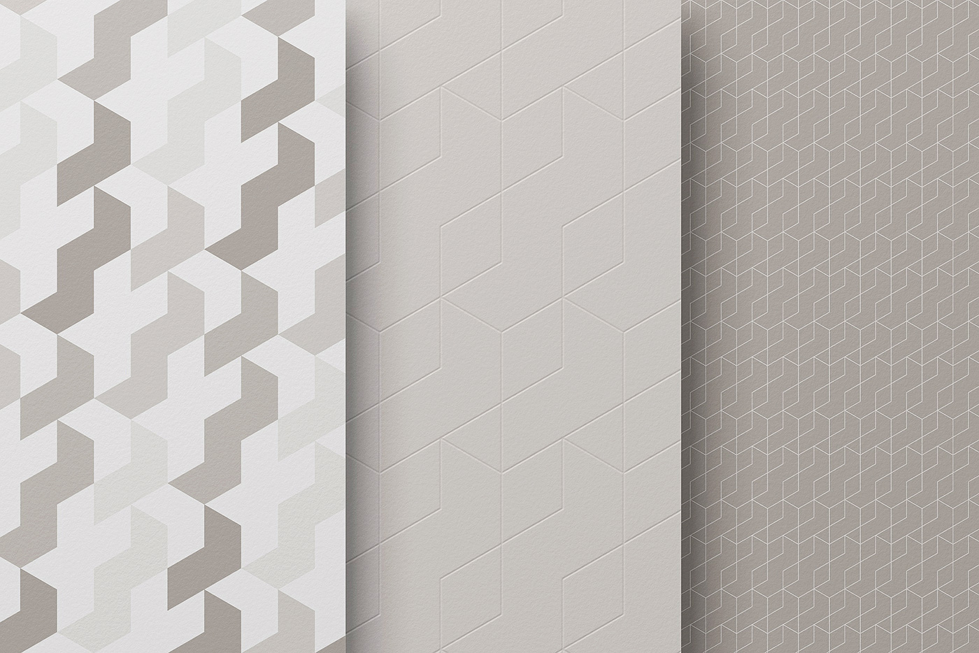
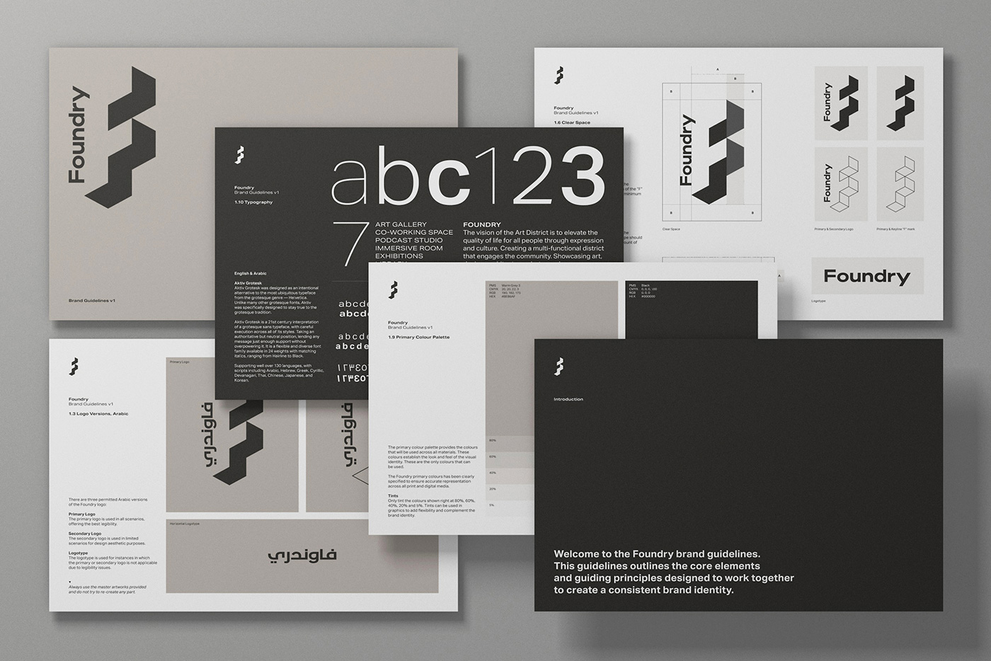
Brutalist interiors are characterised by a minimalist design that showcases the bare building materials and structural elements. The space makes use of exposed concrete and brick, angular geometric shapes, and a predominantly monochrome colour palette. These characteristics helped guide and define the brand identity, typography, palette, signage, and wayfinding.
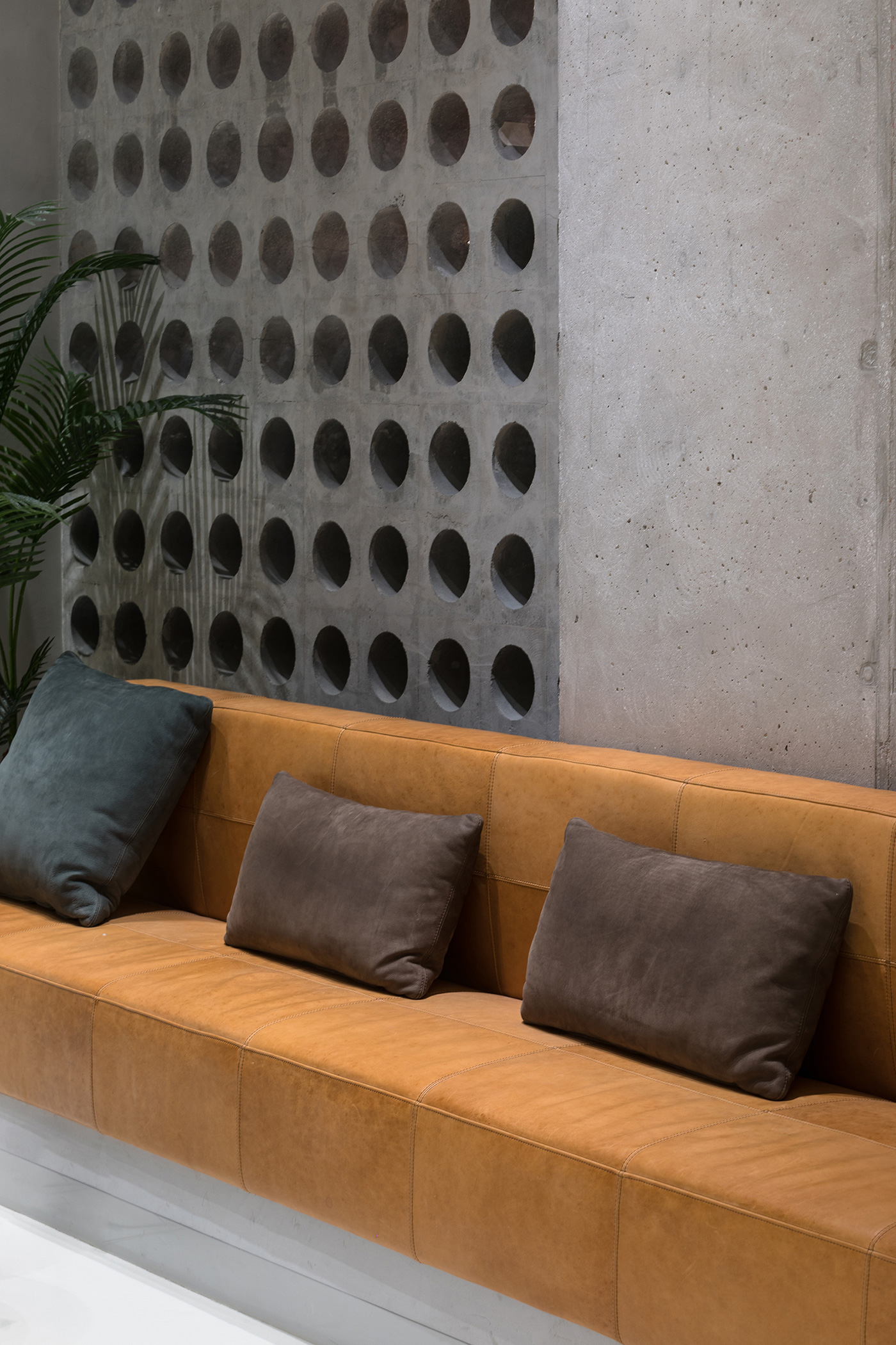
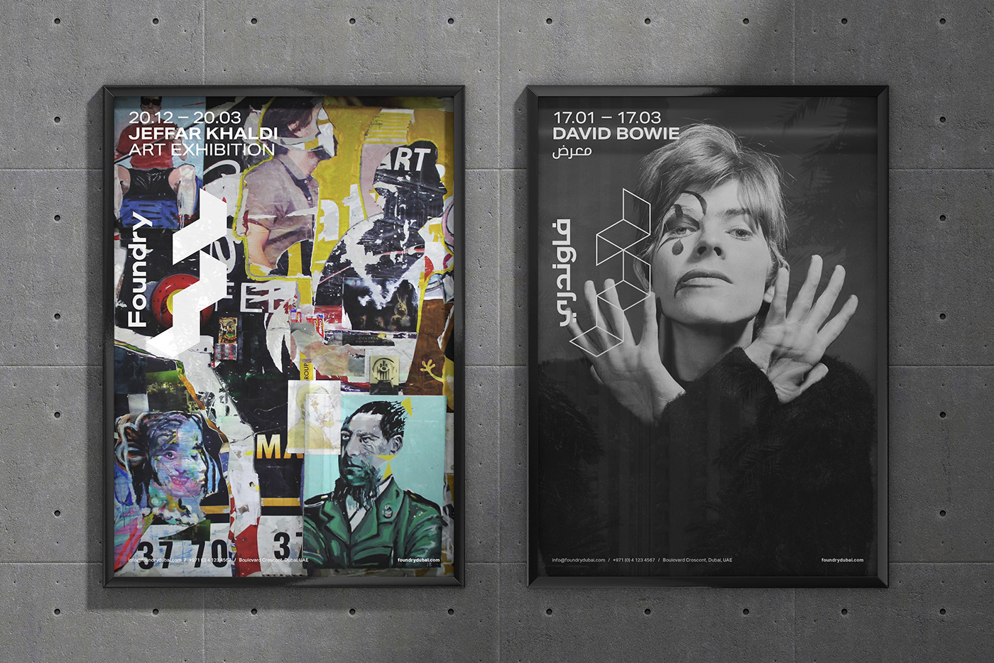
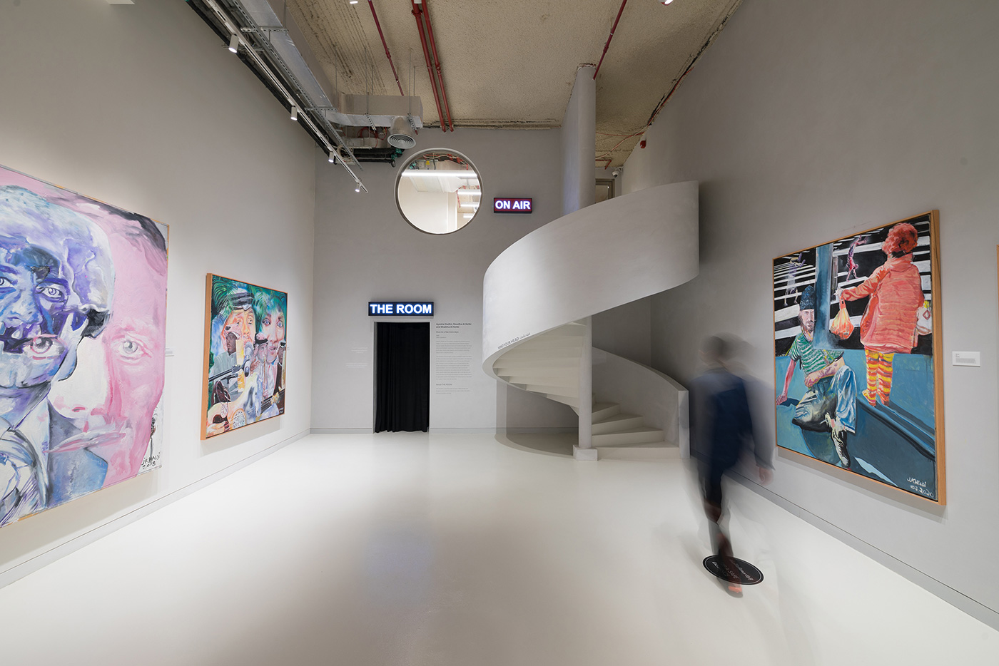
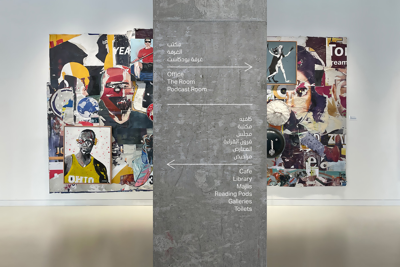
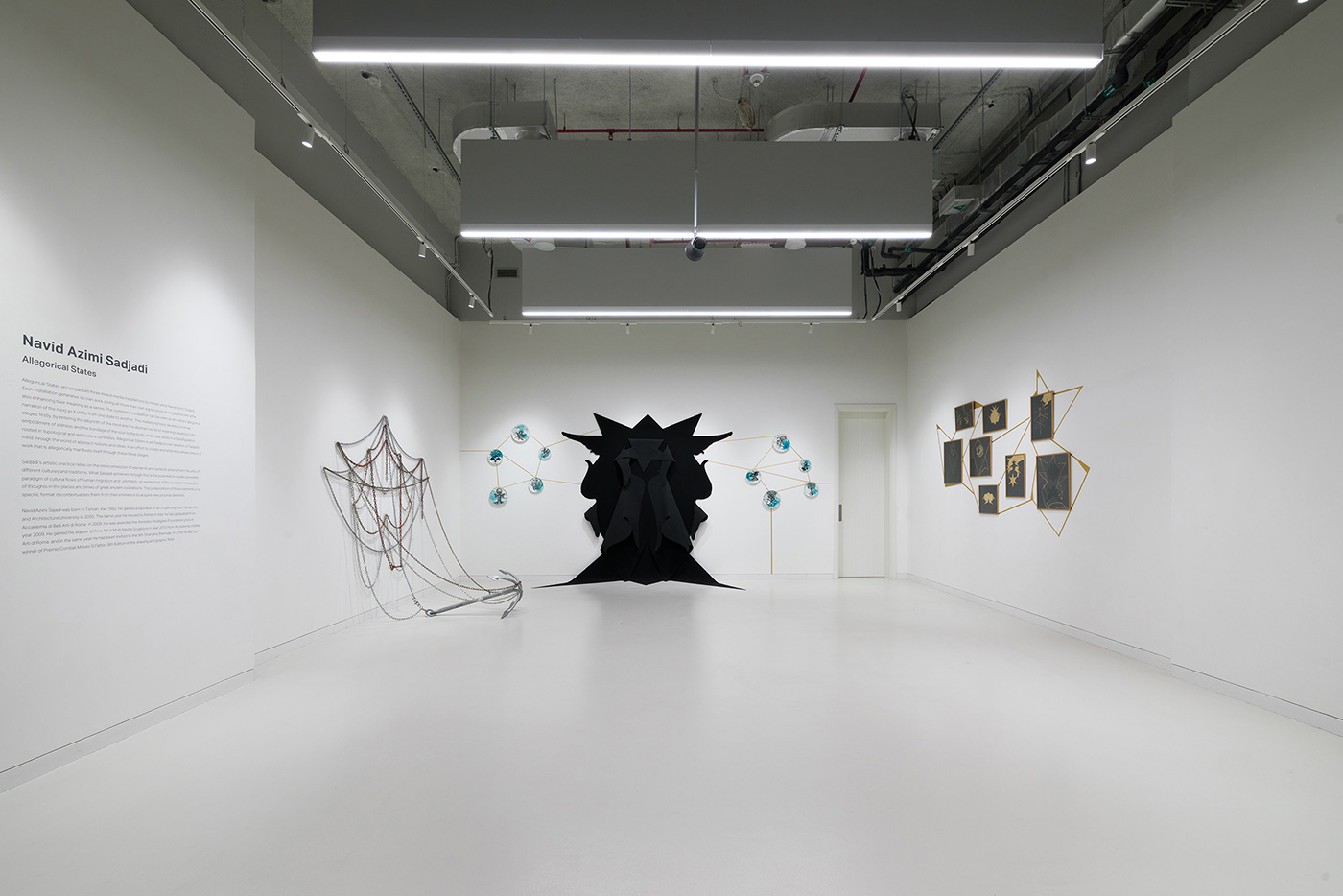
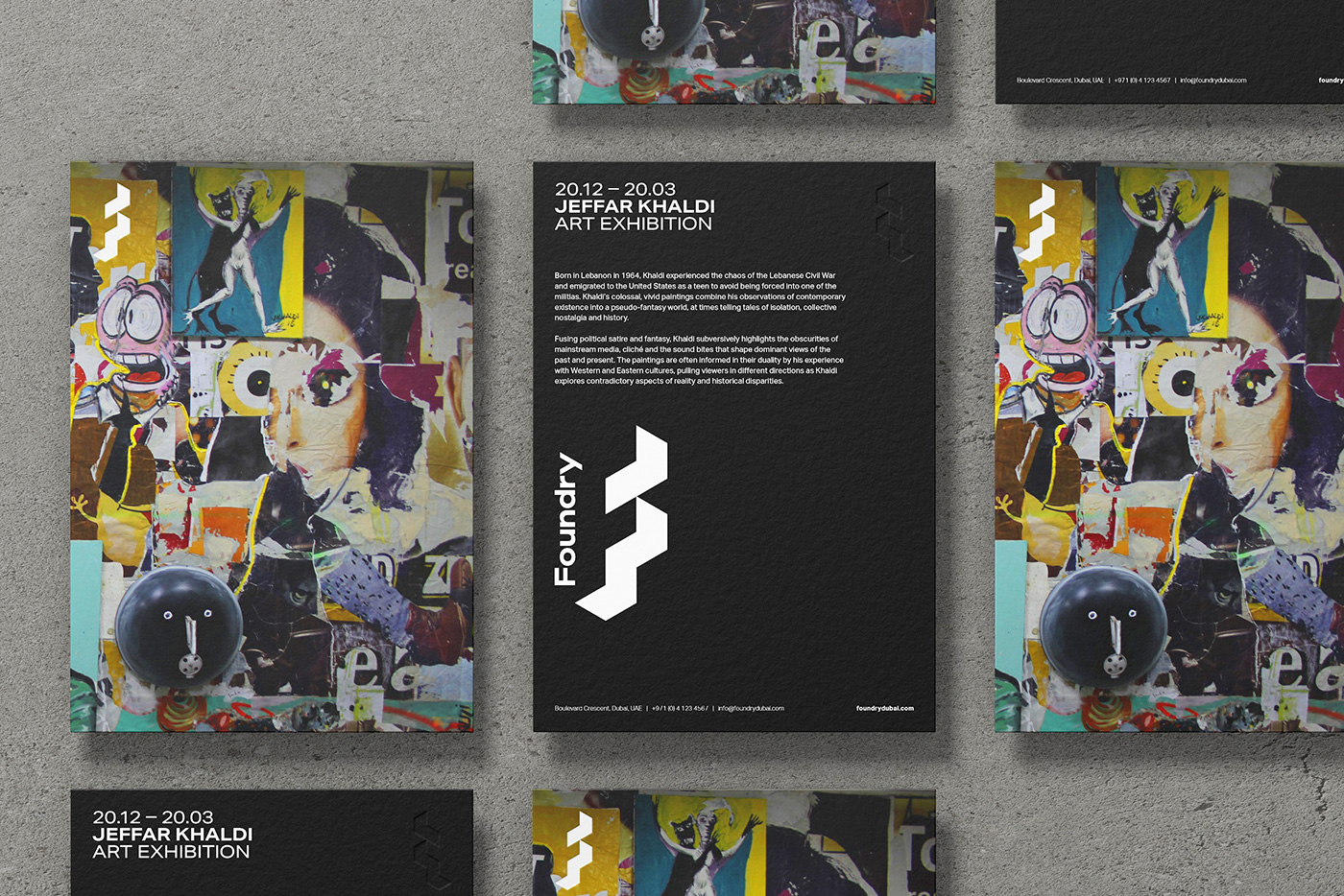
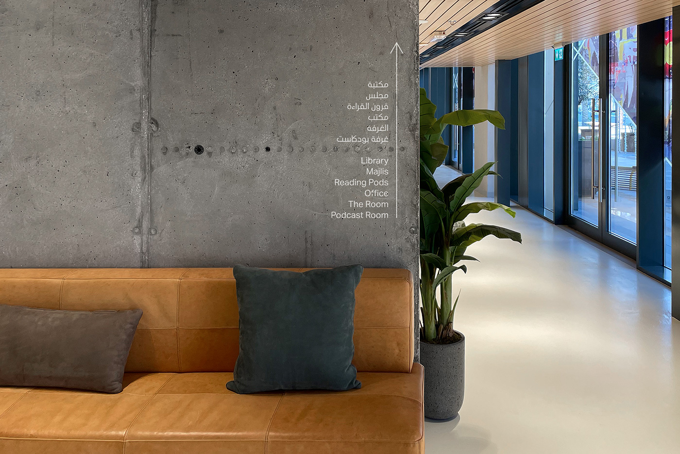
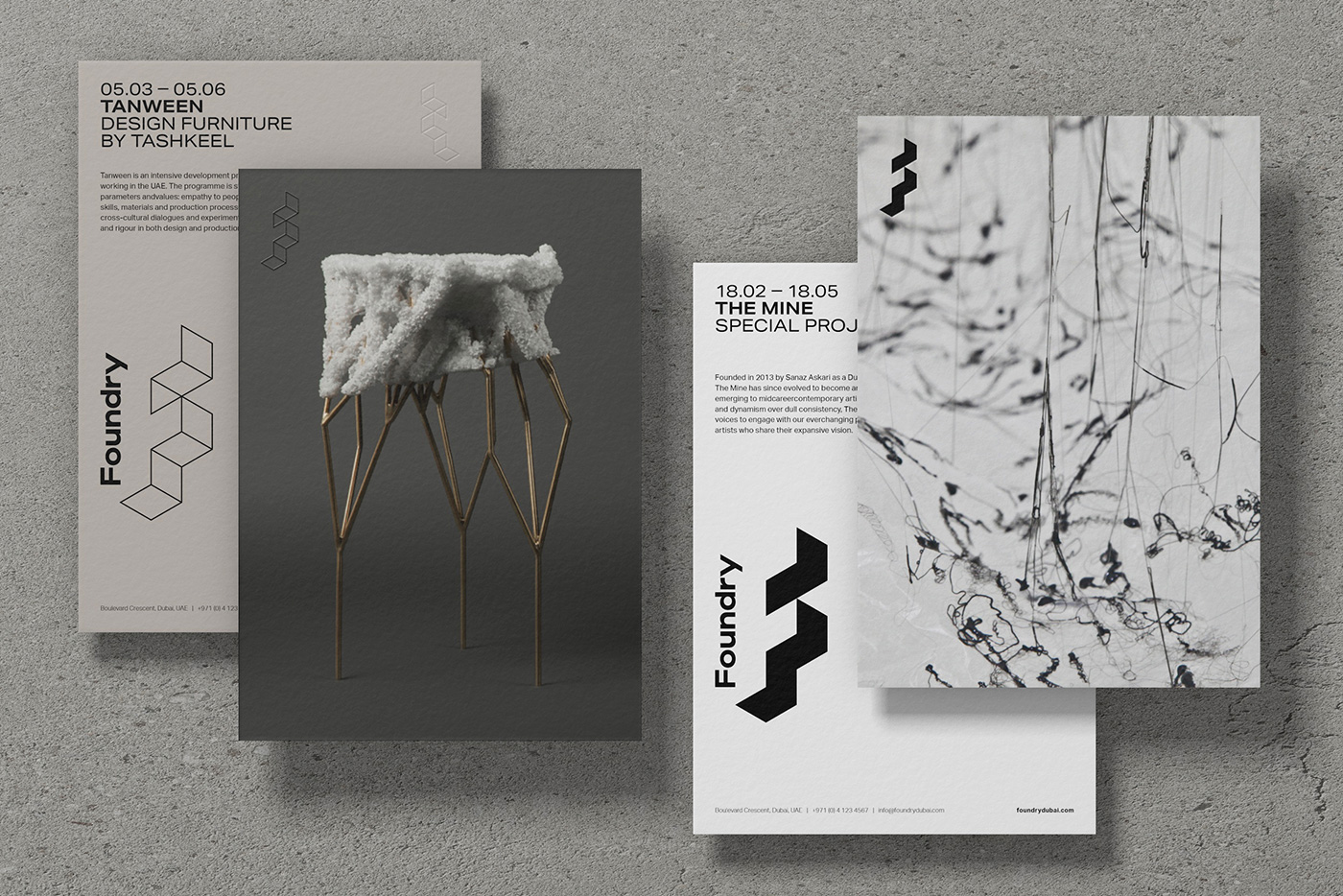
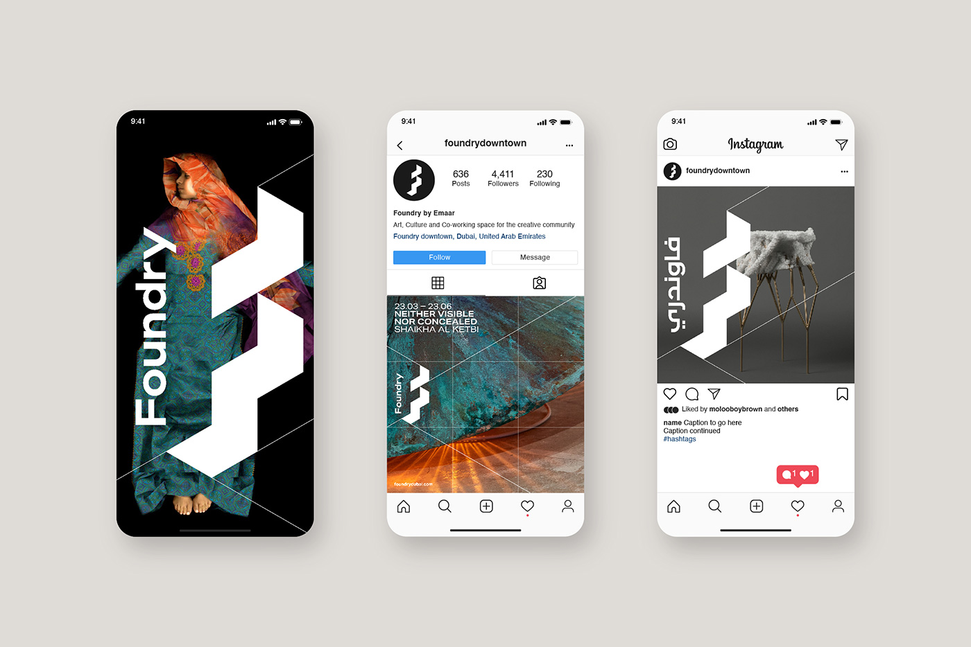
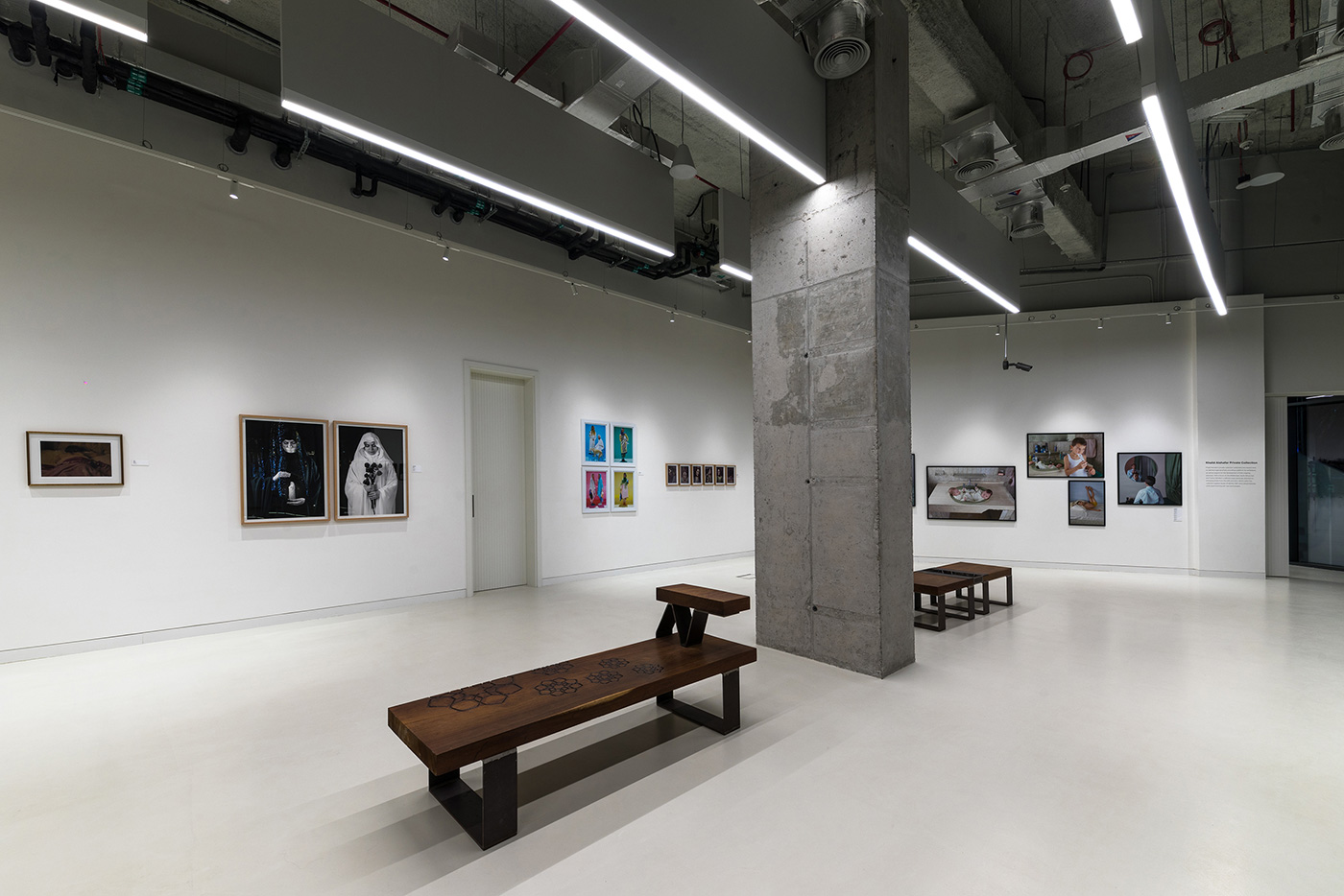
Spread across seven galleries the exterior signage and graphic system needed to designate the space and showcase what was happening within. Bespoke graphic applications were created and applied across the window frontage, teasing the artist’s work showcased within. This helped illustrate Foundry’s content and generate intrigue from the surrounding community.
Typeface: Aktiv Grotesk
Photography: Farel Bisotto
More from Moloobhoy & Brown.
Source
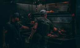
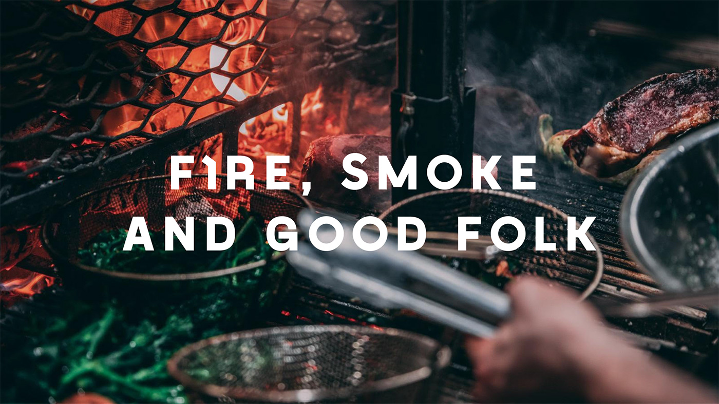
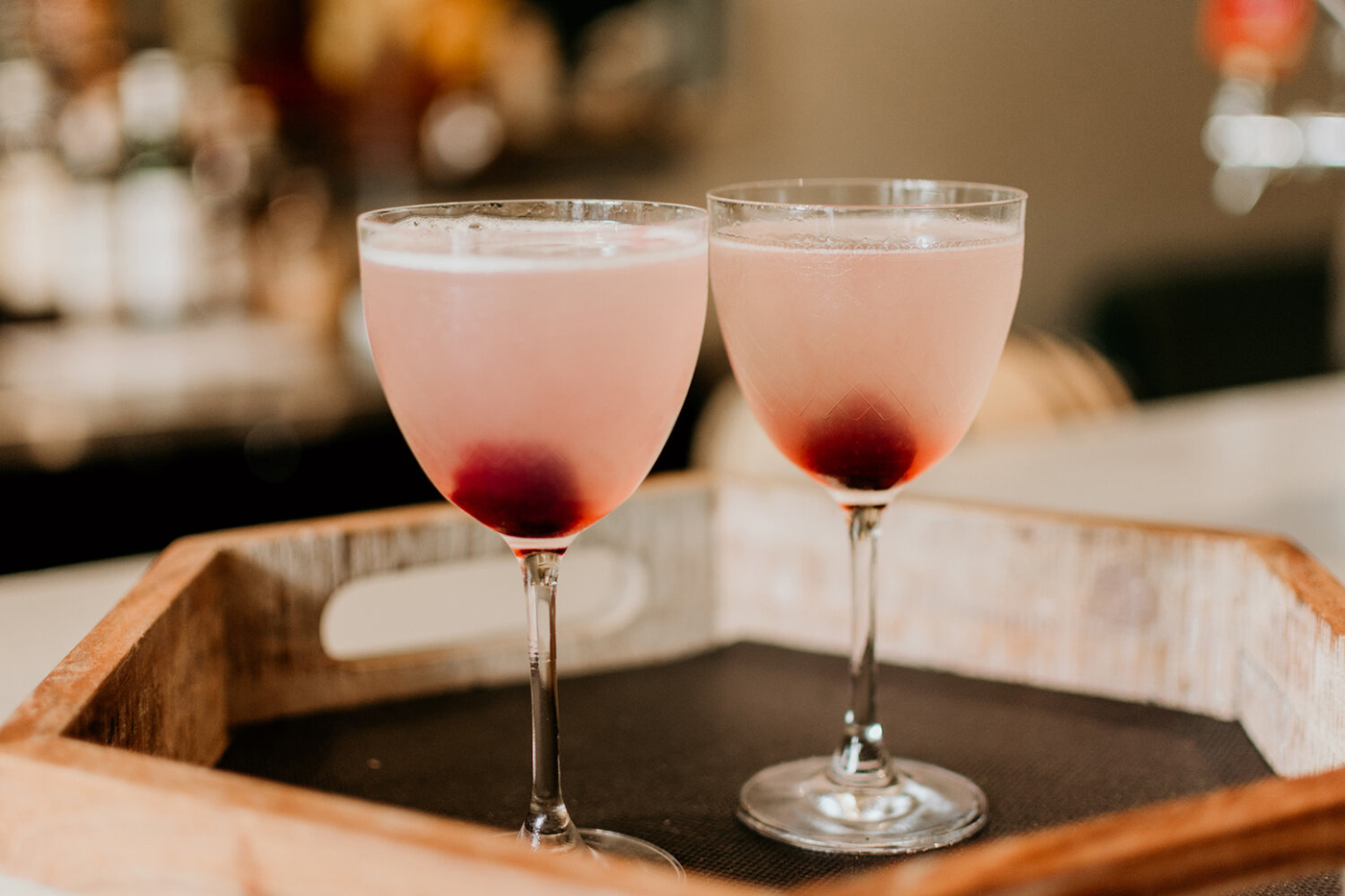
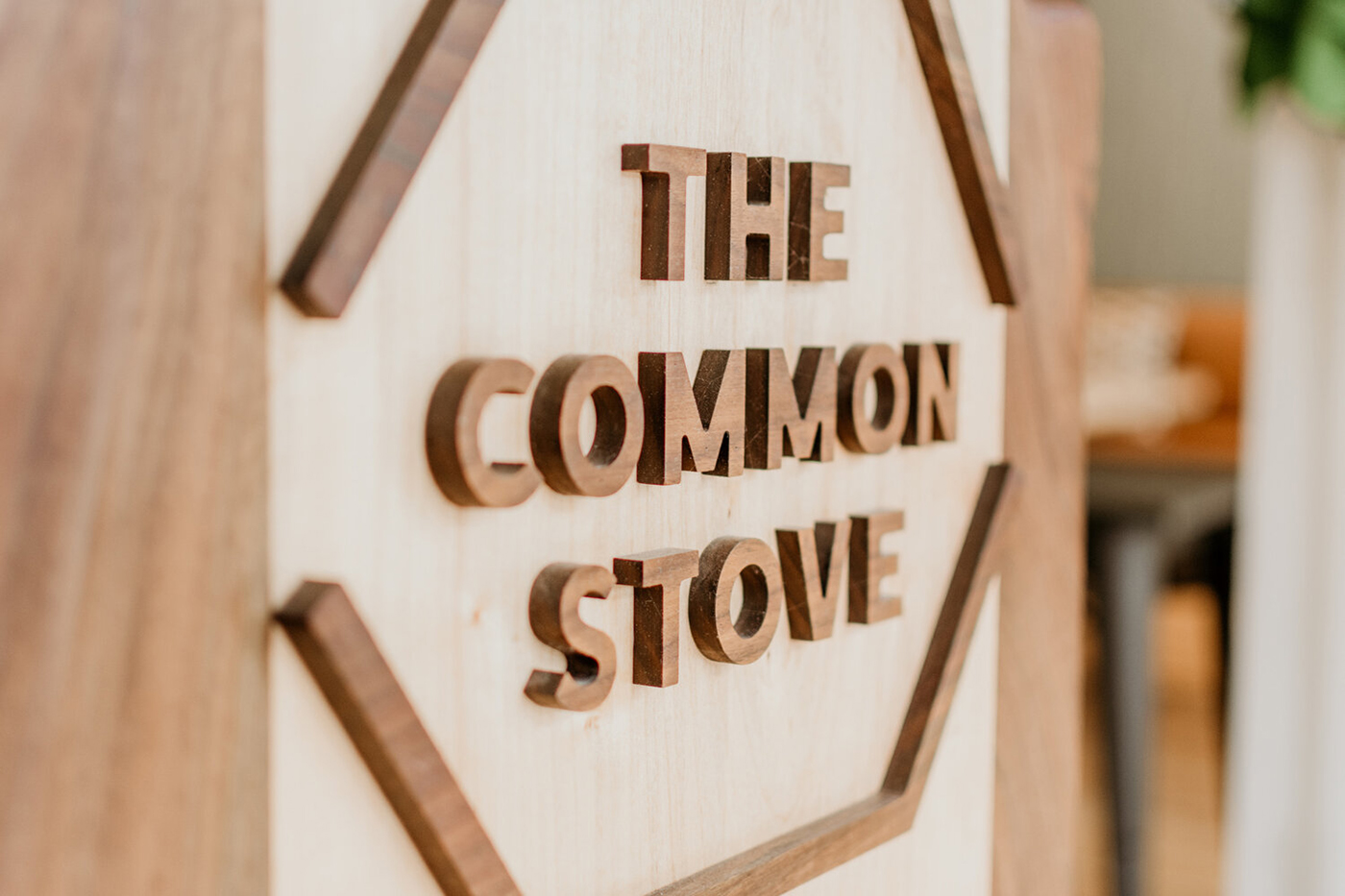
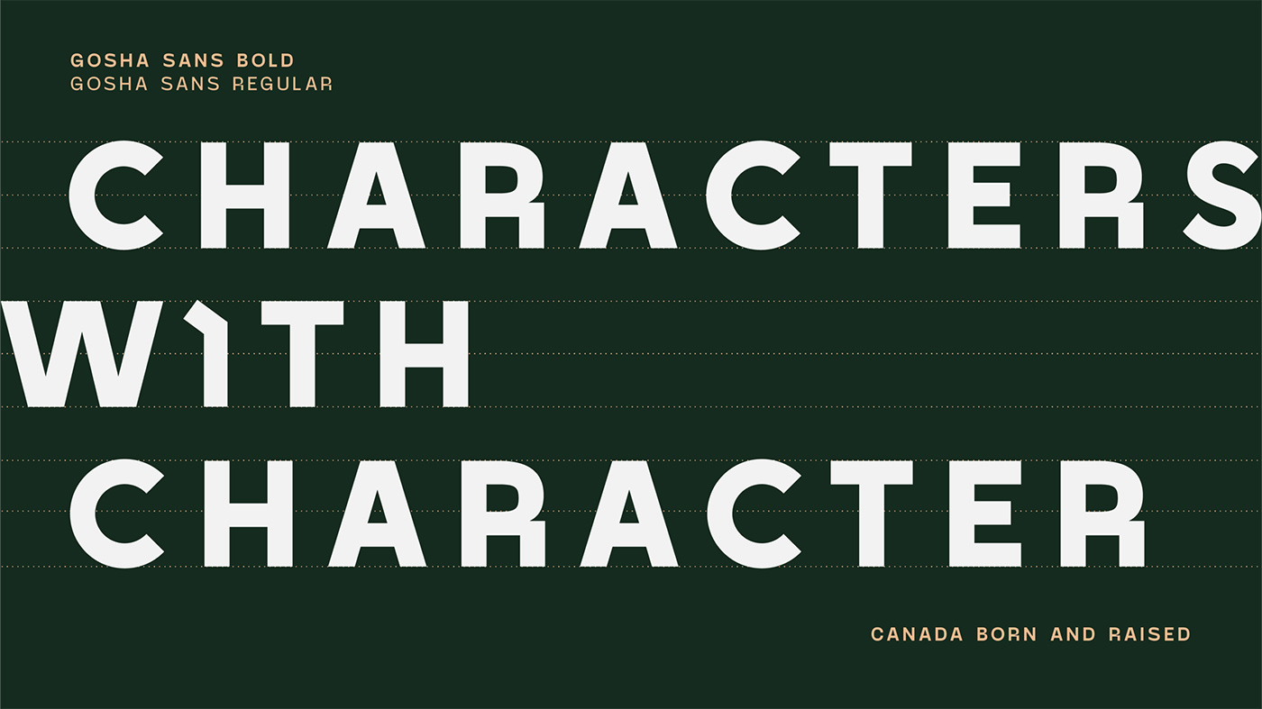
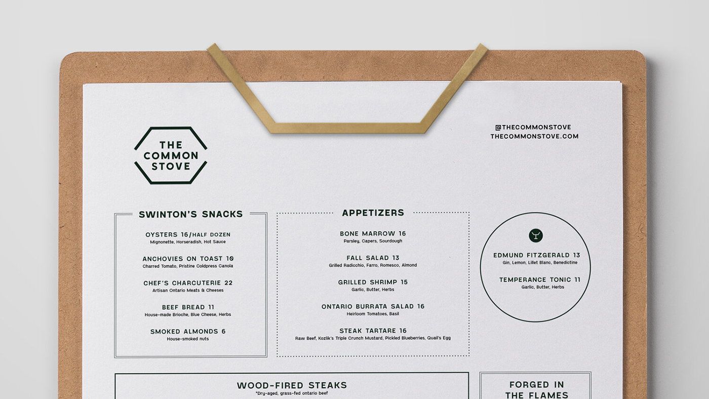
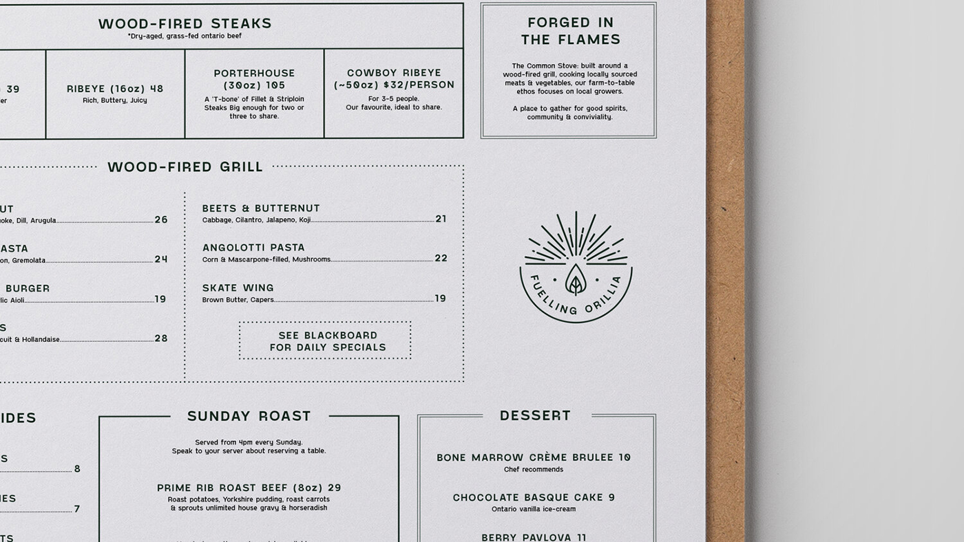
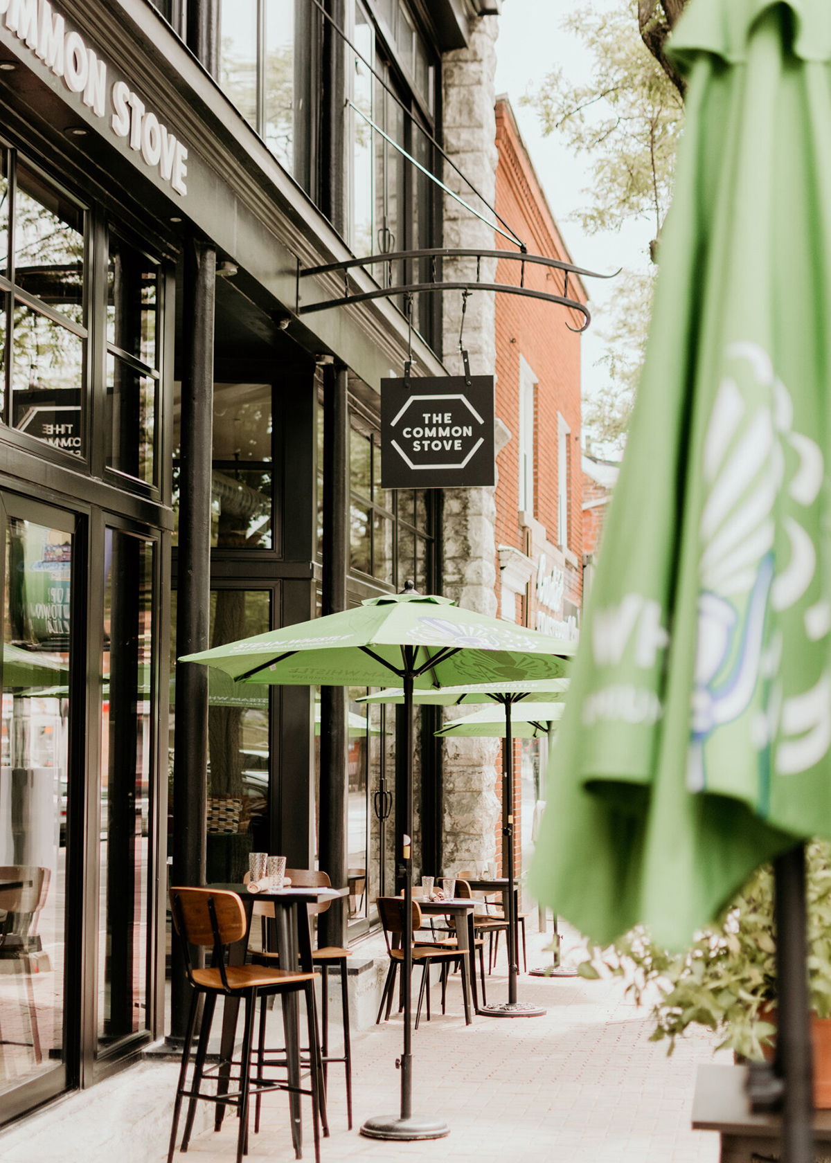
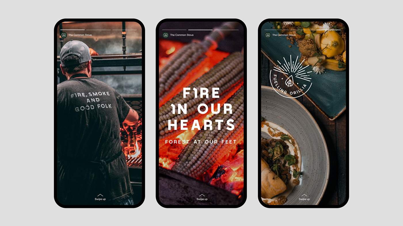
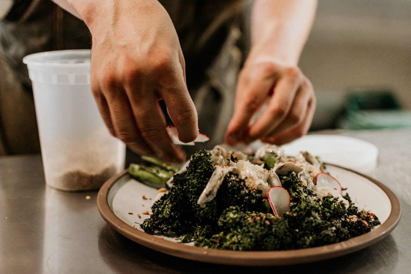
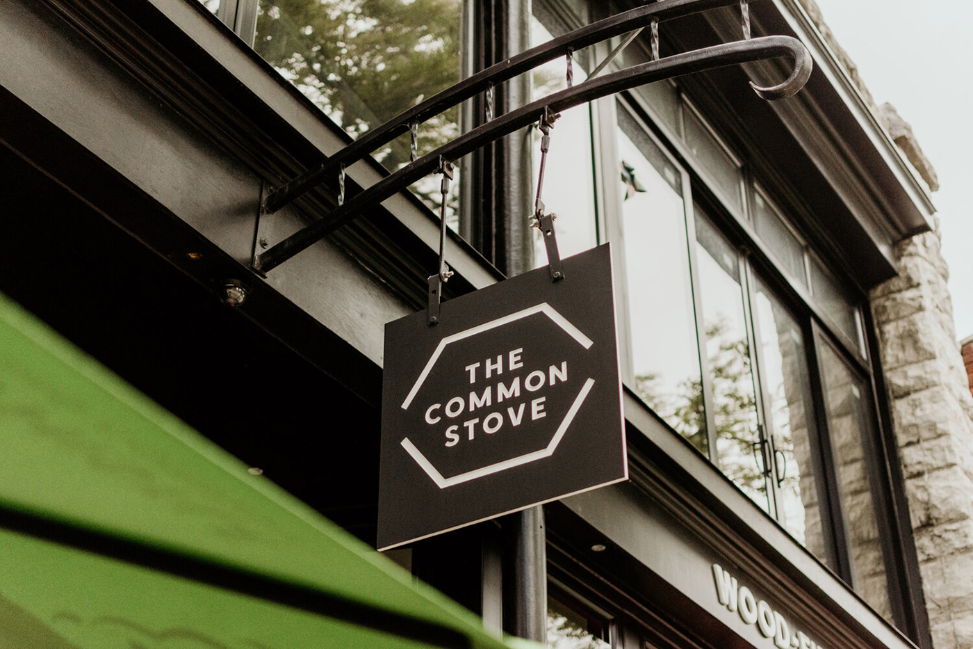
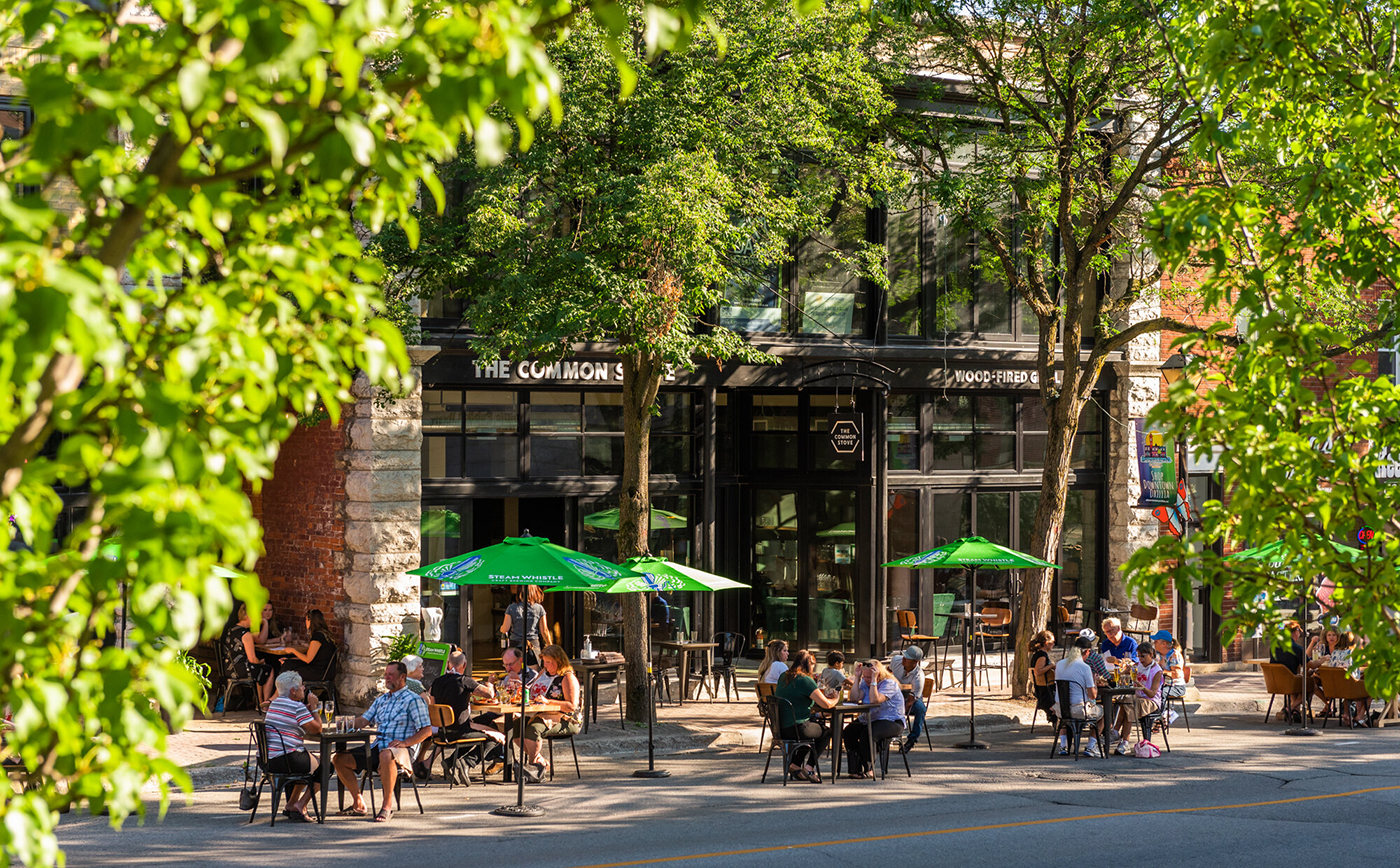
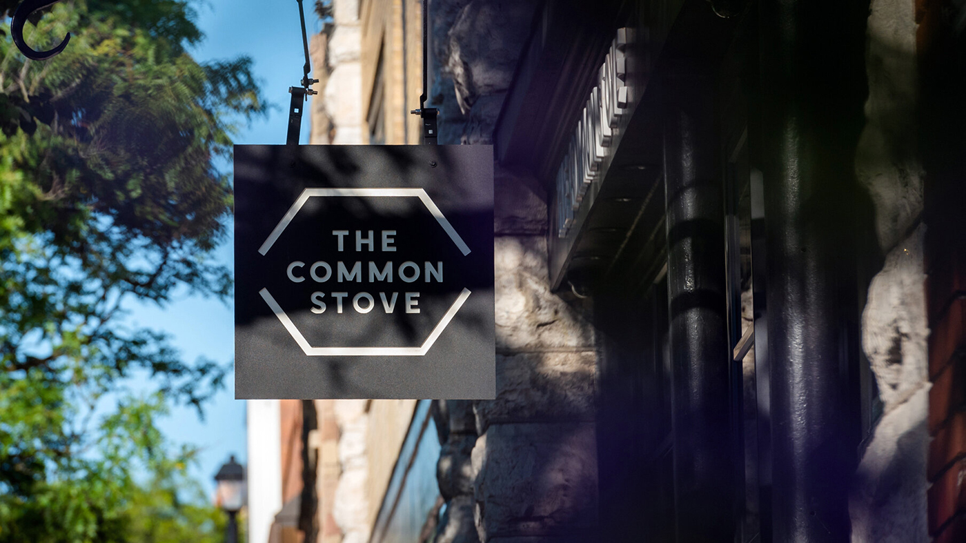
The Common Stove
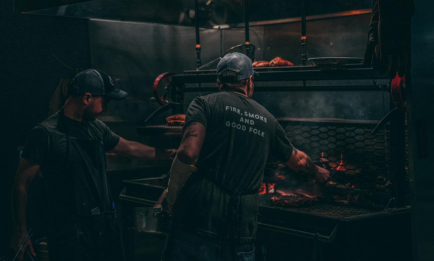
Restauranteurs Simon and Darcy wanted to launch a high-end neighbourhood restaurant, with a difference. One based on community and togetherness, that unites people through food, and where everything possible is made in-house with gentle treatment of simple ingredients. They needed a compelling identity to help tell their story and define their brand character. By using intelligent, warm and engaging messaging we helped The Common Stove stand out and firmly secure their place as a leading restaurant.
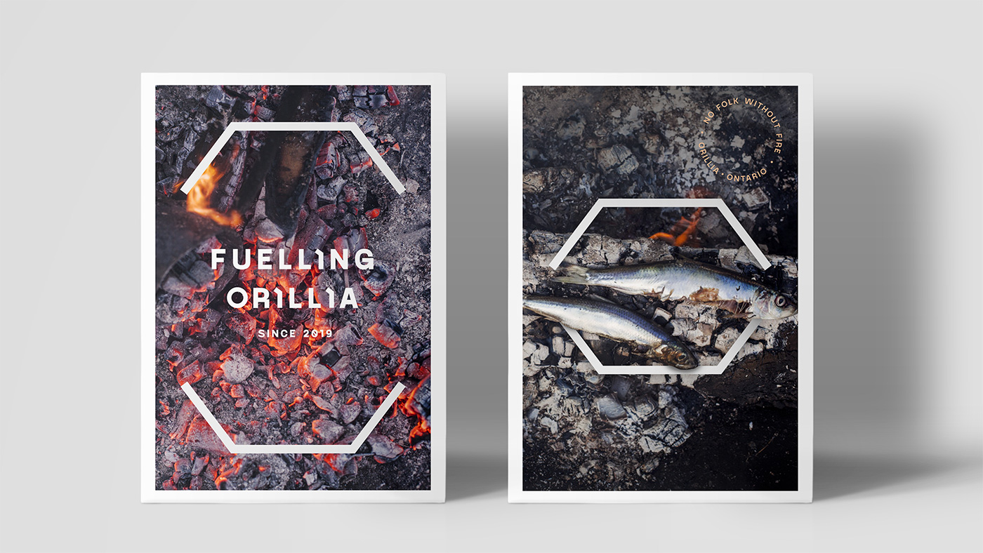
Fuelling Orillia
“The Common Stove” comes from the idea of a communal oven and was inspired by a community design project in Slovenia. Here a traditional U-shaped wood-burning stove, known as a kachelofen, was built in a forest clearing and used as a central meeting point to connect three otherwise remote villages. A place to cook, eat, and come together.
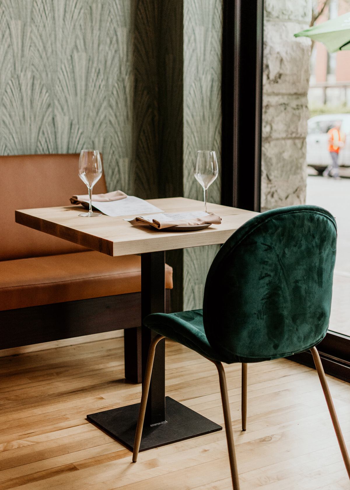
This U shape inspired the chef’s counter and booth design in the Orillia restaurant with cooking centred around a wood-fired grill; borrowing not only its fuel and its shape, but also inspiration from how the kachelofen’s warmth and conviviality inspires community.
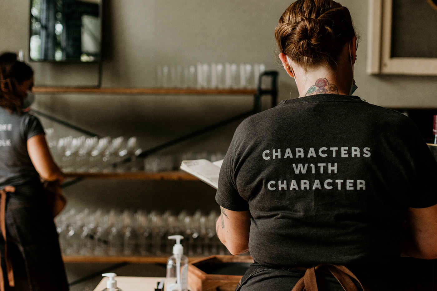
Every element of the brand identity had to speak of the local natural environment particularly through the use of wood to power the fire. But it also had to fuse the idea of food uniting people and articulate the strong sense of community behind the brand.
The menu takes its influence from the wood fired grill and elemental cooking with an emphasis on quality and simplicity using natural ingredients locally sourced from the vast forests and lakes.
Forged in flames
Our research into local competitors identified an opportunity to stand out from the crowd through intelligent, warm, and engaging messaging. We worked with the U shape used for the booths and kitchen counter to create a flexible holding shape reflecting the traditional concept of the kachelofen stove. It inspired the typographic detail, as well as physical elements such as door handles and menu holders.
We also created symbols to capture the wilderness feel of the area, food gathering and local charm. The colour palette was influenced by the local environment emulating the natural tones of the forests, crystal clear lakes and simple high-quality ingredients.
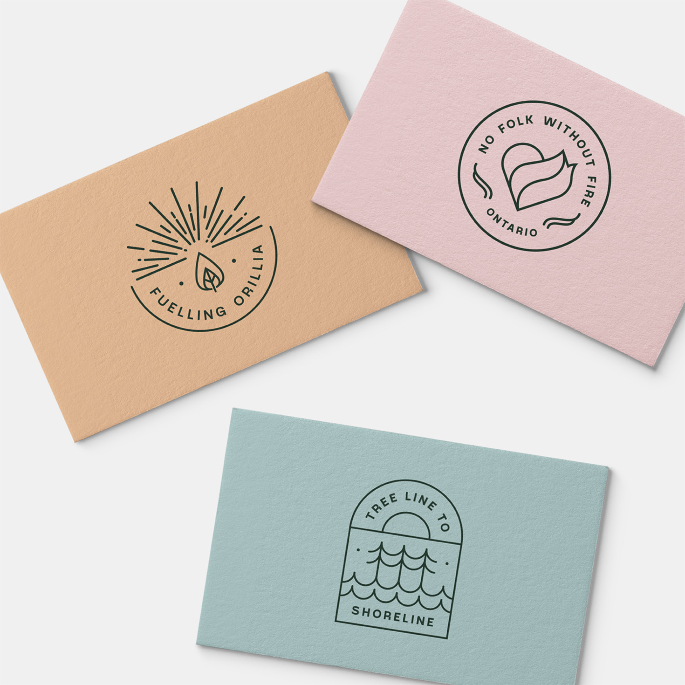
The typography used was inspired by eastern Europe and Russia — subtly referencing the roots of The Common Stove. Headlines were customised to reflect the geometric sans-serif details of the Toronto subway. The use of geometric shapes was further developed in the menu design, reminiscent of subway tiles.
Photography by Rene Dawn.
Lantern elsewhere on Identity Designed: National Children’s Bureau.
Source

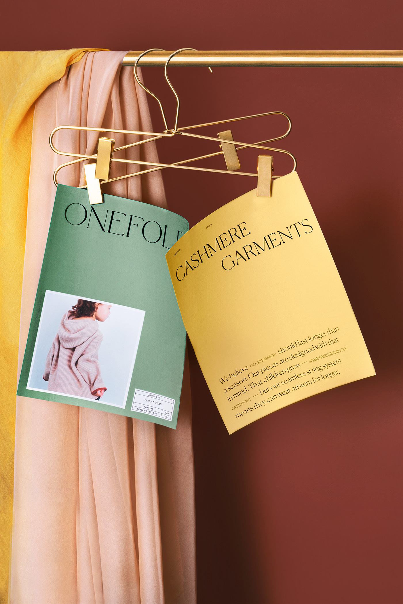
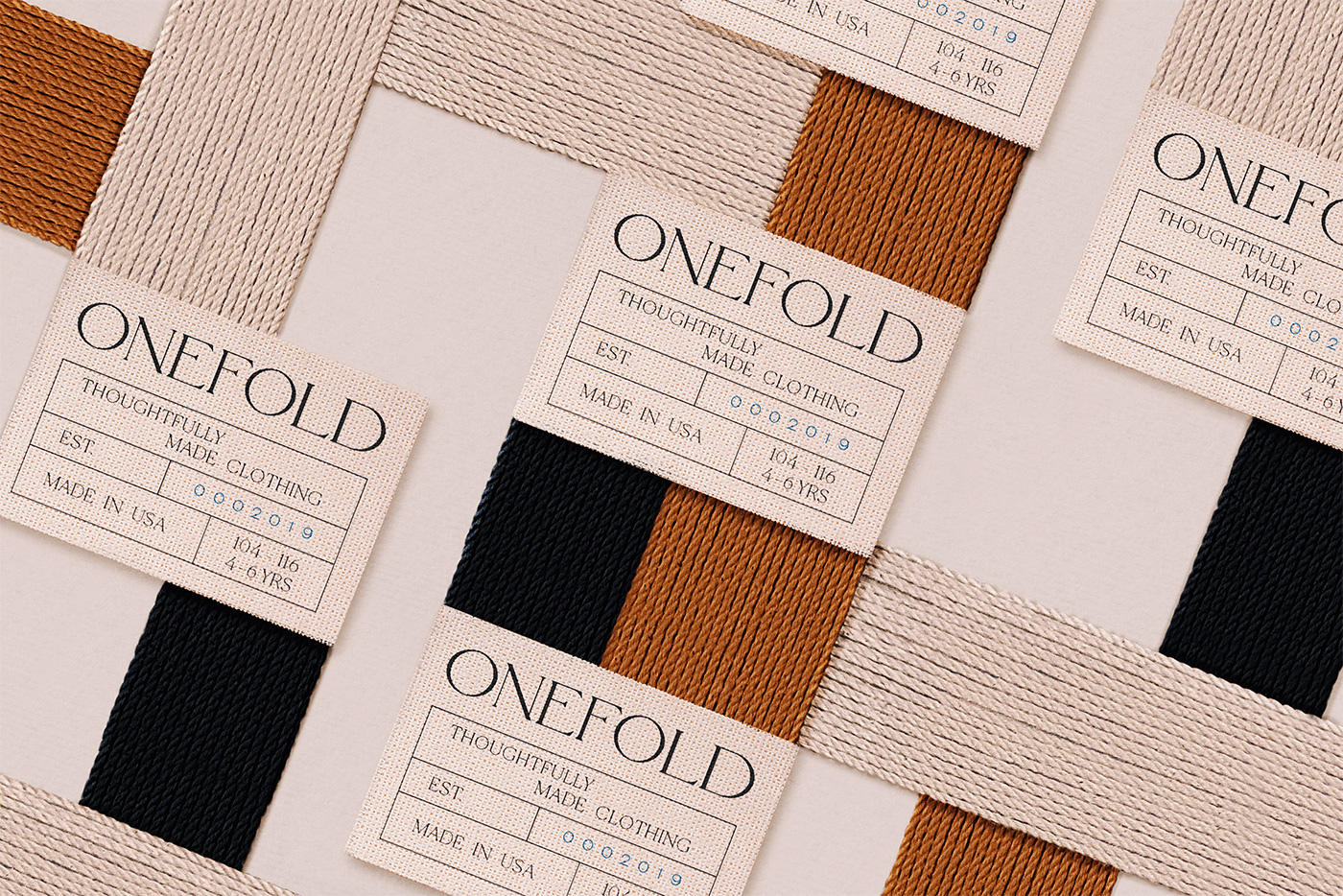
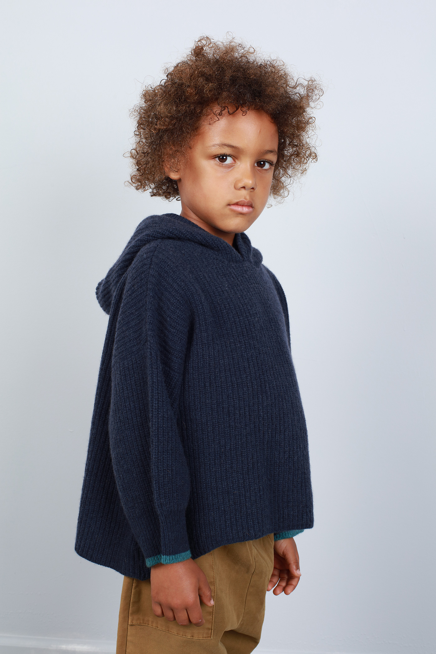
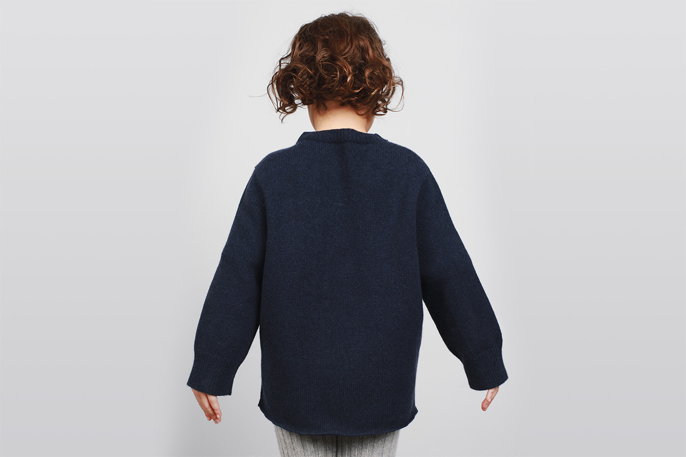
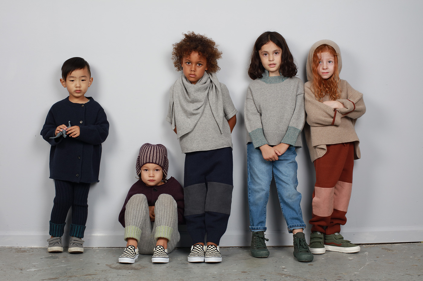
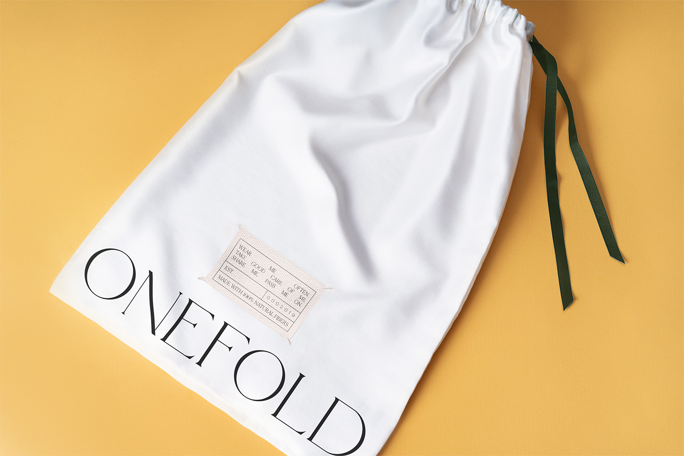
Onefold
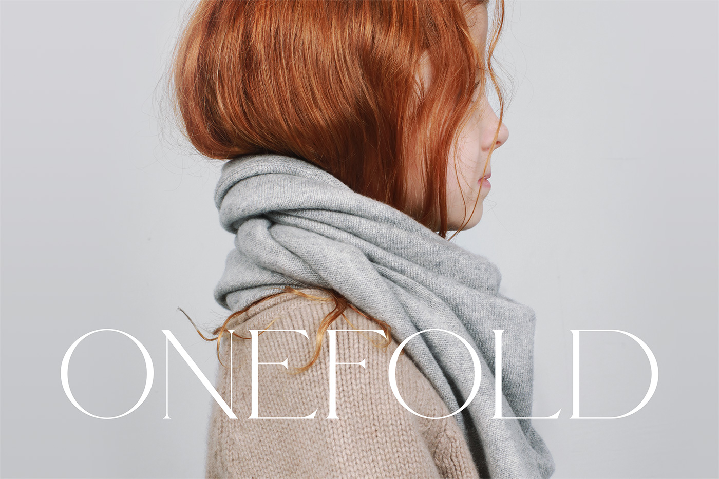
Onefold is a clothing brand in New York that sells recycled cashmere garments for kids. Their approach to fashion challenges the way we think about kid’s clothes and the socialization of gender norms among children. They strongly believe that fashion shouldn’t define a child’s identity or restrict their movement throughout the world. The brand strives to create thoughtful, well-constructed, and long-lasting garments, with timeless and unisex designs that grow with your child.
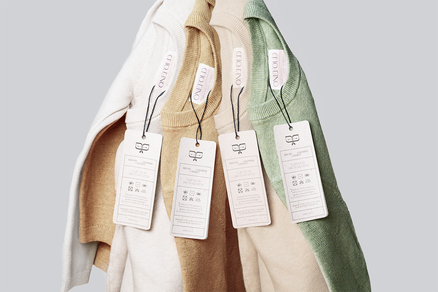
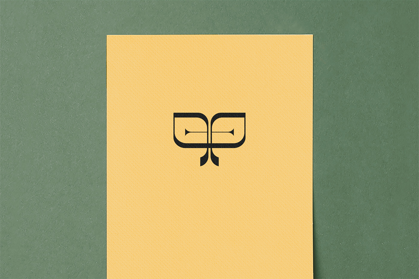
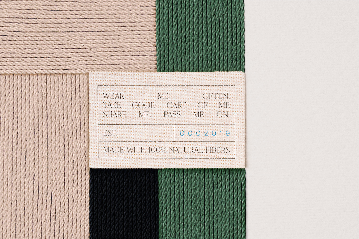
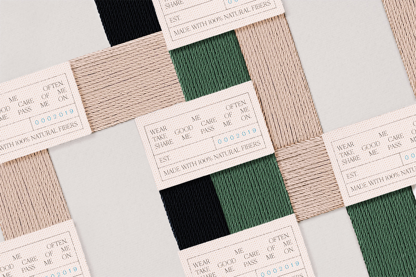
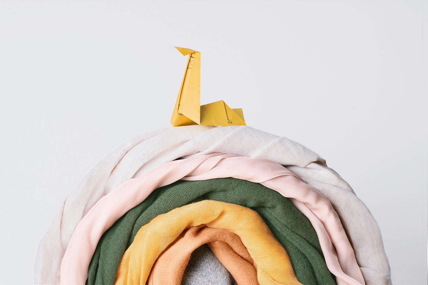
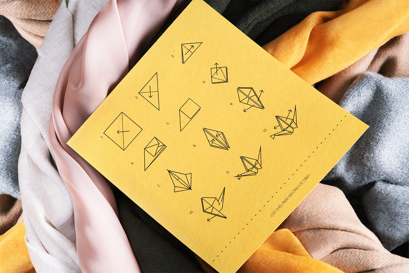
The graphic solution follows the principle of simplicity, using timeless typographies, clean editorials and neutral colors, conveying the idea that less can be more. The icon was designed combining the concept of Onefold’s cyclical philosophy with the concept of infinity, resulting in a modernist and minimalist ribbon icon that represents the reuse of natural materials, while thinking that each piece can be worn for multiple years and then passed on to the next generation.
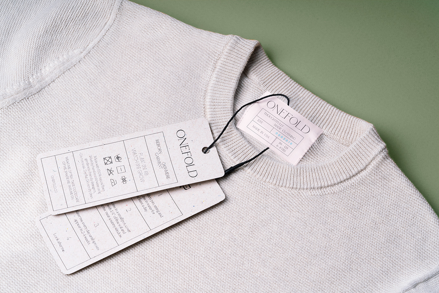
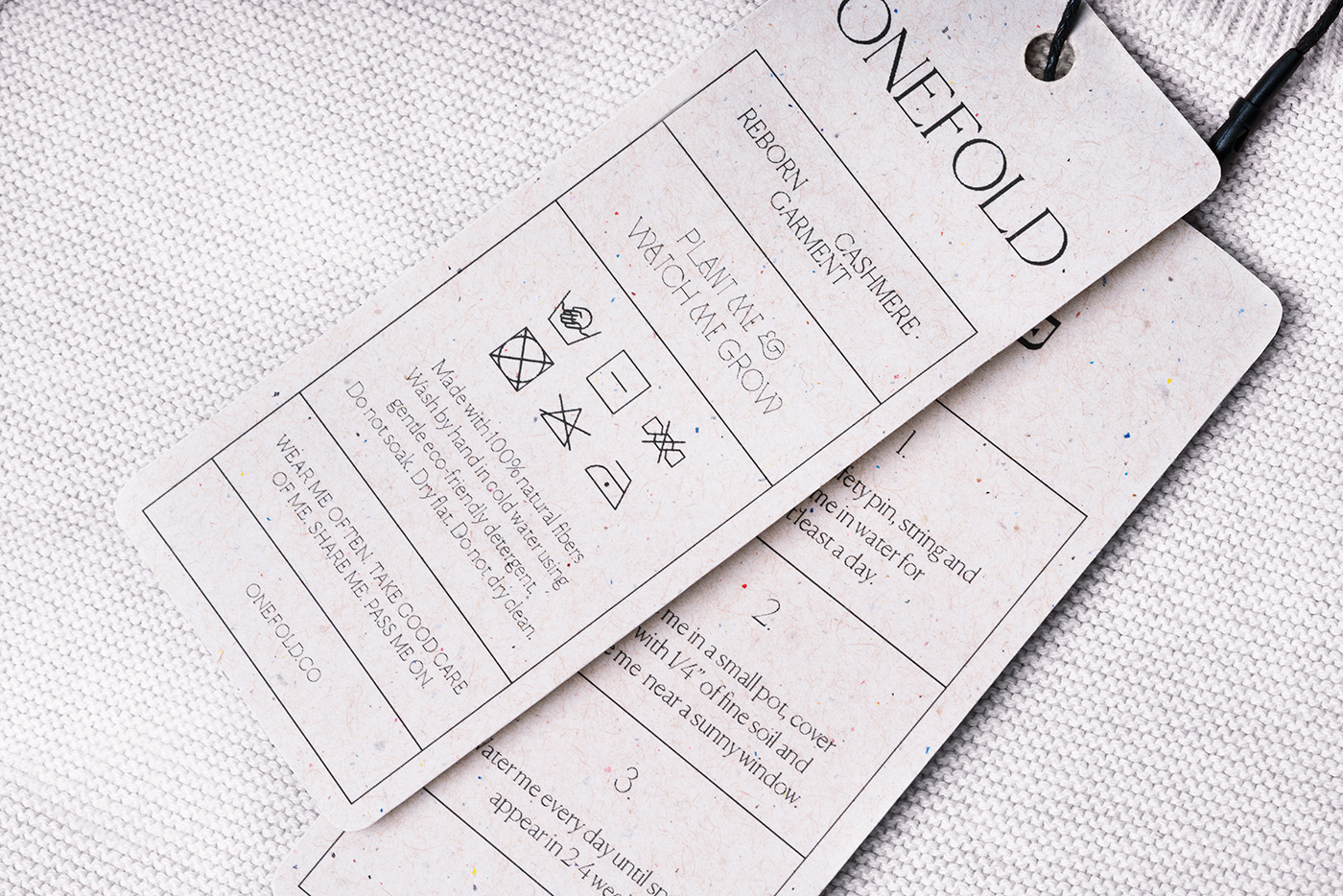
We wanted our visual outcome to align with our client’s vision. Staying away from gender stereotypes like blue for boys and pink for girls was something we absolutely agreed upon. We asked questions like, “Why do kid’s clothing brands have to all be overly childish with a naive or cute look and feel just because kids are associated with that aesthetic? We were influenced more by the vision of what was wanted for the brand in terms of simplicity and timelessness with a bit of playfulness.
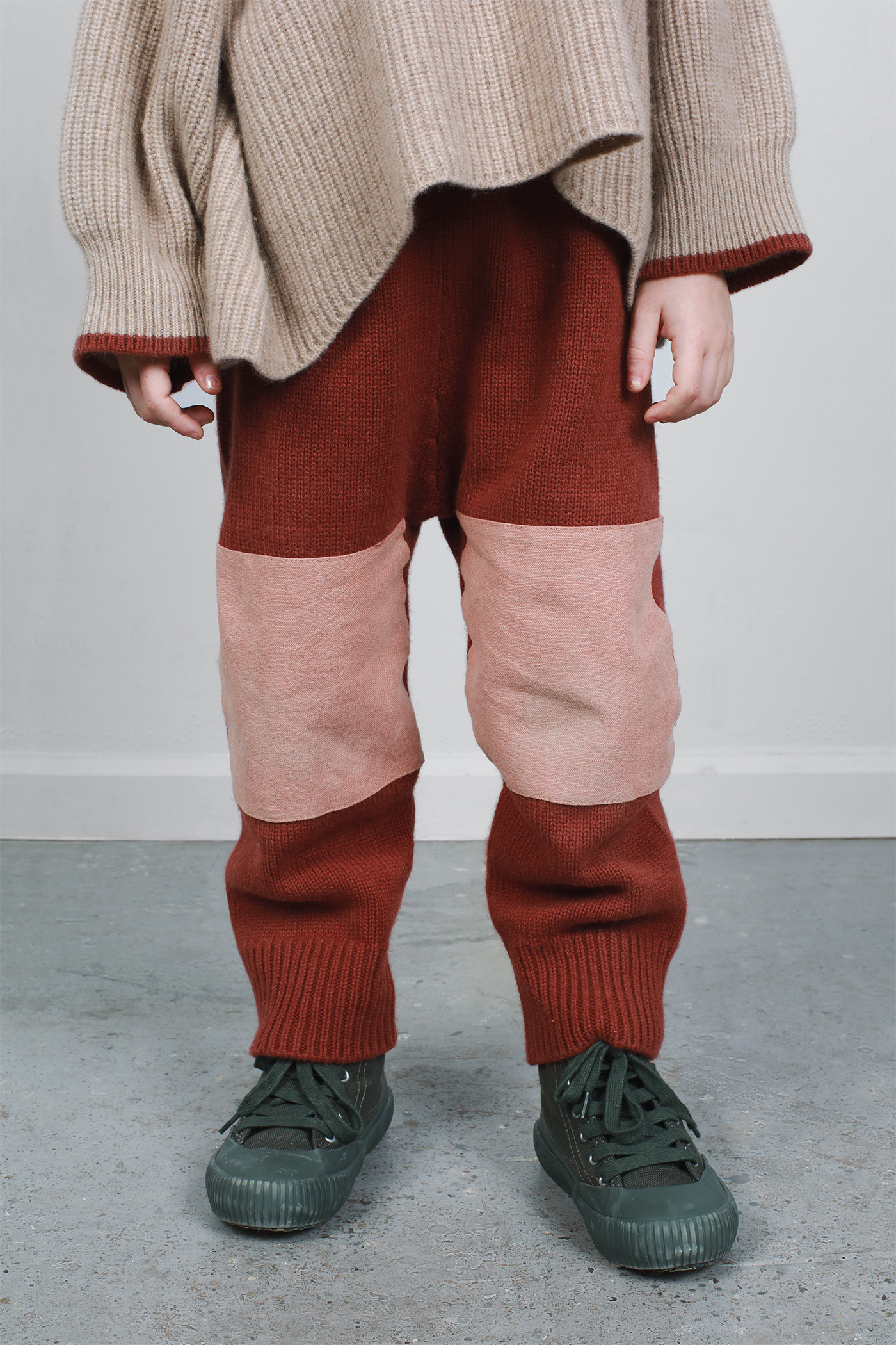
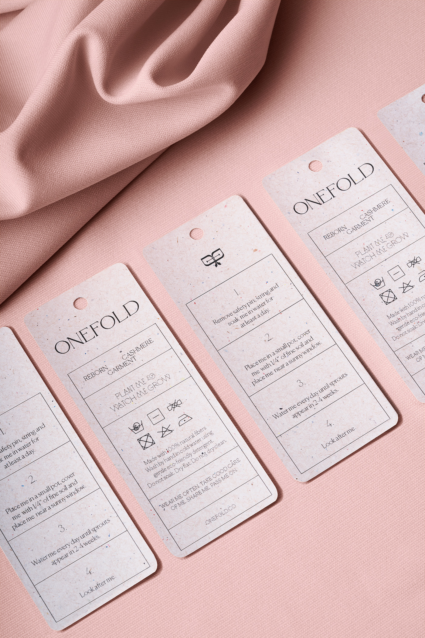
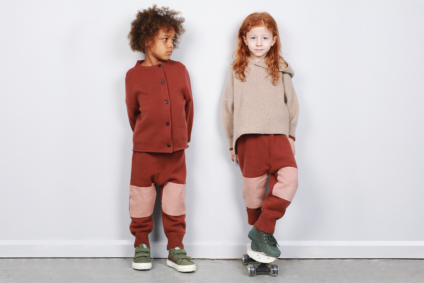
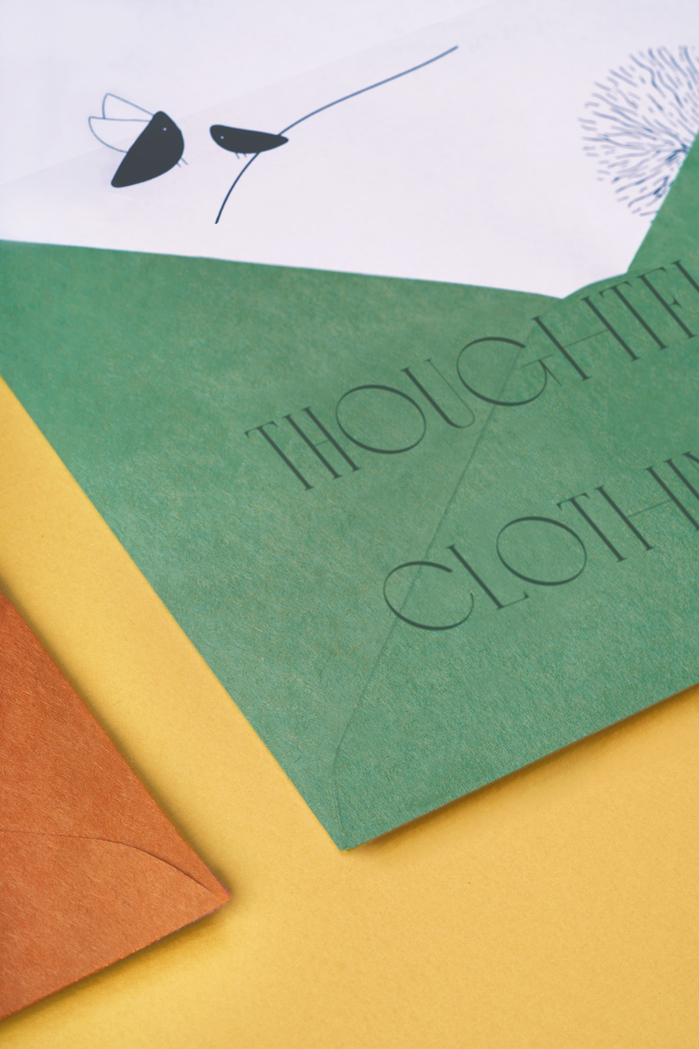
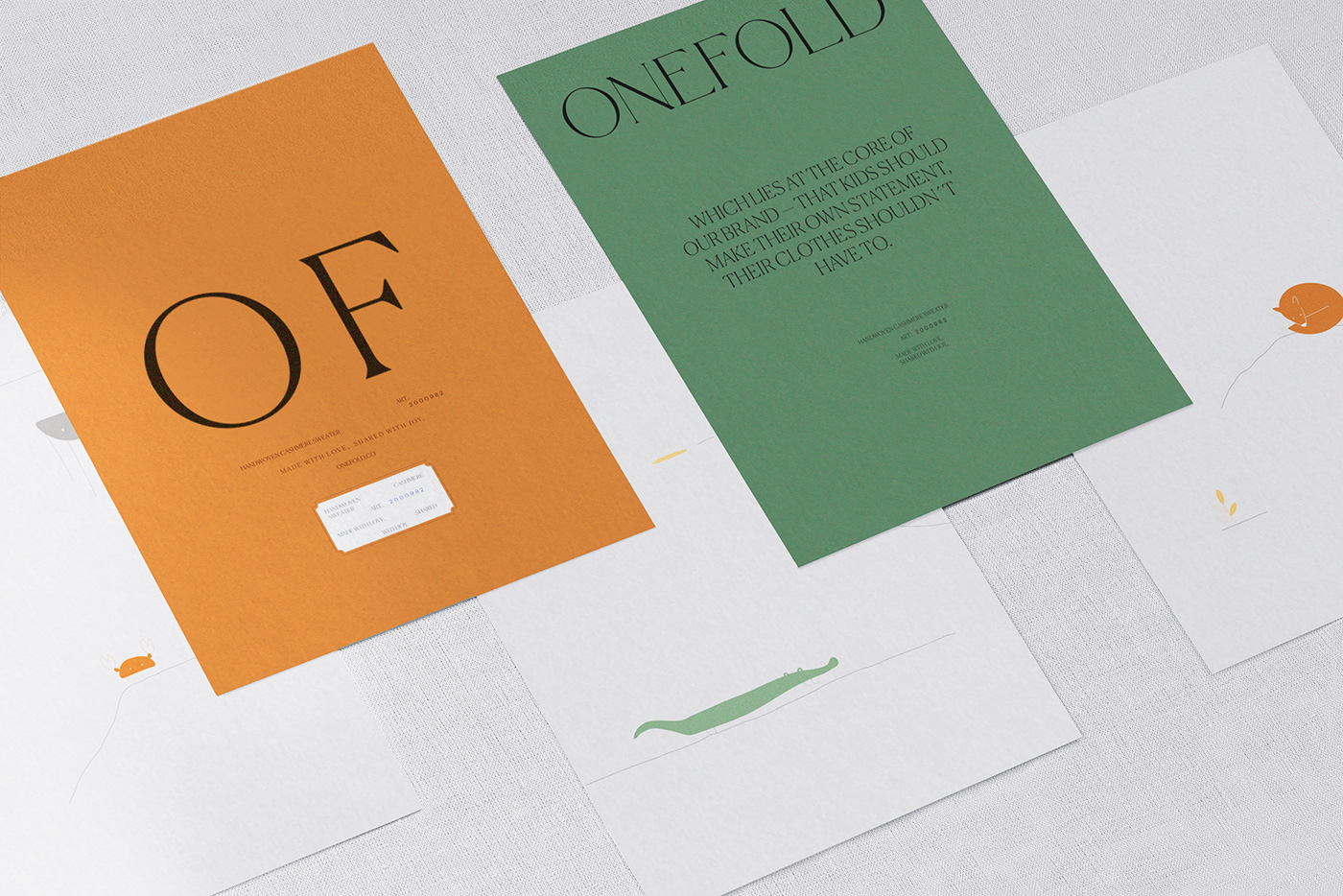
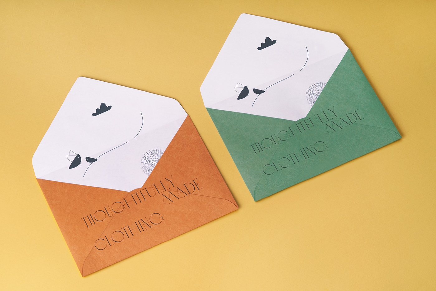
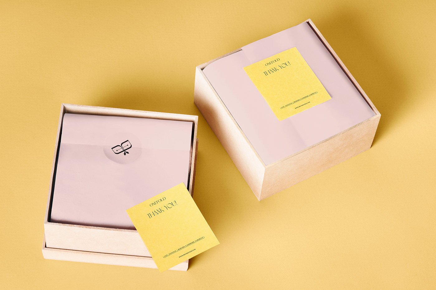
Onefold, challenging the way we think about clothes through great design.
Photos by Futura and Stephen Blaise.
Futura elsewhere on ID: Buddy Buddy.
Source

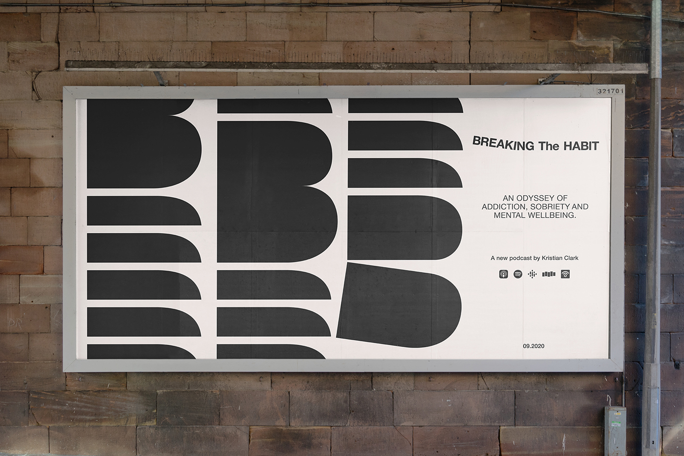
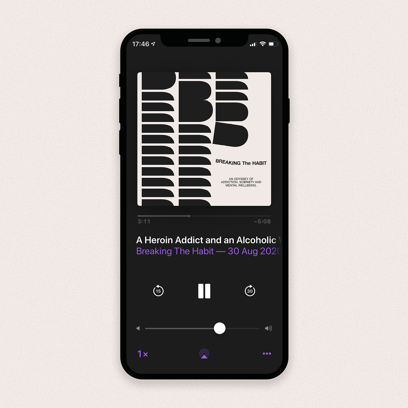
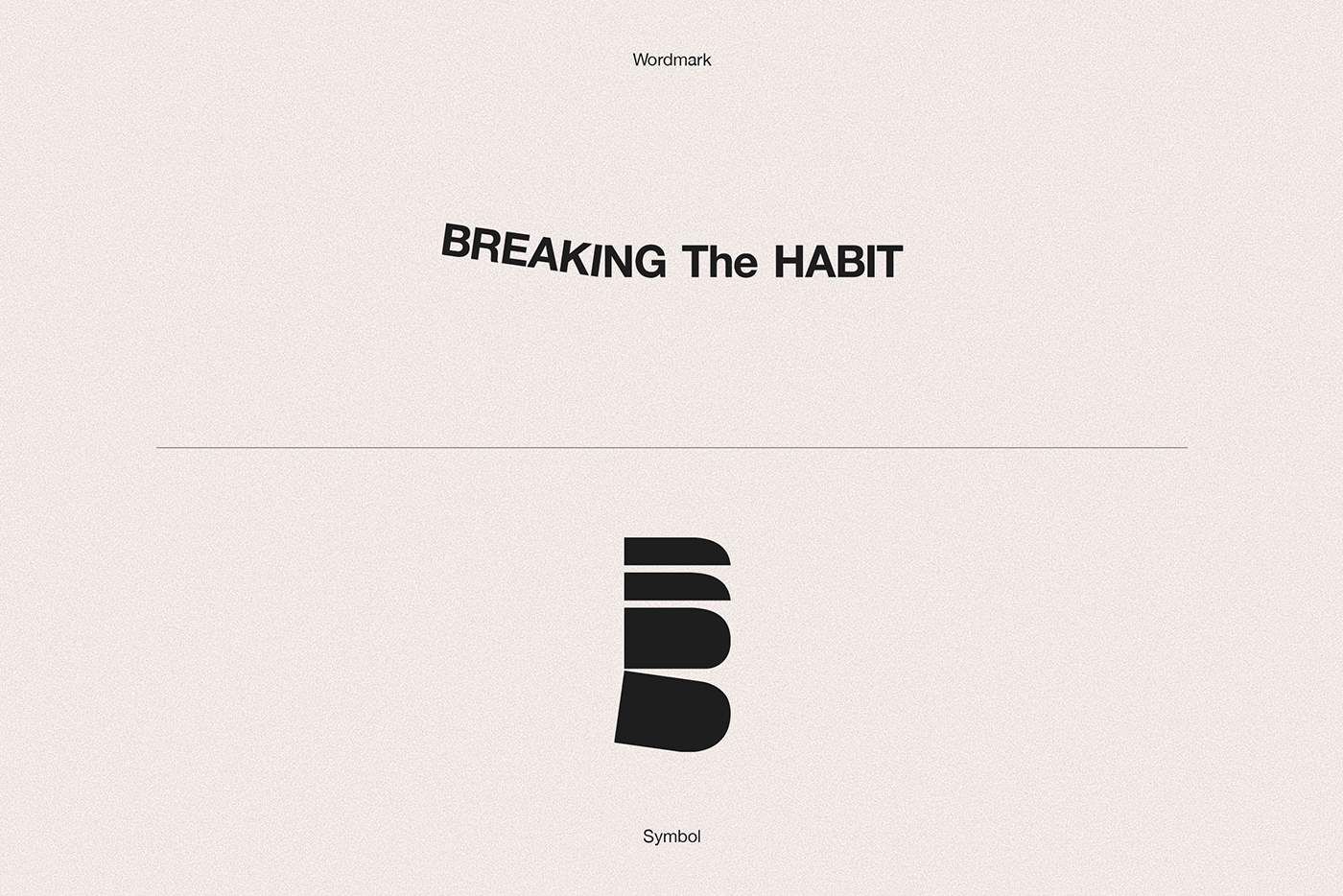
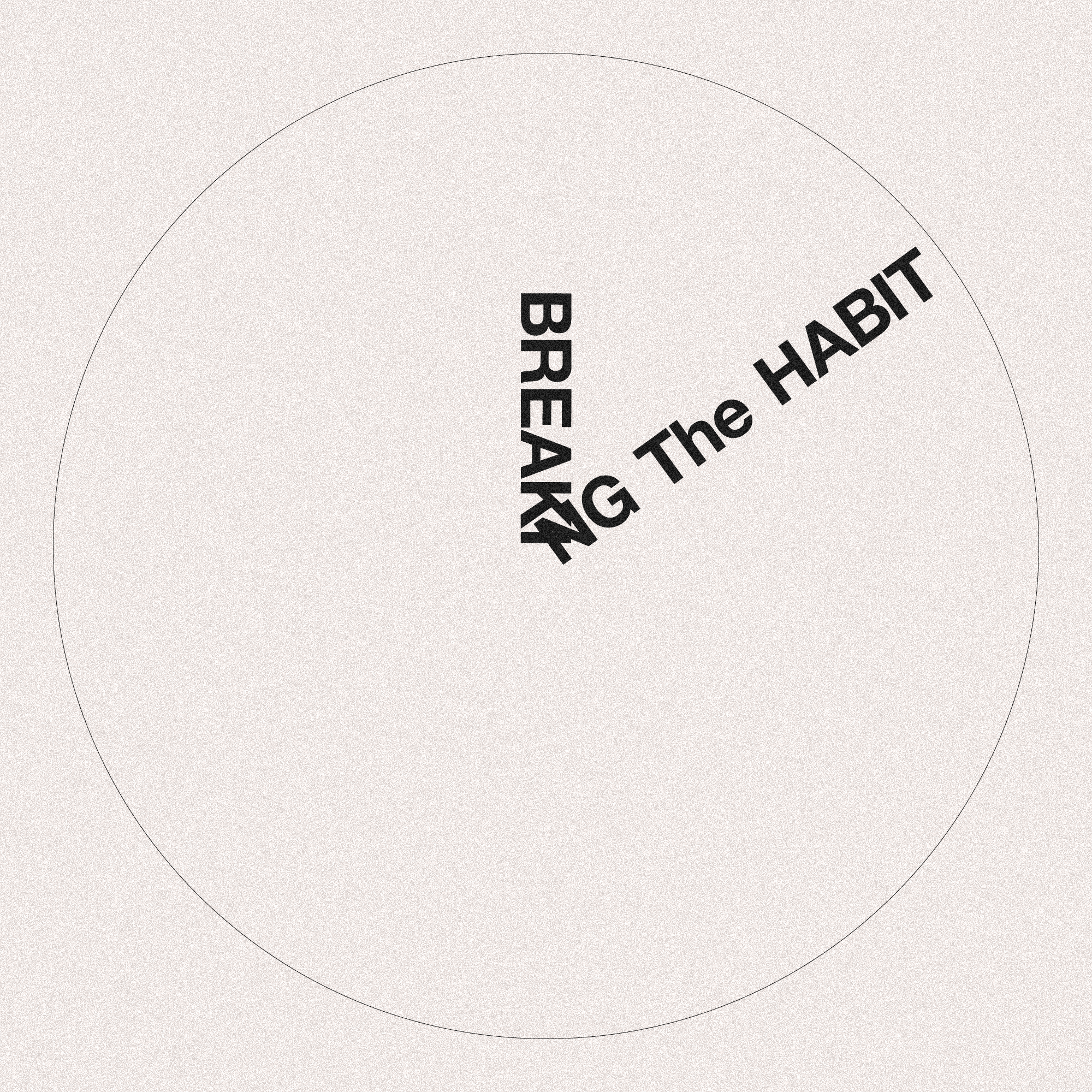
Breaking the Habit
Kristian is one of my best friends. He’s one of the funniest, most genuine people I’ve ever met. He’s also an addict.
He did not ask to be this way, but the effects of depression and anxiety led him on a path towards the illness and some very dark places.
After losing touch for a few years, Kristian resurfaced on Instagram, sixty days sober and with the announcement that he was launching a new podcast that would detail his journey from a 20-something gripped by alcohol addiction, to where he is now — a man thriving in recovery.
I reached out and offered to help. We caught up on the last few years, I learned a lot about what an addict is and what they are not. Some of his stories genuinely brought me to tears.
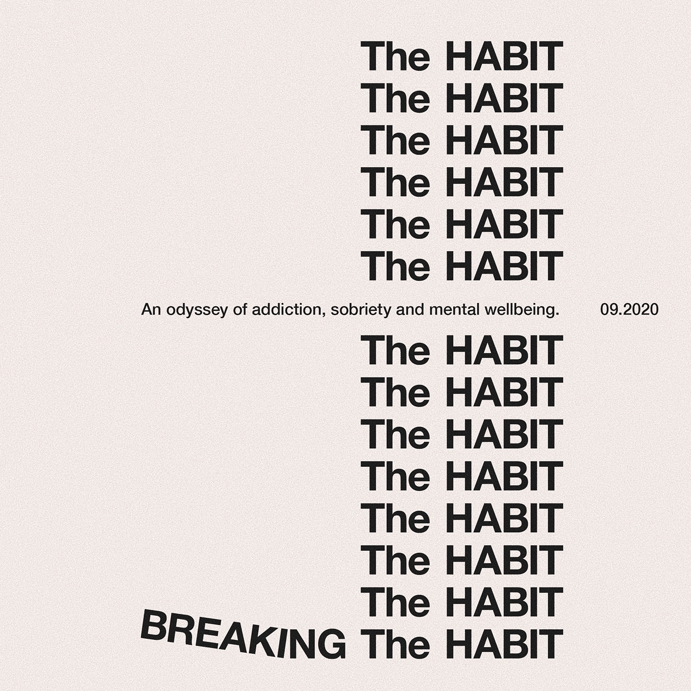
Over the last few months we’ve been working together to develop a visual identity and art direction style for the podcast, titled Breaking the Habit — An Odyssey of Addiction, Sobriety and Mental Wellbeing.
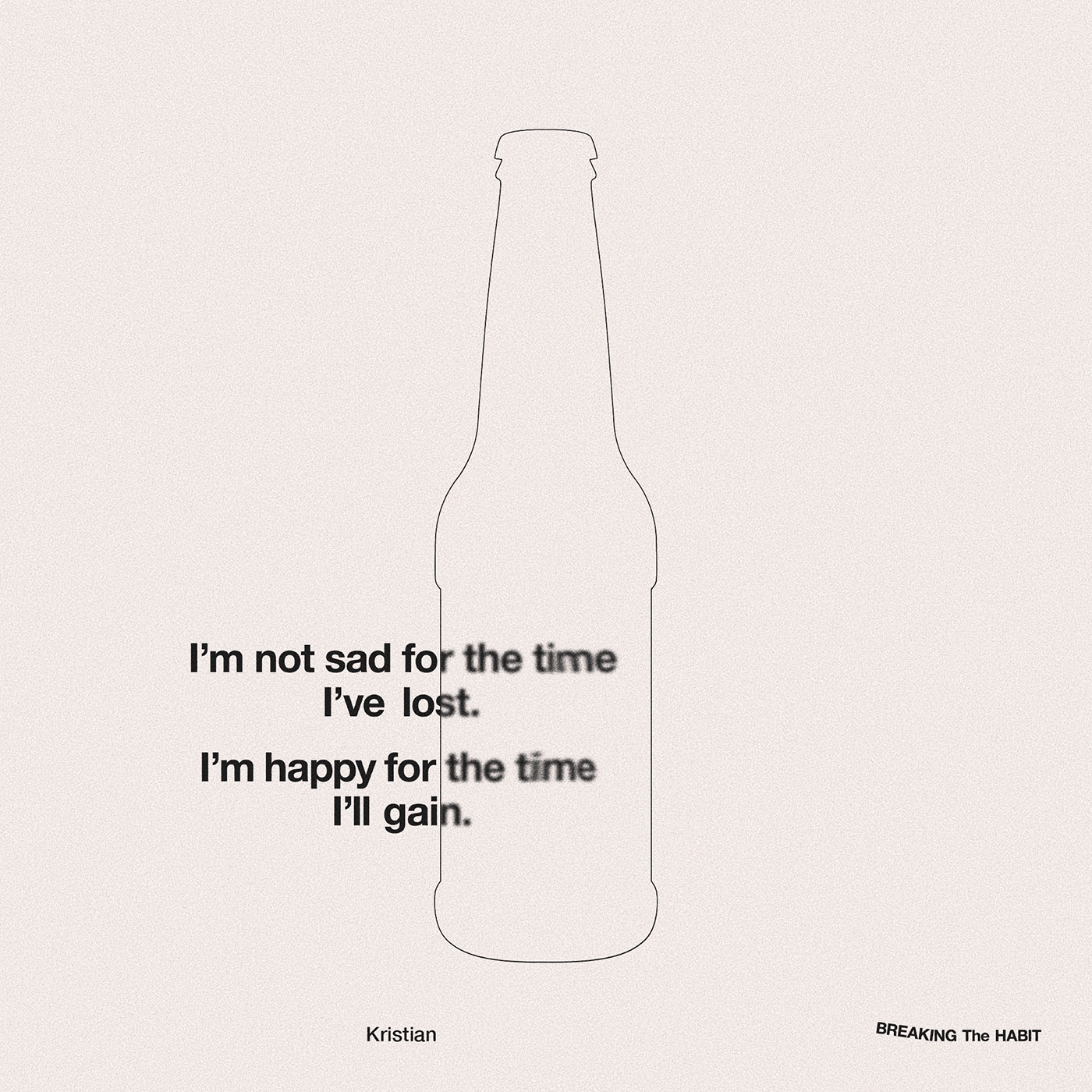
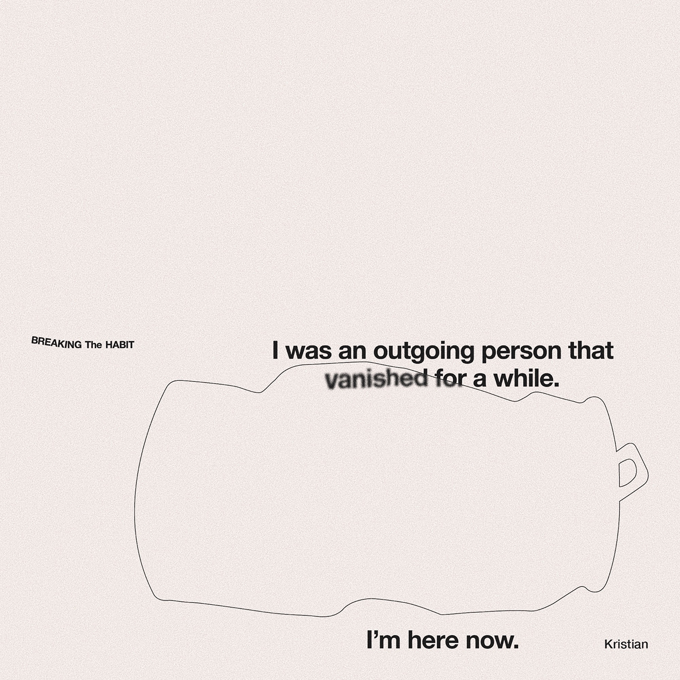
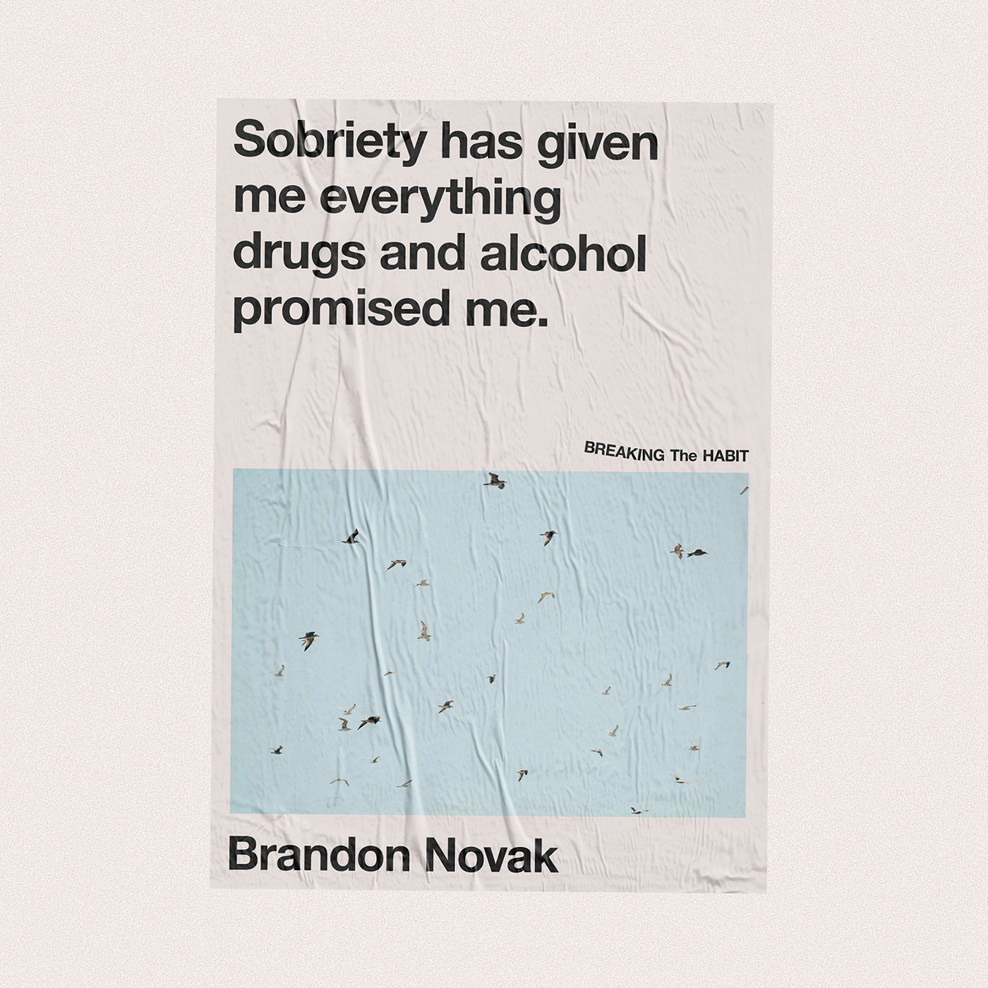
The visual identity uses repeated elements that somehow break or change to reflect the idea of “breaking out of the cycle of addiction.” Elsewhere, the use of metaphorical imagery and understated tone of the art direction reflects the raw, unfiltered themes of the podcast, creating an aura for the brand that is neither happy or sad in an attempt to capture the often uncertain journey from addiction to sobriety.
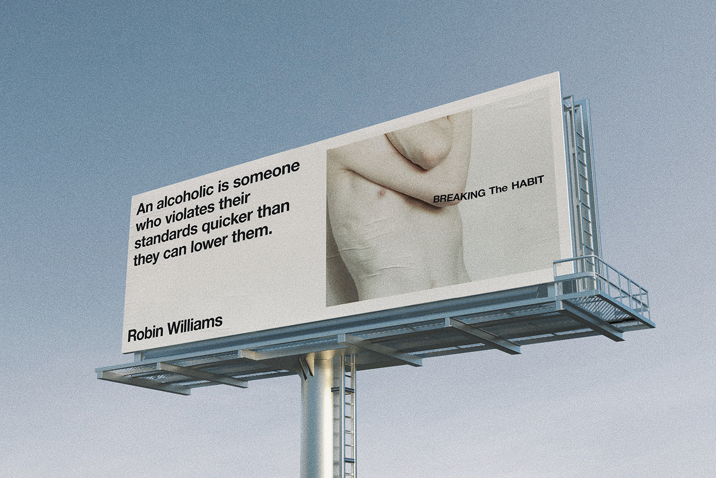
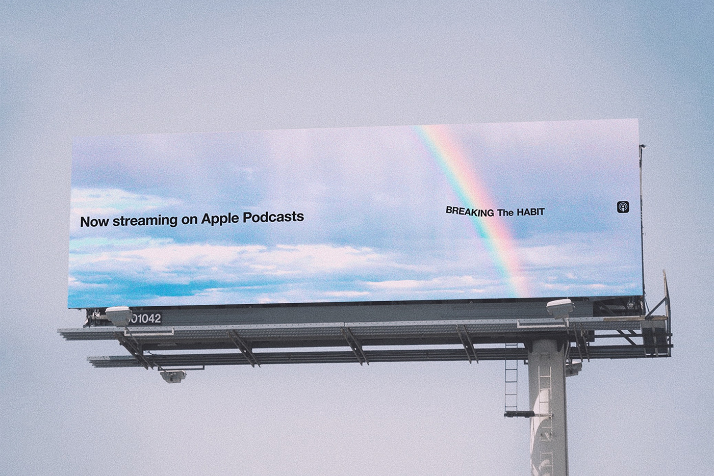
Poignant quotes of famous individuals who have battled addiction are visualised onto billboards and posted across the brand’s social media channels, to highlight their importance and to help give a voice to those who are suffering.
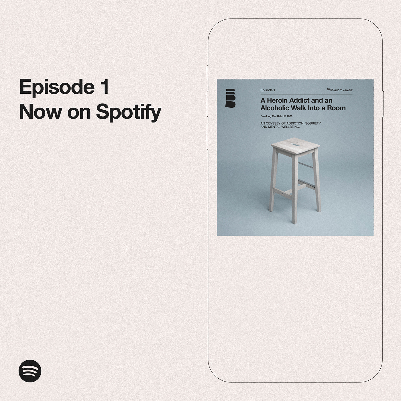
Episode 1 is now streaming everywhere.
More from Ash Watkins.
Source